How Fun Hair Salon JC Architecture
2014-09-02 01:00
架构师提供的文本描述。美发沙龙位于台北市最混乱、最时尚的地区。基于它的条件,即拥挤地区的旧街坊之一,我们的目标是将设计中的美发经验作为将旧的狭小空间转变为时髦场所的比喻。
Text description provided by the architects. How Fun Hair Salon is located in the most chaotic/trendy district in Taipei City. Based on its condition that is one of old street houses in the crowded area, our goal was to bring the experience of having hairdressing in design as a metaphor of converting the old narrow space into a trendy spot.
我们开发了改变台北街景的可能性。为小空间创造自由、开放和欢乐成为我们设计台北的兴趣和任务,台北是亚洲最密集的城市之一。我们的设计一开始很简单,描述了去一家美发沙龙的经历,一天头发不好,外观焕然一新。我们专注于通过改变我们的外表来延长我们寻找不同情绪的感伤之旅。因此,我们在空间中插入了一条隧道,创造了一种直接的过渡体验。
We developed the possibility to change the street scape in Taipei. Creating the freedom, openness and joy for small spaces becomes our interest and task in designing for Taipei one of Asian cities with extremely dense landscape. Our design started out simple, to describe experiences of going to a salon with a bad hair day to a brand new look. We focused on extending the sentimental journey that we all looking for different moods by changing our appearances. Therefore, we inserted a tunnel into the space to create a direct experience of transition.
我们的目标是一个较少装饰的设计,可以揭示空间的本质和工作人员的个性。我们研究了不同的材料,以创造一个环境辉光在接收柜台,并已开始使用合成石与照明,以其最佳的效果。我们用计算机软件创造了更多的曲线的可能性,更好地适应真实的空间。我们还在一楼的顶上设计了一个绿色的屋顶,供俯瞰街道的台北居民享受。
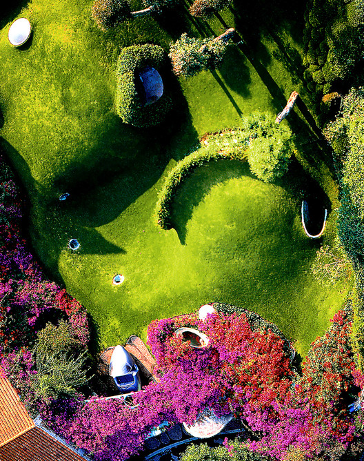
We aimed at a less-decorated design that can reveal the essence of the space and the personalities of people who work in. We research into different materials for creating an ambience glow at the reception counter, and have come to using synthetic stone with lighting for its best effects. We used computer software to create more possibilities of curves that better fit in the real space. We also designed a green roof on top of the first floor for the pleasures of Taipei residences who look down onto the streets.
在我们的设计工作作为一个整体,用户体验是最重要的关注。我们关心环境、营销计划和消费者心理之间的相互联系。对于商业空间,我们相信我们不会总是有很多机会来设计大立面,因此,创造新的外观,但保持当前环境的个性将是未来的趋势。我们希望设计简单,但有这个地区的潮流和时尚的精致。我们首先要改变一条小巷的外观,并期望它对更大范围的生活区产生影响。我们希望这座城市更活泼、更友好。
In our design work as a whole, user experience is the most important concern. We care about the interconnection amongst environment, marketing program and consumer psychology. For commercial space, we believe that we won't always have many opportunities to design for big facades, therefore, creating new appearance but preserving the personality of current environment will be a trend in the future. We wanted the design to be simple, but have the delicacy of trend and fashion of this area. We start with changing the look of a small alley, and expect it to be influential to a wider scale of living area. We want the city to be more lively and friendly.
门面是熙熙攘攘的小巷和室内沙龙之间的一个独特的界面。这条隧道几乎是管道穿过车道,并提供了整个旅程从外面的车道与玻璃分隔私人和公共空间,外观是一个伟大,清新,干净的界面之间的两个空间。
The facade is a distinct interface between the bustling lane and the inside salon. The tunnel almost pipes right through the lane and offers that entire journey inside from the outside lane with glass separating the private and public space, the facade is a great, crisp, clean interface between the two spaces.
隧道创建了一个独特的空间,为客户创建了一个旅程。这条隧道有助于将顾客的方向转变成一条穿过沙龙地板的亲密通道。
The tunnel creates a distinct space that creates a journey for the customer. The tunnel helps transform customers’ direction into an intimate pathway across the salon floor allowing.
 举报
举报
别默默的看了,快登录帮我评论一下吧!:)
注册
登录
更多评论
相关文章
-

描边风设计中,最容易犯的8种问题分析
2018年走过了四分之一,LOGO设计趋势也清晰了LOGO设计
-

描边风设计中,最容易犯的8种问题分析
2018年走过了四分之一,LOGO设计趋势也清晰了LOGO设计
-

描边风设计中,最容易犯的8种问题分析
2018年走过了四分之一,LOGO设计趋势也清晰了LOGO设计


 PintereAI


