Salle Polyvalente de Plumergat Studio 02
2014-10-21 01:00
架构师提供的文本描述。这个提议的多用途房质疑了传统建筑方法的基本原理。建筑一般是由于增加了一种东西,即在特定的景观上提供材料。然而,这座建筑却产生了一种相反的效果:它给人的印象是从减法到减法。
Text description provided by the architects. This proposed multipurpose room questions the founding principles of the traditional architectural approach. Construction generally results from an addition, that is, a supply of materials onto a given sight. This building, however, generates an opposite effect: it gives the impression of being born from a subtraction, from a reduction.
Floor Plan


就像一个石匠想象着摆在他面前的花岗岩块一样,这个最初的长方形体积似乎被雕刻、掏空、扭曲、扁平和锐化,以使最公正的形式活下来。
In the same way that a stonemason imagines the granite block placed before him, this initial rectangular volume appears to have been carved, hollowed, twisted, flattened, and sharpened to bring to life the most just form.
© Luc Boegly
吕克·博格利


这就是说,土的处理和地基的处理在这里是最重要的。体积是相对于地形的自然水平封闭起来的,这样房间就能最适合邻近建筑物的地平线,并在下面的花园上提供一个地面的开口。这种关注于流通性的关注,一直延伸到主要阶段的概念上。同样地,由于内部坡道的独特作用,也纳入了残疾人的无障碍环境。
This is to say that the treatment of the soil and its foundation is paramount here. Volume is enclosed in relation to the natural level of the terrain so that the room fits best into the horizon of its neighboring buildings and provides a ground-level opening onto the garden below. This attention to the ease of circulation, which goes all the way to the conception of the main stage, equally incorporates handicap accessibility thanks to the unique play of internal ramps.
© Luc Boegly
吕克·博格利


这个项目的主要材料是白色混凝土,它产生了一种发光的效果,放大了结构的角度和体积的失重。为了装饰高体积的一面,设计师joran briand设计了一幅金属帆布,以使英国的符号之一:胭脂。
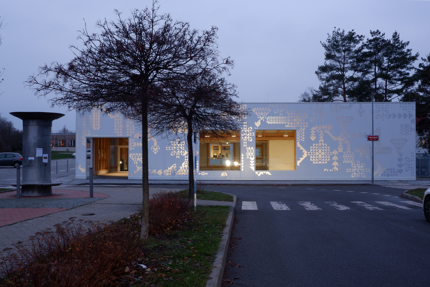
The dominating material for this project is white concrete, which generates a luminous effect to amplify the weightlessness of the structure’s angles and volumes. To dress the high-volume sides, the designer Joran Briand designed a metallic canvas to stylize one of the symbols of the UK: the ermine.
.jpg)


.jpg)

.jpg)


.jpg)

.jpg)

.jpg)

.jpg)


.jpg)

Architects Studio 02
Location Plumergat, France
Category Cultural Architecture
Project Year 2014
Photographs Luc Boegly

 PintereAI


