Media Library Choisy
2015-03-30 06:00
架构师提供的文本描述。新媒体图书馆位于乔西-勒罗伊(巴黎郊区),于2014年春季由布伦纳克·冈萨雷斯(Brenac Gonzalez)提供。
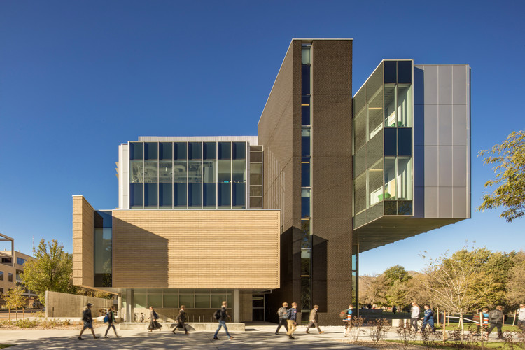
Text description provided by the architects. The new media library in Choisy-le-Roi (Paris suburb), delivered in the spring of 2014 by Brenac+Gonzalez & Associés, is located in the Port urban development zone at the heart of a new urban sector in full redevelopment. This former 30-acre working harbor, still typified by a landscape of sand quarries, has already been partially filled by tall buildings that line the Seine. This location is enabling the town's cultural center of gravity to gravitate towards the Seine, the banks of which, long isolated by the presence of railroad tracks, will soon be redeveloped on both sides of the river.
乔西-勒罗伊实际上是唯一一个横跨塞纳河的城镇。该项目的特殊位置、靠近河岸和洪水风险决定了该项目的基本方向。尽管媒体图书馆的简单藏书通过比喻停泊在河上的船只来回忆网站的过去,但它的金属面扩展,调节了内部亮度,正朝着这一地区光明的方向发展。高耸建筑物:洪水风险缓解计划(PPRI)适用于这一地区,其规则对建筑物与地面的关系有很大影响。因此,图书馆的底层无法开发。
Choisy-le-Roi is in fact the only town in the Val de Marne département to straddle the Seine. The exceptional location, its proximity to the river banks and the risk of flooding have defined the project's fundamental orientations. lthough the media library's simple volumes recall the site's port past by playing on the metaphor of a ship moored on the river, its expanded metal facing, modulating the interior luminosity, is turned towards this area's bright future. A raised building : The Flood-risk Alleviation Plan (PPRI) applies to this area, and its rules strongly influence the relationship of buildings to the ground. The library's ground floor therefore could not be developed.
因此,这座建筑被抬高,从地面上分离出来,只从一楼开始它的建筑简介。这种体积的分离创造了建筑下的空间,由草,植物覆盖和一张加布床组成的广泛的景观,引导游客到有玻璃的防风接待区,一个受保护的外部展览空间和一个具有纪念意义的“橘子皮”通道楼梯。这一水平空间在其厚度核心的垂直空隙中得到回响,形成一个中央露台,整个建筑围绕在它周围,像一条丝带。
The building has thus been raised, detaching it from the ground, and only begins its architectural brief from the first floor upwards. This detachment of the volume creates room under the building for an extensive landscape composed of grass, plant cover and a bed of gabions that guides visitors to a glassed-in wind-break reception area, a protected exterior exhibition space and a monumental "orange-peel" access staircase. This horizontal space is echoed in a vertical void at the core of its thickness, forming a central patio around which the whole building wraps like a ribbon.
因此,真正的一楼是一层,作为接待和指导区。它还划定了受控制的部门、成人和青年的区域,并允许进入建筑物的活动空间,这些空间也可以自主运作。两个巨大的图片窗口打开活动区域到装饰样的城市和接待区到河岸。这两个屏幕就像活生生的绘画,从内部看是一幅沉思的图像,从外部可以被看作是城市的信号。下一层是混合用途的,容纳成人区和图书馆的行政办公室和部门。游客的路线把他们带到了屋顶露台上种植的建筑物,这些屋顶露台展示了它的带状布局。
The real first floor is therefore one level up and serves as the reception and orientation area. It also delineates the controlled sectors, the areas for adults and young people and gives access to the building's space for activities, which can also function autonomously. Two monumental picture-windows open the activities area onto the decor-like city and the reception area onto the river banks. These two screens work like living paintings, a contemplative image from the inside and can be seen from the outside as urban signals. The next floor up is of mixed use, housing the adult area and the library's administrative offices and departments. The visitors' route takes them to the buildings planted roof terrace that materializes and reveals its ribbon-like layout.
A media library as symbol
一个(媒体)图书馆总是象征着一个知识的地方,因此它被塑造成一个螺旋,一个通过知识进步的标志,通过文化和文化与代际融合的社会提升。大部分的开放空间围绕着一个空的核心,形成一个上升的丝带状的体积。为了预测未来在“21世纪媒体图书馆”中的使用,我们选择将结构推向地块的外部界限,以释放所有限制,从而确保最大限度的灵活性。
A (media) library always symbolizes a place of knowledge, so it is shaped in a spiral, an emblem of progress through knowledge, social ascension through culture and the blending of cultures and the inter-generational. The majority of the open spaces turn around an empty core and form a rising ribbon-like volume. With a view to anticipating future uses in a "21st-century media library" a choice was made to push the structure to the outer limits of the plot so as to free the arrangement of all constraints, thus ensuring maximum flexibility.
该设施被刻度密度扩大金属覆盖,有时覆盖窗户以过滤光线,有时覆盖“步枪桶蓝”铝。只有大屏幕窗口的视图才能突出显示异常的框架。卷是抽象的,美学灵感来自港口建筑的基本形状,以纪念遗址的历史。
The facility is covered with graduated-density expanded metal with this mesh sometimes covering the windows to filter the light and sometimes the facing of "rifle-barrel-blue" aluminum. Only the views from the large screen-windows have been favored for highlighting the exceptional framing. The volumes are abstract, and the esthetics are inspired by the elementary shapes of harbor buildings in memory of the site's history.
利用这个三角形图形的特殊位置,这座建筑讲述了一艘停泊在种植地上的船在移动。图书馆的名称以霓虹灯的形式将附在建筑物的上部,以增加从桥和河对岸的能见度。从远处看,当塞纳河喷出冬季的薄雾时,这艘“船”看起来就像一艘幽灵船。
Using the exceptional location of this triangle-shaped plot, the building speaks of a moored ship floating on planted ground in movement. The library's name in the form of a neon sign will be attached to the upper part of the building to increase its visibility from the bridge and from the other side of the river. From afar when the Seine exhales its winter mist, this "boat" will look like a ghost ship.
 举报
举报
别默默的看了,快登录帮我评论一下吧!:)
注册
登录
更多评论
相关文章
-

描边风设计中,最容易犯的8种问题分析
2018年走过了四分之一,LOGO设计趋势也清晰了LOGO设计
-

描边风设计中,最容易犯的8种问题分析
2018年走过了四分之一,LOGO设计趋势也清晰了LOGO设计
-

描边风设计中,最容易犯的8种问题分析
2018年走过了四分之一,LOGO设计趋势也清晰了LOGO设计


 PintereAI


