PintereAI


Miu Miu Aoyama Store Herzog - de Meuron
2015-03-31 21:00
© Nacasa & Partners
© Nacasa


架构师提供的文本描述。Miu项目位于著名的普拉达东京震中对面的对角线上,也是由赫佐格设计的。
Text description provided by the architects. The project for Miu Miu is sited diagonally across the street from the celebrated Prada Tokyo Epicenter – also designed by Herzog & de Meuron – in an elegant neighborhood that has, over the past two decades, become a showplace of architectural invention. In contrast to the transparency of the all-glass Prada building, however, the understated metallic surface of the Miu Miu façade is opaque, which lends a more intimate quality. The architects say: “Contrary to expectations for a site that is home to so many luxury brands, Miyuki Street in Aoyama Tokyo is not particularly beautiful or elegant. The architecture is heterogeneous – a hodgepodge of freestanding buildings of different heights and shapes, with neither historical tradition nor common standards. Never meant to be a space of its own, the street is a purely technical and functional link between Omotesando and the Aoyama Reien cemetery farther down the road. Despite single trees here and there, the atmosphere is not inviting, like a boulevard or a plaza. Tokyo is pure, quintessential city, its territory exploited to the full with absolutely no leeway for the individuality that we take for granted in European cities.
© Nacasa & Partners
© Nacasa

十多年前,当我们为青山普拉达(PradaAoyama)设计玻璃建筑时,我们已经注意到这一点。当时,我们对扭转这种局面很感兴趣-一方面,把一个小广场放在建筑物的一侧,另一方面,让建筑完全被看到-这样我们就可以从四面八方看到内部,也可以从里面看到城市的特定景观。
We already noticed this over 10 years ago when we were planning the glass building for Prada Aoyama. At that time, we were interested in counteracting the situation – on one hand, by placing a small plaza to the side of the building, and on the other, by making the structure completely see-through so that one can see into the interior from all sides and can also look out from inside at specifically targeted views of the city.
© Nacasa & Partners
© Nacasa

在过去的十年里,这座独特的建筑已经成为一个非常频繁的地方,因此对于普拉达,我们的客户普拉达(Prada),以及作为建筑师的我们来说,在规划位于街对面附近的Miu商店时,考虑到这一点是很重要的。我们首先尝试了几种不同的建筑类型。由于分区法规要求较低的高度,我们探索了一座更小、更亲密的建筑的潜力。我们用下面的想法来引导我们的想法:更像是一个家而不是百货公司,更多的是隐藏而不是开放,更低调而不是奢侈,更不透明而不是透明。
Over the past decade, the distinctive building has become a much-frequented location and it was therefore important to Prada, our client Prada Japan and also to us as architects to take this into account in planning the Miu Miu store located in the immediate vicinity on the opposite side of the street. We started out by trying several different architectural typologies. Since zoning regulations called for less height, we explored the potential of a smaller, more intimate building. We used the following thoughts to channel our ideas: more like a home than a department store, more hidden than open, more understated than extravagant, more opaque than transparent.
© Nacasa & Partners
© Nacasa

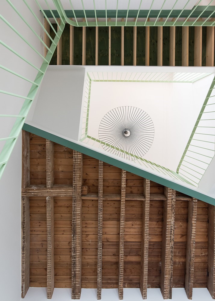
最适合这些考虑因素和规格的类型模型是一个直接放在街道水平的盒子,它的盖子稍微张开,标志着入口,让行人可以往内看。只有这样,他们才意识到这座大楼是一家商店。在这里,在超大的天篷下,两层的内部一眼就能看到,就好像是用一把大刀把音量切开了,把里面翻了过来。铜质表面的圆润、柔软的边缘与金属盒外部锋利的钢棱角相接,而包在织锦中的洞穴状壁龛则像戏院中的阁楼一样,面对着商店的中心空间。两层高层的商店不仅在桌子和展示柜上展示诱人的商品,还像一个宽敞舒适的家,有诱人的沙发和扶手椅。
The typological model that best suited these considerations and specifications was a box placed directly at the level of the street, its cover slightly open to mark the entrance and allow pedestrians to look inside. Only then do they realize that the building is a shop. Here, under the oversized canopy, the two-storey interior is visible at a single glance, as if the volume had been sliced open with a big knife, turning the inside out. The rounded, soft edges of the copper surfaces inside meet with the razor-sharp steel corners on the outside of the metal box, while the cave-like niches clad in brocade face the central space of the shop like loges in a theatre. The shop on two tall storeys not only presents enticing goods on tables and in display cases; it is also like a spacious and comfortable home with inviting sofas and armchairs.
© Nacasa & Partners
© Nacasa

FAÇade既没有标志,也没有浮华;它是一个抛光的、镜面光滑的表面,就好像一次巨大的笔触已经把通常光滑的钢制面板FAÇ的表面扫平了一样。这个表面吸引了路过行人的目光和好奇心。但是,不是像在商店橱窗里那样提供一个视野,而是将目光倒转;而不是预期的透过窗口,观众会遇到自我反省。
The façade has neither logo nor pomp; it is a polished, mirror-smooth surface, as if one single giant brushstroke had swept smooth the ordinarily matte surface of the steel panelled façade. This surface attracts the gaze and curiosity of passing pedestrians. But instead of affording a view inside, as in a shop window, the gaze is inverted; instead of the anticipated see-through window, viewers encounter self-reflection.
© Nacasa & Partners
© Nacasa

虽然这条街不是一个鼓励逗留和环顾四周的地方,但这座建筑本身就是一种向人们发出邀请的姿态,邀请他们进屋停留一段时间。“
While the street is not a place that encourages lingering and looking around, the building itself is a gesture that extends an invitation to come inside and stay a while.”
© Nacasa & Partners
© Nacasa


Architects Herzog & de Meuron
Location Tokyo, Japan
Category Store
Area 269.0 sqm
Project Year 2015
Photographs Nacasa & Partners


推荐作品
相关文章
-
2018年走过了四分之一,LOGO设计趋势也清晰了LOGO设计
-
2018年走过了四分之一,LOGO设计趋势也清晰了LOGO设计
-
2018年走过了四分之一,LOGO设计趋势也清晰了LOGO设计