Morgue in Xirivella Renovation In_Arquitectura
2015-05-08 03:00
© David Zarzoso
(David Zarzoso)


架构师提供的文本描述。该项目是对20世纪80年代建造的一座工业仓库进行改造,该仓库被闲置用于一项新活动的设施,即停尸房的设施。这项工程使我们得以翻新一幢旧工业大厦,以显示该建筑物的使用对建筑物所在的邻里所产生的影响。目前,由于近年来经济危机的影响,该社区部分无人居住。
Text description provided by the architects. The project is the renovation of an industrial warehouse built in the 1980's that was unused, for the facilities of a new activity, that of a morgue. The project has allowed us to renovate an old industrial building to show the effect that the usage of the building has had on the neighborhood where the building is located. Currently, the neighborhood is partly unoccupied due to the effect of the economic crisis of recent years.
© David Zarzoso
(David Zarzoso)


这个项目的一个想法是创造一个新的停尸房概念,把这个空间理解为一个温暖、欢迎的空间,明亮而安静,更类似于房子的起居室,而不是我们通常在停尸房里找到的空间。
One of the ideas of the project is to create a new concept of a morgue, understanding the space as a warm, welcoming space, luminous and quiet, more similar to the living room of a house, as opposed to the spaces we usually find in morgues.


该地段有一个三角形的形状,并占据了角落的块,它的位置。这座建筑的三面都暴露在外面,并与另一座同样类型的建筑合二为一。正面俯瞰街道和空地。
The lot has a triangular shape and occupies the corner of the block where it is located. The building is exposed on three of its sides and bound by a party wall with another building of the same typology. The facades overlook the streets and the open space of the lot.
© David Zarzoso
(David Zarzoso)


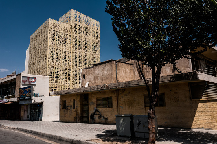
在外观上,我们努力工作,彻底翻新建筑物的形象,以突出其馀的工业仓库。为此目的,我们用一个新的金属外壳包裹建筑,并创造了一个大的开口,从一个角落开始,穿过两个主要的正面。新的金属包层,我们做了一个当代的形象,平衡了正面的末端,并区别于其他相邻仓库的门窗屋顶。大的洞口涉及到内部和外部,并为太平间的房间带来了光线。主要行人通道通过墙突出显示,该墙相对于其余部分改变方向,并将用户引入建筑物。停车场外部空间的窗台涂上了停尸房正面的颜色,因此,以低成本的资源,我们可以将这一空间定位为停车场,部分是供用户使用的地方,根据新装修的项目形象,采用当代设计。
On the exterior we work strongly, completely renovating the image of the building in order to highlight in among the rest of the industrial warehouses. For this purpose, we envelop the building with a new metal skin and create a large opening that starts at a corner and traverses the two main facades. With the new metal cladding, we make a contemporary image, equalize the ends of the facades, and differentiate from the rest of the neighboring warehouses with gabled roofs. The large opening relates interior and exterior, and brings light into the rooms of the morgue. The main pedestrian access is highlighted through a wall that changes direction with respect to the rest, and introduces the user into the building. The sill on the exterior space of the lot is painted with colors present on the facade of the morgue, so that with a low cost resource, we achieve to condition this space, in part as parking and in part as a place for users to occupy, with a contemporary design according to the new renovated image of the project.
© David Zarzoso
(David Zarzoso)


内部几乎是透明的,仓库的整个高度都被释放了。对于其功能性调节,重要的是将公共用途空间与限制区域分开,并根据其使用情况在房间内达到一定的规模。因此,我们选择在不影响现有结构的情况下,采用隔断系统和干墙天花板,使我们能够在旧的建筑中塑造内部结构。考虑到这些想法,大楼在公共区域设有一个大厅,设有接待室和行政厅、候车室、咖啡厅、两个叫醒室和礼拜堂,在禁区内设有一间房间、办公室、工作人员厕所和更衣室,以及私人停车场。公共和公共区域通过立面上的大开口与场地的开放区域有着直接的关系。
The interior was practically diaphanous with the entire height of the warehouse freed up. For its functional conditioning, it was important to separate the public use spaces from the restricted areas, and to achieve a scale in the rooms according to their use. For this reason, we opted for partition systems and drywall ceilings that without affecting the existing structure, have allowed us to mold the interiors within the old contained. Taking into account these ideas, the building has on the public area a hall with a reception and administration, waiting room, cafe, two wake rooms and chapel, and in the restricted area a thanatopraxy room, offices, staff restrooms and changing rooms, and private parking. The common and public areas have a direct relation with the open area of the site through the large opening on the facades.
© David Zarzoso
(David Zarzoso)


停尸房的室内设计也是该项目的一部分。我们明确地设计和选择了家具,创造了单一的氛围,其特征是一个灰色的水平平面(人行道),白色和深灰色的背景(墙壁),橡木家具,线条纯正,挂毯上有暖色。照明也是项目研究的一个方面。我们试图突出建筑元素与灯具集成到天花板上,当关闭时消失,并点燃空间,而不是主角。在唤醒室里,所有的照明都是间接的。隐藏的照明已经成为一种资源,用来加强教堂空间和加强连接内部和外部的大开口。
The interior design of the morgue is also part of the project. We have designed and chosen the furniture expressly, creating a single atmosphere, characterized by a gray horizontal plane (pavement), a white and dark gray background (walls), oak furniture with pure lines and warm colors on the tapestries. The lighting has also been an aspect studied in the project. We have sought to highlight the architectural elements with luminaires integrated into the ceiling that disappear when turned off, and light the space without being protagonist. In the wake rooms, all lighting is indirect. The hidden lighting has been a resource used to enhance the chapel space and to enhance the large opening that links the interior with the exterior.
© David Zarzoso
(David Zarzoso)


.jpg)

.jpg)

.jpg)

Architects In_Arquitectura
Location Xirivella, Valencia, Spain
Category Refurbishment
Site Director Inés Esteve Sebastia, Nuria Moya Llorens
Collaborators Vicente Calabuig Montesinos, Teresa Huesa
Project Area 602.0 m2
Project Year 2015
Photographs David Zarzoso

 PintereAI


