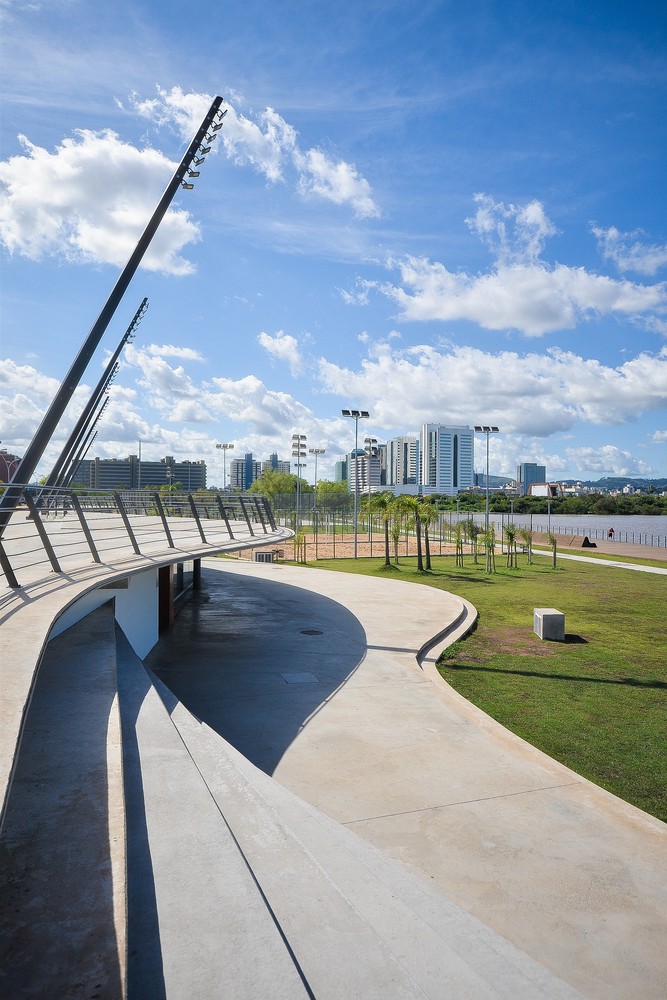
Scape NAS architecture
2015-07-12 05:00
架构师提供的文本描述。在为期10年的“生活建筑节”期间,主展馆位于圣徒来酒店中心广场。这个关键点是今年庆祝活动的主要背景和信息点。
Text description provided by the architects. For the 10 years of the Festival of Lively Architecture the main pavilion takes place at central plaza of hotel saint come. This key point is the main backdrop and information point for this year’s festivities.
似乎重要的是,使用不同的元素,标点符号的庭院,作为一个基础的整体发展的展馆的形状。从地面开始,展馆以各种随机步骤展开,为游客提供阅读空间、放松场所或节日期间举行的各种活动的舞台。
It seemed important to use the differents elements that punctuate the courtyard as a basis for the overall development of the pavilion's shape. Begining from the ground, the pavilion unfolds in a multitude of random steps that can serve for visitors as reading spaces, relaxation places or stages for the various events that take place during the Festival.
展馆包括广场的旧柱,以创造它的形状。土壤变成了屋顶,内部形成了一个很大的接待区供公众使用。因为它的形状和慷慨,那种内在的阴谋。这个空间由信息墙、地图和其他与节日有关的材料组成,成为节日周围信息和会议的场所。
The pavilion includes old columns from the plaza that to create its shape. The soil becomes roof and the interiority form a large reception area for the public. Because of its shape and generosity, that interiority intrigue. Consisting of informatives walls with maps and other materials related to the festival, this space becomes a place of informations and meetings around the Festival.
这座建筑是用木头建造的,就像整个帕维隆一样。目的是在内部和信封之间建立真正的对比。
The structure is made of wood, like the entire pavilon. The aim was to create a real contrast between the inside and the envelope.
里面的气氛非常明亮和欢迎,以便为游客提供一个信息点。外部物质性与院落直接相关。展馆在背景、暗色调和锐角之间是对立的。外信封是由中等颜色的质量,以创造一个黑暗的垫子和强大的材料,以支持该地方的威严。
Inside the atmosphere is very bright and welcoming in order to provide an information point for visitors. The outer materiality is directly related to the courtyard. The pavilion is in opposition between the context, privileging dark tones and sharp angles. The outer envelopel is made of medium tinted in the mass, in order to create a dark mat and powerful material in order to support the majesty of the place.
景观被定位为一个客人在广场的中心充满了历史,它与元素交谈,并利用对比质疑空间。
Scape is positioned as a guest in the heart of the plazza full of history, it converses with the elements and uses contrasts to question space.
 举报
举报
别默默的看了,快登录帮我评论一下吧!:)
注册
登录
更多评论
相关文章
-

描边风设计中,最容易犯的8种问题分析
2018年走过了四分之一,LOGO设计趋势也清晰了LOGO设计
-

描边风设计中,最容易犯的8种问题分析
2018年走过了四分之一,LOGO设计趋势也清晰了LOGO设计
-

描边风设计中,最容易犯的8种问题分析
2018年走过了四分之一,LOGO设计趋势也清晰了LOGO设计


 PintereAI


