ZAMNESS nook architects
2015-07-13 13:00
架构师提供的文本描述。我们已经尝试了很长一段时间来改变我们的工作地点,在参观了几个公寓和建筑之后,我们突然发现了一个机会,为一个与一个非常知名的客户共享的办公室开发一个项目。这一次,时间是我们的主要挑战-我们必须完成一个室内设计项目,获得估计的成本。管理建筑工程并在3个月内搬迁。这是巴塞罗纳城的一个非常有限的时间尺度。
Text description provided by the architects. We had been trying for one, very long year to change our place of work and after visiting several apartments and establishments, we suddenly came across the opportunity of developing a project for a shared office with a closely known client. On this occasion time was our main challenge- we had to finish an interior design project, obtain estimated costs, manage the construction works and move in just 3 months. This is an extremely limited timescale for the city of Barcelona.
© nieve | Productora Audiovisual
c nieve\x\x{e76f}Productora Audiovisual


工作空间的结构非常常见于70年代在Poble Nou社区建造的建筑物上;大型阁楼的外墙完全是玻璃的,里面有车间和仓库,有各种各样的人和服务电梯,还有一个非常工业化的特点,让人想起了这个社区正在不断更新的富有成效的过去。我们发现了一个空荡荡、完全没有隔墙的空间,300平方米的空间由钢筋混凝土柱和挂梁支撑。
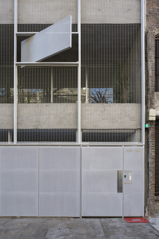
The working space has a configuration very commonly found on buildings built in the 70’s at the Poble Nou neighborhood; large lofts with completely glazed facades that housed workshops and warehouses, with various people and service lifts, and a very industrial character that’s reminiscent of the neighborhood’s productive past which is now undergoing a continuous renewal. We found a space that was empty and completely lacked partitions, 300 m2 supported by reinforced concrete pillars and hung beams.
© nieve | Productora Audiovisual
c nieve\x\x{e76f}Productora Audiovisual


该结构由三个明显符合所需功能规划的中心线组成:两个办公室位于两侧,以及中心的公用会议室和休息区。
The structure is composed of three centerlines that clearly fitted the required functional plan: two offices located on opposite sides and the common meeting rooms and resting areas in the center.
Floor Plan


我们从一开始就注意到,由网状结构和调制后的立面设置的正交排列的强度。它也非常明显地表明,其中一条中心线比其他部分更窄,这使得解决这两个非常相似的办公空间的需要变得更加复杂。当时的干预很明确:建造了三个光影-两个用于会议室,一个用于浴室;我们通过赋予现有真空层次结构并将我们的干预与原始信封区分开来定义集合。
We noticed, from the beginning the strength of the orthogonal arrangement set by the reticular structure and the modulated façade. It also made very obvious the fact that one of the centerlines was narrower than the rest, which complicated the solution for the need of the two very similar office spaces. The intervention was then clear: the construction of three light volumes- two for meeting rooms, one for the bathrooms; we defined the ensemble by granting hierarchy to the existing vacuum and differentiating our intervention from the original envelope.
© nieve | Productora Audiovisual
c nieve\x\x{e76f}Productora Audiovisual


我们用对角线来区分我们的干预和配置从结构轴的极限溢出的空间。这建立了三个卷和两个横贯整个空间的对角线之间的关系,为休息区域和宽敞的厨房留出空间。这种想法是通过使用三种不同的灰色路面色调来加强的,它们从正面附近最黑暗的地方到对面入口最轻的地方。
We used diagonals to set apart our intervention and to configure spaces that overflowed from the limits of the structural axis. This established a relationship between the three volumes and two diagonals that go across the entire space, making interstitial spaces for resting areas and an ample galley. This idea was reinforced by using three different pavement tones of gray that go from the darkest near the facade to the lightest at the entry on the opposite side.
© nieve | Productora Audiovisual
c nieve\x\x{e76f}Productora Audiovisual


这些体积最初被认为是带有平顶的矩形盒子,是会议室的最小结构。随着时间的推移,我们把它们变形成不对称的部分,把对角线提升到屋顶,把它的体积提高到楼板和挂梁所规定的极限所规定的容量。
These volumes were originally thought of as rectangular boxes with flat roofs, the minimum structure for a meeting room. As time went by, we deformed these, transforming them into asymmetric pieces by elevating the diagonal to the roof, increasing its volume up to the capacity set by the limits defined by the slab and the hung beams.
© nieve | Productora Audiovisual
c nieve\x\x{e76f}Productora Audiovisual


我们将浴室放置在入口附近,并将其从原来的路面水平提升到卫生设施的唯一一端的排水管。
We placed the bathrooms near the entry and elevated it from the original pavement level to allow the sanitary installation to reach the only drainpipe located on one end of the establishment.
© nieve | Productora Audiovisual
c nieve\x\x{e76f}Productora Audiovisual


然后,我们开始用同样的材料解决体积和工作台的问题。我们使用了耐用、耐水、体积大的彩色芯板。其余的家具都是适合空间尺寸的标准模块。
We then set ourselves to solve the volumes and the working tables with the same material. We used colored chipboard, which is durable, water resistant and available in large sizes. The rest of the rest of the furniture are standard modules adapted to the dimensions of the spaces.
© nieve | Productora Audiovisual
c nieve\x\x{e76f}Productora Audiovisual


在发现空白画布的挑战后,我们在Zamness对角线上建立了稀释每个区域界限的方法,就像我们打算稀释工作、休息和休闲时间之间的限制一样。
Upon finding the challenge of a blank canvas, we established in Zamness diagonals that diluted the limits of each zone the same way that we intend to dilute the limits between work, rest and leisure time.
© nieve | Productora Audiovisual
c nieve\x\x{e76f}Productora Audiovisual


.jpg)

.jpg)

Architects nook architects
Location Poble Nou, 08018 Barcelona, Barcelona, Spain
Category Offices Interiors
Area 300.0 sqm
Project Year 2015
Photographs nieve | Productora Audiovisual

 PintereAI


