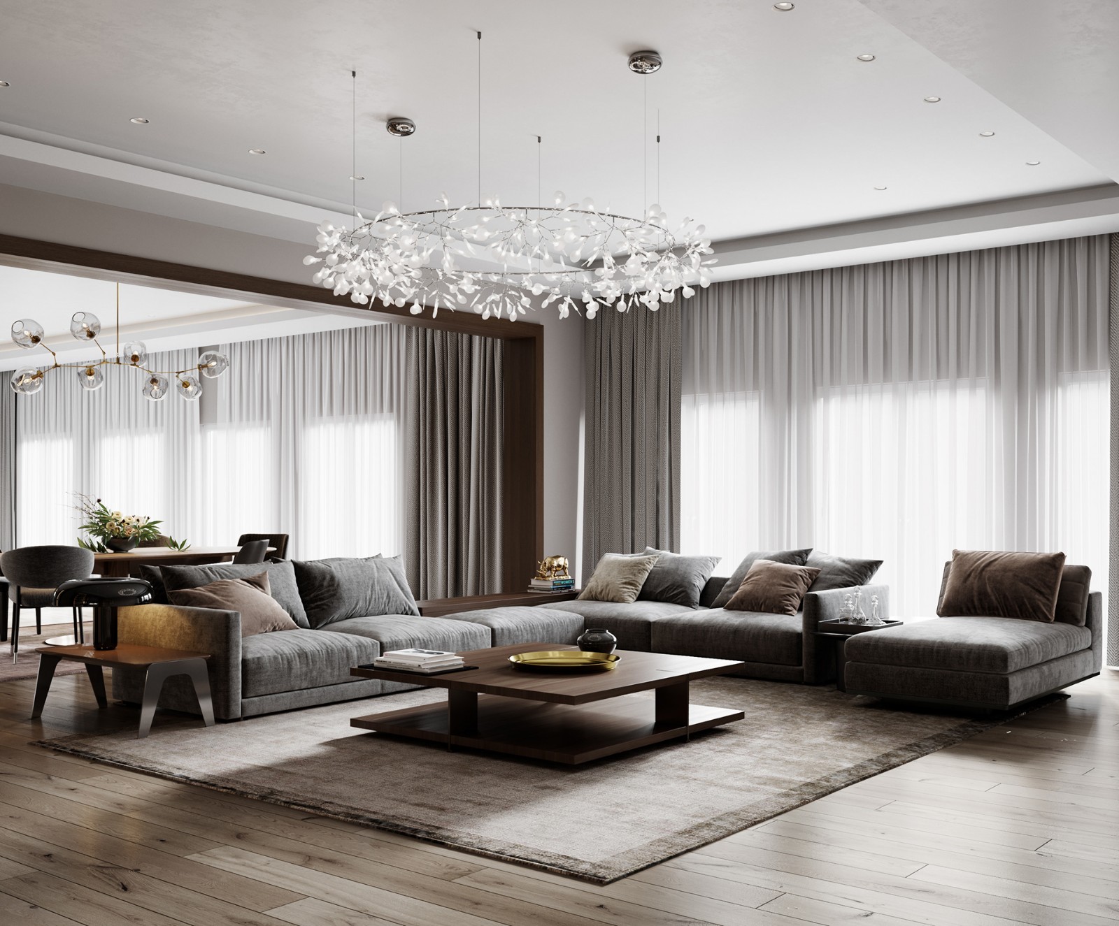
Tyche Apartment CaSA + Margherita Serboli
2015-08-11 03:00
架构师提供的文本描述。这套房产占用了巴塞罗那埃克斯洛区的一栋艺术新楼,卡萨和马尔盖丽塔·塞尔博利(Margherita Serboli)对其进行了全面翻修,使其成为一个意大利家庭的度假公寓。
原来的布局浪费了相当大的空间,定位也很差。它的纵向分布,在横向承重墙的强迫下,形成了许多密集分隔的小空间,保留在一条长走廊上,将公寓的两端隔开。
Text description provided by the architects. The property occupies an art nouveau building of the Eixample district of Barcelona and was fully renovated by CaSA and Margherita Serboli to become the holiday apartment for an Italian family.
The original layout wasted considerable space and was poorly orientated. Its longitudinal distribution, forced by the transversal bearing walls, resulted in many densely separated small spaces, spared along a long corridor that isolated the two ends of the apartment.
该项目是卡萨与建筑师马尔盖丽塔·塞尔博利(Margherita Serboli)合作的结果。客户简介“
ʼ”使用了一条指导方针:他们希望拥有三间双人间卧室和一套房子,通过使用现代语言的设计,突出和强调20世纪初对这栋建筑的详细设计。
The project is the result of a collaboration between CaSA and Architect Margherita Serboli.
The clientʼs brief was used a guideline: their wish was to have three double bedrooms and a home that would highlight and underline the early 1900 detailing of the building, through a design that using a contemporary language.
自然光-通常是一个基本的工程主题-让建筑师们对现有的空间布局进行了彻底的改造。以前压缩裂缝布局的三面承重墙
,已经转化为横轴,围绕着这些轴线,空间被组织成不同的区域。
The natural light – as usual a fundamental project theme – brought the architects to the complete renovation of the existing arrangement of spaces.
The three bearing walls that previously compressed the fractured layout have been transformed into transversal axes around which the space is organized into different areas.
第一个轴对应于大厅,它在宽敞的居住空间和现在占据了以前的卧室的开放式厨房之间安排了连续的空间。一个最宽的白天地区已经创造了打开部分老走廊的厨房-客厅,并通过这样做,让光线洪流,通过密集的树梢模式。
The first of these axes corresponds to the hall, and it organizes the continuous space between the wide living space and the open kitchen that now occupies the area that was previously a bedroom. A widest day area has been created by opening part of the old corridor to the kitchen-living area, and by doing so allowing the light to flood in, through the dense pattern of treetops.
代表这两个小卧室的木块长在第二把斧头周围。这间淡粉色的房间把白天的面积和物业内部的部分隔开,成为了套房。
这间主卧室以前被厨房和一间工作室占据,形成了一个近20平方米的开放空间,其中包括一层楼高的变化而隔开的浴室。这一解决方案允许充分利用来自伟大的原始窗框的光线,它占据了几乎所有面向内部庭院的墙。
The block that embodies the two minor bedrooms grows around the second axe. This light pink coloured volume separates the day area from the area ad the inner end of the property, which became the suite.
This master bedroom, previously occupied by kitchen and a studio, forms an open space of almost 20sqm, which includes the bathroom that is separated by a change of floor level. This solution allows making the most of the light coming from the great original window frame that occupies almost all the wall facing the inner courtyard.
客户端ʼ检索艺术新秀精华的意愿导致了该项目恢复了原有的功能,同时添加了新的组件,这些组件可以在不背叛自己同时代的情况下支持相同的语言。为此目的,一些原始的功能已经被拯救,比如原来的窗户木制品,或加泰罗尼亚拱顶,以前隐藏在一个虚假的天花板后面,现在暴露了他们原来的陶土完成,典型的建筑ʼ的时期
。
The clientʼs will to retrieve the art nouveau essence has led the project to the restoration of original features while adding new components that could sustain the same language without betraying his own contemporaneity. For this purpose some of the original features have been rescued, like the original windows woodwork, or the Catalan vaults, previously hidden behind a false ceiling that now expose their original terracotta finish, typical of the buildingʼs period
.
水压瓦代表了这种20世纪初住宅的典型元素,客户ʼ希望在这个项目中重新引入它们。建筑师已经明确设计了一个液压瓦,使用当前的格式作为六角形和当代的颜色。
The hydraulic tile represents a typical element of this kind of early twentieth century dwelling; It was the customerʼs wish to reintroduce them in this project. The architects have expressly designed a hydraulic tile, using a current format as the hexagonal and contemporary colors.
材料和颜色的调色板创造了一种ʼ总是不同的对话,标出了定义该项目的两卷内容,一个是粉红色的油漆,另一个是涂着木头的。
。
The palette of materials and colors creates a dialogue thatʼs always different, punctuated by the two volumes that define the project, one in pink paint, the other clad in wood.
至于家具项目,顾客们要求购买与新鲜调色板相一致的产品,以重申酒店的假日假期。他们选择了
白色金属元素和粉彩颜色,以及一些灰色物体,以强调更多的颜色,并赋予环境更多的生命力。
As for the furniture project, customers have asked for pieces that would be a consistent with the fresh colour palette, to reaffirm the holiday vocation of the property.
White metal elements and pastel colours were picked, along with a few grey objects, to emphasize even more colours and give life to the environment.
公寓里发现了一面古老的斜面镜子,还有一套老式的收音机录音机家具,把人类“活在”的触觉添加到了非常现代的家具上,在温暖的气氛中溶解了它。皮耶罗·塞尔博利(Piero Serboli)的
大型画作主宰了居住空间和套房,提供了一种地中海色彩的形象。
An antique bevelled mirror found in the apartment and an old radio record-player furniture add the human "lived-in" touch to the very contemporary furniture, dissolving it in a warmer atmosphere.
Large paintings by Piero Serboli dominate the living space and the suite, offering a Mediterranean and colourful imagery.
 举报
举报
别默默的看了,快登录帮我评论一下吧!:)
注册
登录
更多评论
相关文章
-

描边风设计中,最容易犯的8种问题分析
2018年走过了四分之一,LOGO设计趋势也清晰了LOGO设计
-

描边风设计中,最容易犯的8种问题分析
2018年走过了四分之一,LOGO设计趋势也清晰了LOGO设计
-

描边风设计中,最容易犯的8种问题分析
2018年走过了四分之一,LOGO设计趋势也清晰了LOGO设计
.jpg)


.jpg)


.jpg)

.jpg)


.jpg)


.jpg)


 PintereAI


