Jonathan Tuckey Design Create Residential Interiors for Post
2015-09-21 04:00
Sketchbook foldout. Image © Jonathan Tuckey Design
为了展示我们的工作,我们已经制作了手绘草图和工作模型,由我们的设计团队在我们的工作室。没有什么东西是通常与开发人员项目相关的商业和巧妙的演示方式的味道。阿金特对这种也许更传统的展示和审查他们建筑的设计过程的方法很感兴趣。如此之多,让潜在买家来到我们的工作室,去看草图和模特,了解这些未来的房子是如何形成的。这种经历也让我们认真思考了展示材料在这个行业中所扮演的角色。建筑师在展示他们的作品的方式上变得过于公司化,这也许是为了吸引客户的错误努力。
To present our work we have produced hand-drawn sketches and working models made by the design team at our studio. There is nothing that smacks of the commercial and slick presentation that is usually associated with developer projects. Argent have warmed to this perhaps more traditional approach to showing and reviewing the design process on their building. So much so that prospective buyers are coming to our studio to see the sketches and models and get a feel for how these future homes are taking shape. The experience has also made us think hard on the role that presentation materials play in the profession. Architects have become too corporate in the way they show their work perhaps in a misguided effort to appeal to clients.
Plan sketch. Image © Jonathan Tuckey Design
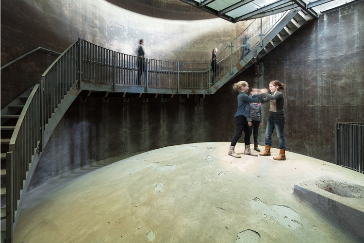
这些公寓回应了“维多利亚时代铁框架和高科技现代主义的新一层融合”。设计师们认为,他们的角色“是创造出一种计划,让人感觉像是威尔金森·艾尔建筑师(Wilkinson Eyre Architect)塑造的复杂几何图形的延续,创造出与他们所建立的弧度和弧线相一致的空间。”公寓的平面图从戏剧性的室内中庭扩大,在储气罐的中心,向外延伸到外部立面,形成非常特殊的楔形形式。
The apartments respond to "the fusion of Victorian iron frames and a new layer of high-tech modernism." The designers felt that their role "was to generate plans that felt like a continuation of the intricate geometry shaped by Wilkinson Eyre Architects, creating spaces that adhered to the radii and arcs that they had established." The floor plans of the apartments expand from the dramatic interior atria, at the centres of the gasholders, outwards to the external façades creating very particular wedge-shaped forms.
Interior/Exterior sketch. Image © Jonathan Tuckey Design
地板到天花板的玻璃窗和半反光的倒树脂地板的结合显着地增加了公寓内的高度感。浇筑的地板也有助于平静楔形的地面平面图,避免内部与建筑物独特的几何形状之间的尴尬碰撞。我们使用染色橡木板来划定起居空间和卧室区域之间的界限。在开放式居住区域内,我们开发了一个厨房设计,发挥了建筑的机械特性;我们为这些单元选择了一种彩色工程板,并使用了不同的刷过的不锈钢和黄铜。我们在天花板上使用镜面板和平面板灯配件来夸大厨房的雕塑形式。为了在主卧室里有一种温暖的感觉,我们在这些空间里铺满了高毡墙板。这些都是与黄铜,连接他们与机械化穿孔金属百叶窗,遮住每套公寓,这也包括黄铜细节,揭示当他们打开和关闭,从内部控制的居民。与此形成鲜明对比的是,浴室内衬了定制的混凝土瓷砖和面板,并配有匹配的混凝土洗脸盆。这些内饰的坚固性得到了与厨房相似的细节的补充,它们使用了冲光板、镜子和黄铜口音;这些元素在视觉上相互作用,增加了这些房间的规模感。
The combination of floor-to-ceiling glazed windows and semi-reflective poured resin floors adds significantly to the sense of height within the apartments. The poured floors also help to calm the wedge-shaped floor plans, avoiding awkward collisions between the interiors and the building's distinct geometry. We have used stained oak timber panels to delineate the thresholds between the living spaces and the bedroom areas. Within the open-plan living areas we developed a kitchen design that plays on the mechanical character of the building; we selected a type of through-coloured engineered board for the units and applied varying finishes of brushed stainless steel and brass. We used mirrored panels and flush, flat-panel light fittings in the ceilings to exaggerate the sculptural form of the kitchens. For a warmer feel inside the master bedrooms, we lined these spaces with full height felt wall panels. These are edged with brass, connecting them with the mechanized perforated metal shutters that shade each apartment which also feature brass details, revealed as they open and close, controlled from within by the resident. The bathrooms by contrast are lined in bespoke concrete tiles and panels and feature matching concrete washbasins. The solidity of these interiors is complimented by details similar to those found in the kitchens with their use of flush light panels, mirror and brass accents; these elements interact visually to increase the sense of scale in these rooms.
Interior sketch. Image © Jonathan Tuckey Design
根据设计师们的说法,这些空间材料调色板的灵感大部分来自“我们在设计概念上与开发人员Argent一起回顾过的许多先例”。其中包括:Carlo Mollino[1967]的Teatro Regio di Torino;Arturo CarMassi的Casa Torre,Via Toselli,Pisa[1250/1980];Ricardo Bofill的水泥厂St Just Des文[1900/1970年代];土库曼斯坦Yoloten的水力发电站[1911]。
According to the designers, much of inspiration for the spaces' material palette come from "the many precedents we reviewed with developer Argent when working on the design concepts." These include: Teatro Regio di Torino by Carlo Mollino [1967]; Casa Torre, via Toselli, Pisa [1250/1980] by Arturo Carmassi; the Cement factory, St Just Desvern, by Ricardo Bofill [1900/1970s]; and the Hydro-electric Power station at Yoloten, Turkmenistan [1911].
Diagram sketch. Image © Jonathan Tuckey Design
建筑师Jonathan Tuckey Design Location Kings Cross,London N1,联合王国类别公寓室内设计师,负责Jonathan Tuckey设计团队Peter You涡,Matthew Fretr,Catarina Cristovinho,Belen Salgado,Glen Tomlin,Katrin S lter助手Ioannis Devaris,Laurence Hiller,Rohullah Kazemi,Ben Stewart-Smith,Helen Galletti,Aneta Szymczyk-Michalski项目年
Architects Jonathan Tuckey Design Location Kings Cross, London N1, United Kingdom Category Apartment Interiors Architect in Charge Jonathan Tuckey Design Team Peter Youthed, Matthew Farrer, Catarina Cristovinho, Belen Salgado, Glen Tomlin, Katrin Sölter Assistants Ioannis Devaris, Laurence Hiller, Rohullah Kazemi, Ben Stewart-Smith, Helen Galletti, Aneta Szymczyk-Michalski Project Year 2015
The project is slated for completion in 2017.
 举报
举报
别默默的看了,快登录帮我评论一下吧!:)
注册
登录
更多评论
相关文章
-

描边风设计中,最容易犯的8种问题分析
2018年走过了四分之一,LOGO设计趋势也清晰了LOGO设计
-

描边风设计中,最容易犯的8种问题分析
2018年走过了四分之一,LOGO设计趋势也清晰了LOGO设计
-

描边风设计中,最容易犯的8种问题分析
2018年走过了四分之一,LOGO设计趋势也清晰了LOGO设计


 PintereAI


