Block Village HAO Design
2015-12-08 22:00
架构师提供的文本描述。当你走进12平(39.6平方米)的房子时,你可以清晰地感受到阳台上透出的光线,简单地点亮空间功能。客厅和餐厅在前面的右侧将是未来大部分家庭记忆的空间。因此,设计师决定让灯光在餐厅里肆无忌惮地闪耀,展示了家庭如何想象自己未来的家-以及松木的质朴的纹理,和谐的绿色,以及简单而快乐的白色墙壁的氛围。
Text description provided by the architects. While stepping into the 12 ping (39.6 square meters)’s house, you can feel the light revealing from the balcony clearly and simply light up the spatial functions. The living room and the dining room in the front right side will be the space to carry most of the family memory in the future. Thus, the designer decides to make the light shine unbridledly along the dining room, bringing out how the family imagine their future home – along with the simple and plain texture of pinewood, the harmonious green color, and the simple but happy atmosphere of white painted-wall.
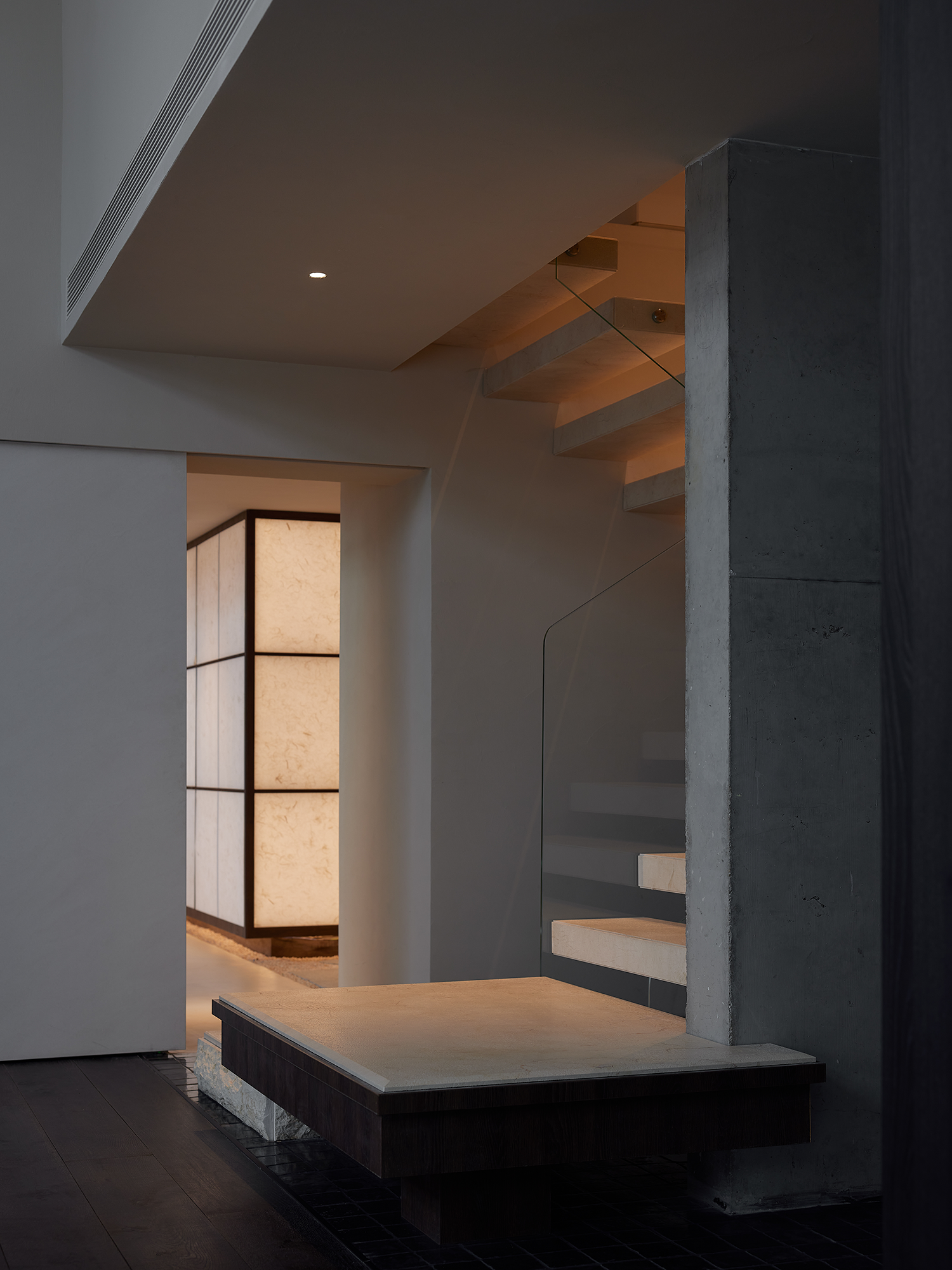
通常,地板空间的设计是为了满足基本的空间需求(3间卧室、1间餐厅和1间客厅)和存储需求。然而,在这种情况下,设计师更注重创造视觉的乐趣,而居民在房子里散步。主循环楼梯与走道结合成一座空气桥,连接主卧室(2.5平)和步入式壁橱(1.5平),能够相对接近空间功能。
Usually, the floor space is designed to meet basic space requirements (3 bedrooms, 1 dining room and 1 living room) and the storage demand. However, in this case, the designer pays more attention to create the pleasure of visual sense while dwellers walking in the house. The main circulation – stairs combine with the aisle turning into an air bridge, connecting the master bedroom (2.5 ping) and the walk-in closet (1.5 ping), which are capable of relatively closer spatial functions.
在保持主人房间隐私的同时,设计师仍然把光线和阴影留在里面,让步入式壁橱中的角落窗户预示着客厅和餐厅最重要的景色。通过设计师的安排,华盛顿的家庭活动室设在主室下面,卫生设备就在步入式壁橱下面。上下空间的两种空间功能相互补充,设计师将楼梯下的空间转化为另一条通道,并通过在空中桥梁上方和通道下方的中庭壁创建书架,不仅扩大了空间尺度,消除了压力感,而且还创造了视觉轴的延伸。
While keeping privacy for the master room, the designer still leaves the light and shadow in it, and makes the corner window in the walk-in closet foreshadow the most important view of the living room and the dining room. Through designer’s arrangement, Washitsu room for family activity is contained under the master room, and the sanitary equipment is right under the walk-in closet. The two spatial functions of up and down space compliment each other, further, the designer transforms the space under the stairs into another aisle, and by creating bookshelves along the atrium wall of the air bridge above and the aisle below, not only extending the spatial scale to eliminate the sense of pressure, but also creating the extension of visual axis.
从建筑的外层,设计师用窗户来描绘场景,而用真实的和想象的门形从内层创建框架。此外,高度是一个在设计中充分应用的元素,例如,客厅中的电视机可以灵活地沿着滑轨拧开,并且能够放置在墙上,保持水平到餐桌上。该设计取代了传统的单功能电视墙.此外,墙上的储藏柜设有隐藏的把手,以保持客厅和餐厅宽敞整洁。每个房间似乎都是独立的,但实际上是紧密相连的。
From outer layer of the architecture, the designer uses the windows to frame the scene, but using real and imaginary door shape to create the frame from the inner layer. Also, the height is an element that is sufficiently applied in designing, for example, the television in the living room is flexible to screw-off along the slide rail, and is able to stow into the wall, keeping horizontal to the dining table. The design replaces the traditional single-function television wall. Besides, the storage cabinet on the wall is equipped with hidden handles to keep the living room and dining room commodious and neat. Each room seems independent but actually closely connected.
一致的绿色调产生了空间对话-纹身的抹茶绿与主人室墙壁的绿色混合,而黑板的深绿色则与储藏柜底部的绿色相一致。时间也是设计场景的另一个要素。它不断变化,被重新安排和重新定义,以塑造家庭生活中最纯净的面貌。
The consistent green-tone gives rise to the spatial dialogue – matcha-green of the tatami is blended with the green color of the wall in the master room, while the dark green color of blackboard consistent with the green color of the storage cabinet bottom. Time is also another element when framing the scene. It’s constantly changing, being rearranged and redefined to shape the purest look of the family’s life.
 举报
举报
别默默的看了,快登录帮我评论一下吧!:)
注册
登录
更多评论
相关文章
-

描边风设计中,最容易犯的8种问题分析
2018年走过了四分之一,LOGO设计趋势也清晰了LOGO设计
-

描边风设计中,最容易犯的8种问题分析
2018年走过了四分之一,LOGO设计趋势也清晰了LOGO设计
-

描边风设计中,最容易犯的8种问题分析
2018年走过了四分之一,LOGO设计趋势也清晰了LOGO设计


 PintereAI


