Oiz House Hiroshi Kikuchi Architects
2016-01-08 22:00
Courtesy of Hiroshi Kikuchi Architects
由菊池广志建筑师提供


架构师提供的文本描述。这是一座小房子,就在火车站旁边。我们选择了一种粗糙的棕色灰泥作为外部装饰。它指的是钢轨锈蚀的颜色。凹面是由周围环境的观察效果决定的。当你在工地上走动时,这座建筑会给你带来几个不同的视角。仔细地确定了窗户的大小,并安装了隔音玻璃。我们只是在每一层的每个房间,以最大化的内部空间。
Text description provided by the architects. This is a small family house standing next to the railway yard. We chose a rough brown plaster for exterior finish. which refer to the rail rust color. The recessed facade was determined by view effects from surroundings. When you walk around the site, this building will give you several differential perspectives. The size of the windows was determined carefully and sound proof glass has been installed. We simply made each room at each floor for maximize the interior space.


我们把楼梯放在西侧的凹面。折叠楼梯是这座建筑最具特色的空间。这个折叠的楼梯帮助连接每个空间与顺序经验。
We located the stair case at recessed facade on west side. The folded stair is the most characteristic space in this building. This folded stair helps to connect each space with sequential experience.
Courtesy of Hiroshi Kikuchi Architects
由菊池广志建筑师提供


为了连接每个空间,我们选择了两个规则。1.我们用不同的方向制作了每扇窗户。这将反映超光速条件进入空间。我们尽量避免所有房间朝同一个方向。
In order to connect each space we chose two rules. 1. we made each window in different direction. This will reflects the surronding light condition into the space. We tried to avoid all rooms are facing to the same direction.
Courtesy of Hiroshi Kikuchi Architects
由菊池广志建筑师提供


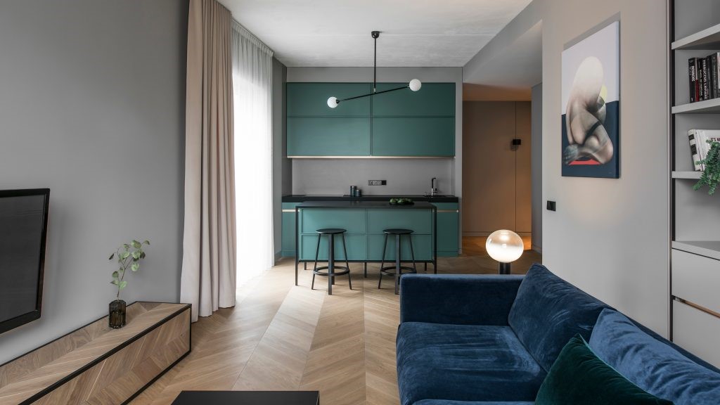
2.我们在墙上涂了颜色。每个方向都有不同的光谱。具体来说,北光和东光对蓝色的比重更大,西光和南光的光谱更红。我们用这个规则来决定每种颜色。一楼墙壁采用浅绿色,二楼墙壁采用天蓝色。两者都面向北面和东面。我们还在二楼和三楼涂上了红色和深橙色,面向南和西。尤其是在二楼,当红色和天蓝色直接发生冲突时,这将给人一种特殊的体验。为了调整蓝色颜色的衰退,我们在邻居的墙上稍微加上了灰色。几乎看不见,但它是有效的。
2. we applied colors on walls. Each direction has different light spectrum. Concretely saying, north and east light has more weight on blue color and west and south light has more red in spectrum. We used this rule for determining each color. We applied light-green on 1st floor wall and sky blue on 2nd floor wall. Both are facing on the north and the east. We also applied red and dark orange on 2nd floor and 3rd floor, facing on the south and the west. Especially, in 2nd floor when red and sky blue conflict directly in sight, this will give a special experience. In order to adjust the recession of blue color we slightly applied gray color on neighbor's wall. Hardly see but it is effective.
Courtesy of Hiroshi Kikuchi Architects
由菊池广志建筑师提供


Architects Hiroshi Kikuchi Architects
Location Nerima, Japan
Category Houses
Area 78.0 sqm
Project Year 2009

 PintereAI


