De Resident cepezed architects + HofmanDujardin
2016-02-22 03:00
© Leon van Woerkom | cepezed
C.Leon van Woerkom\x{e76f}
Text description provided by the architects. radical refurbishment de resident
荷兰政府驻海牙办事处大楼最近进行了彻底翻修。现代化是由天花板化建筑师(中庭和设计协调)、HofmanDujardin(室内)和工程公司AnteaGroup(稳定性、MEP、消防安全、声学和可持续性)合作设计的。
The Dutch government office block De Resident in The Hague has recently undergone a radical refurbishment. The modernizing has been designed by a collaboration between cepezed architects (atrium and design coordination), HofmanDujardin (interior) and engineering firm the Antea Group (stability, MEP, fire safety, acoustics and sustainability).
flexible central government
中央政府正在缩小规模。也正因为如此,它越来越多地指向灵活的工作(地点)概念。此外,根据总体社会发展情况,会议和互动等主题日益重要。居民现代化既是国家收缩的一部分,也是对新工作方式的关注。这个建筑群就在海牙中央车站的旁边。它由希利康和卡斯塔利亚建筑组成,分别有14层和20层,总建筑面积为55.000平方米。卡斯塔利亚是20世纪60年代末美国建筑师迈克尔·格雷夫斯(MichaelGraves)在20世纪90年代修订的一座建筑,目的是为卫生、福利和体育部(DepartmentofHealth,福利和体育部)提供住房。Hel图标现在是社会事务和就业部的所在地,最初由Soeters van Eldonk机构设计,在设计过程中进行了密集的协商。
The central government is slimming down in size. Also because of this, it is more and more directed towards flexible work (place) concepts. Additionally and in accordance with overall social developments, themes such as meeting and interaction are increasingly important. The modernizing of De Resident is part of both the state shrinkage and the focus on new ways of working. The complex is situated right next to The Hague’s Central Station. It consists of the buildings Helicon and Castalia, respectively counting fourteen and twenty floors with an overall gross floor area of 55.000 m2. Castalia is a late 1960’s building block that American Architect Michael Graves revised in the 1990’s in order to house the Ministry of Health, Welfare and Sport, which returned to the building after its newest redo. Helicon now houses the Ministry of Social Affairs and Employment and was originally designed by the Soeters van Eldonk agency, that was intensively consulted during the design process.
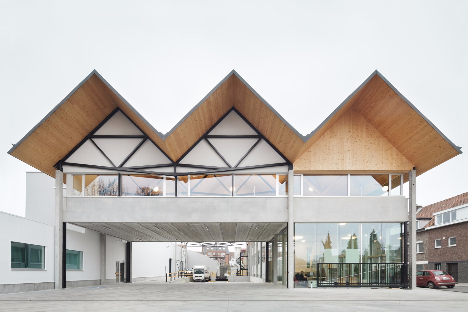
赫利康和卡斯塔利亚之间的帕纳索斯广场以前作为一个相互的户外活动,有一种黑暗的,有限的气氛。天花板化把它变成了两个部门的一个明亮的、半公开的入口。连接建筑有70多米长,高20米。IF提供完整的自主体验,对现有结构的影响最小。它由大型的钢门体组成,上面有一个玻璃屋顶。该复合入口位于3,60米的网格内,深度不少于1米,穿着白色,铺有拉伸的织物和钢板。因此,他们作为中立的侧翼,构成一个完全独立的建筑部分,当看到纵向视线。然而,在一条横跨街角的视线中,它们提供了一个很好的视角,可以看到原来的Hel图标和Castalia。中庭的两端有透明的立面,前面有五米高的旋转门。这些带有中央政府标志的签名元素被用来在夜间关闭入口区域。除其他功能外,中庭还设有一家公共咖啡馆和一座长达近40米、宽5米的大型“家具建筑”,这些设施组织了流向这两座建筑的流通流以及安保分区。它有一个复合包钢结构,并包括一个玻璃搬运工的小屋和电梯。屋顶铺满了木头,支撑着三棵大树。
The Parnassus square between Helicon and Castalia formerly functioned as a mutual outdoors with a darkish, limited atmosphere. cepezed transformed it into a light, semi-public entrance atrium for both departments. The connecting construction is over seventy metres long and has a height of twenty meters. If offers a complete autonomous experience with minimal impact on the existing structures. It is composed of large steel portals with a glass roof on top of these. The compound portals are positioned in a grid of 3,60 metres, have a depth of no less than a metre and are clad in white with stretched fabric and steel sheeting. Thus, they function as neutral side wings that constitute a fully independent building section when perceived in a longitudinal sight line. In a corner-spanning sight line however, they provide a good view over the original Helicon and Castalia. The ends of the atrium have transparent façades, in front of which five metre high pivoting doors have been positioned. These carry signing elements with the logo of the central government and are used to shut the entrance zone off during night time. Among other functions, the atrium houses a public café and a large ‘furniture construction’ of almost 40 metres long and five metres wide which organizes the circulation streams to the two buildings as well as the security zoning. It has a composite-clad steel construction and includes a glass porter’s lodge and lift. The roof is clad with wood and supports three large trees.
© Leon van Woerkom | cepezed
C.Leon van Woerkom\x{e76f}
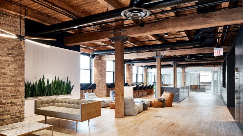
内部重新安排提供了各种各样的工作设置。较低级别的办公大楼设有较一般的功能,如会议场所和会议室、短期办公场所、教育中心、图书馆、咖啡馆和餐厅,中央政府所有工作人员以及其他部门的工作人员都可以使用这些功能。这些共用功能之上的楼层已由蜂窝式办公室转变为更开放的工作环境,有宽敞的工作区和特别的功能,例如浓缩室及会议室和谘询室。而且,每一层楼都有自己的起居室。
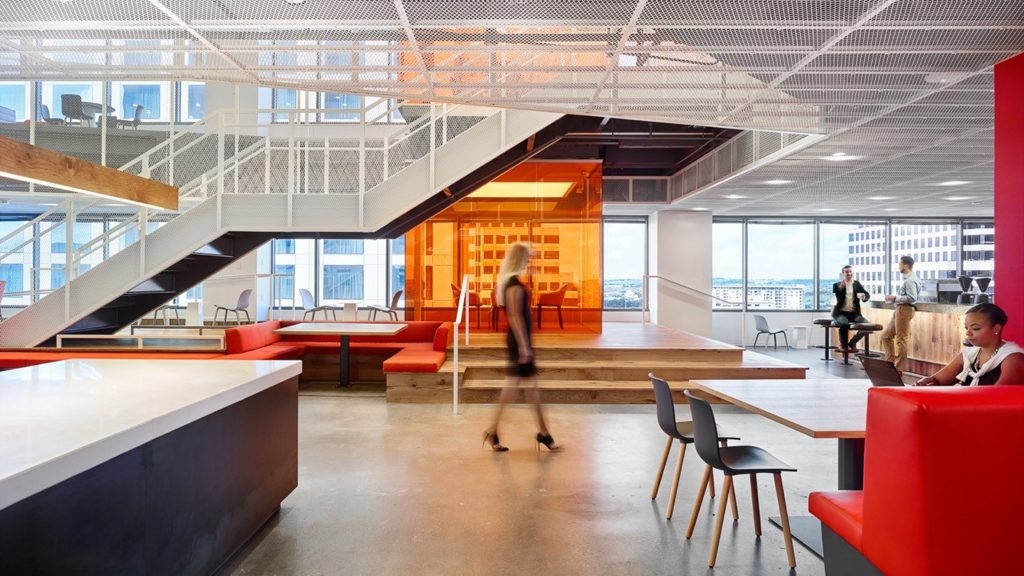
The interior rearrangement offers a wide variety of work settings. The lower levels of the office blocks house the more general functions such as meeting places and meeting rooms, short-stay work places, an education centre, library, café and restaurant, which can be used by all staff members of the central government, also from other departments. The floors above these shared functions have undergone a transformation from cellular offices to a more open work environment with spacious work areas and special functions here and there, such as concentration rooms and rooms for meeting and consulting. Also, every floor level has its own living room.
© Leon van Woerkom | cepezed
C.Leon van Woerkom\x{e76f}
在天花板设计的中庭被认为是一种最佳的中性附加物,霍夫曼·杜贾丁(HofmanDujardin)的室内设计完全符合现有建筑的后现代性质,Graves和Soeters van Eldonk都引用了荷兰建筑的历史。人们可以看到各种各样的引用著名的荷兰艺术家在德居民情结。例如,卡斯塔利亚天花板与柏林设计的海牙博物馆的特色天花板相呼应。这座建筑的地板唤起了人们对德胡格(DeHoogh)和维米尔(Vermeer)等大师已经粉刷过的地板的强烈回忆。将荷兰古典元素纳入德居民的原始设计,被用作装修室内设计的起点。HofmanDurjardin后来发展了扩大荷兰经典的概念。为此,该办公室挑选了各种各样的旧的和现代的荷兰杰作,扩大了这些作品,并将它们投影在不同楼层的平面图上。随后,根据这些预测完成了其中的大部分区域。这导致了不同的气氛,同样大胆和强大,深深植根于荷兰的遗产,而这不是显而易见的。绘画的选择也是根据部级部门的工作领域进行的。就社会事务和就业而言,主题与工作有关,而卫生、福利和体育方面的主题则与福祉有关,包括聚会或水果静物。
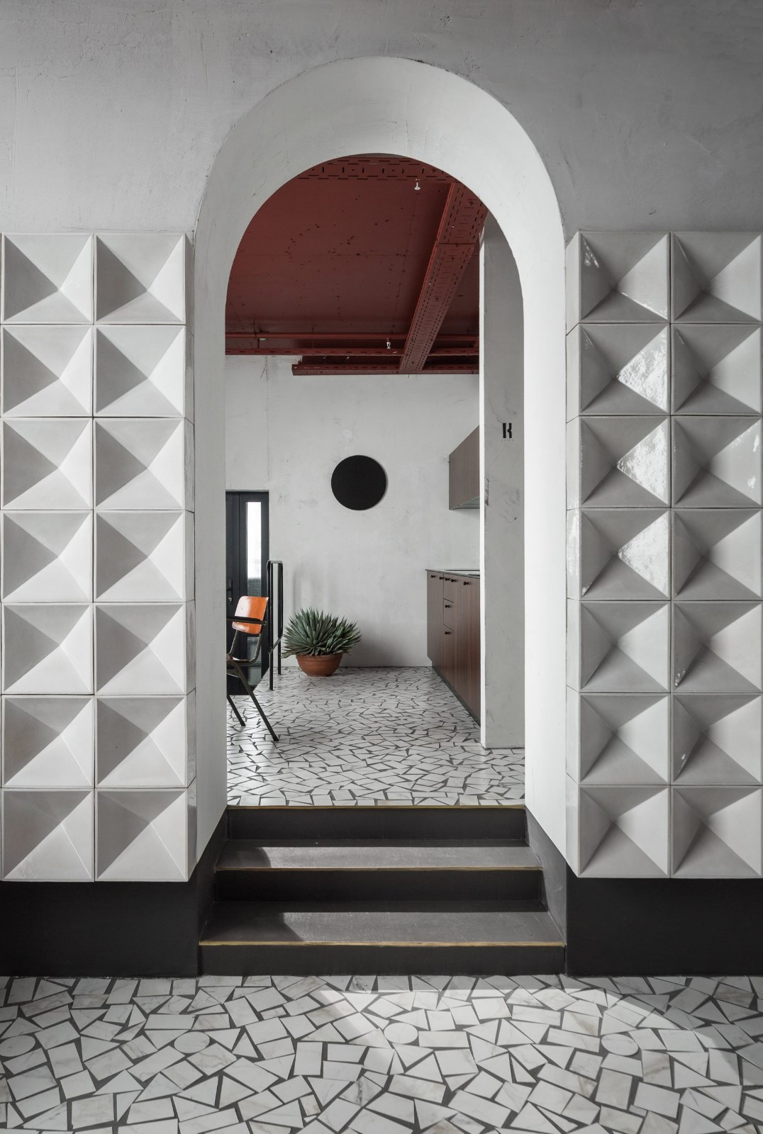
Where the cepezed-designed atrium has been conceived as an optimally neutral addition, the interior design by HofmanDujardin is fully in line with the postmodern nature of the existing buildings, for which both Graves and Soeters van Eldonk quoted liberally from the history of - often Dutch - architecture. One can discern a wide variety of references to famous Dutch artists within De Resident-complex. The Castalia-ceiling, for example, echoes the characteristic ceiling of the Berlage-designed Gemeentemuseum in The Hague. The floor of the building evokes a strong reminiscence of the floors already painted by masters such as De Hoogh and Vermeer. This incorporation of classic Dutch elements in the original design of De Resident has been used as the starting point for the interior design of the renovation. HofmanDurjardin subsequently developed the concept of enlarging Dutch classics. For this, the office selected a wide variety of both old and modern Dutch masterpieces, enlarged these and projected them on the floor plans of the different storeys. Subsequently, large areas of these have been finished based on these projections. This has resulted in a variegation of atmospheres equally bold and powerful and deeply rooted in Dutch heritage without this being obvious. The choice of paintings is also based on the work fields of the ministerial departments. For Social Affairs and Employment, themes are related to work for instance, while for Health, Welfare and Sport, subjects are related to well-being and cover for example parties or fruit still lifes.
© Leon van Woerkom | cepezed
C.Leon van Woerkom\x{e76f}
Architects cepezed architects, HofmanDujardin
Location Castalia, Parnassusplein 5, 2511 VX Den Haag, The Netherlands
Photographs Leon van Woerkom | cepezed, Matthijs van Rhoon
 举报
举报
别默默的看了,快登录帮我评论一下吧!:)
注册
登录
更多评论
相关文章
-

描边风设计中,最容易犯的8种问题分析
2018年走过了四分之一,LOGO设计趋势也清晰了LOGO设计
-

描边风设计中,最容易犯的8种问题分析
2018年走过了四分之一,LOGO设计趋势也清晰了LOGO设计
-

描边风设计中,最容易犯的8种问题分析
2018年走过了四分之一,LOGO设计趋势也清晰了LOGO设计


.jpg)


.jpg)

.jpg)


.jpg)

.jpg)


 PintereAI


