Monash North West Precinct Jackson Clements Burrows
2016-08-20 20:00
© Peter Clarke
(c)彼得·克拉克


架构师提供的文本描述。该项目涉及在莫纳什大学克莱顿校区重建三栋破旧的1980年代建筑。其目的是在这三栋大楼内建立新的非正式和吸引人的学习中心,并通过新建行人步道来澄清校园道路。
Text description provided by the architects. The project involved the redevelopment of three tired 1980s buildings at Monash University’s Clayton campus. The intention was to establish new informal and engaging learning hubs within the three buildings and to clarify campus wayfinding by creating new pedestrian ‘walks’.
© Peter Clarke
(c)彼得·克拉克


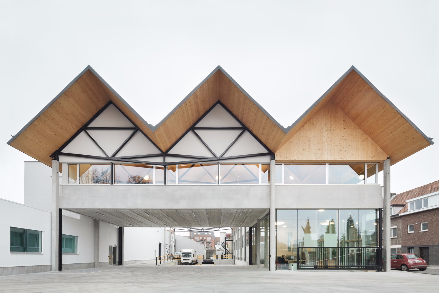
JCB的回应是通过正式的姿势来加强主要的校园交叉口,其中包括折叠和扭转混凝土遮篷、戏剧楼梯和座位平台。遮篷提供住所、入口身份和与学生领域的戏剧性的接触,从楼梯的角度考虑会众、观察和沉思的时刻。
JCB’s response was to reinforce the main campus intersection with a formal gesture incorporating folding and twisting concrete canopies, a theatrical stair and seating platforms. The canopies provide shelter, entrance identity and a dramatic engagement with the student realm, allowing for moments of congregation, observation and contemplation from the vantage of the stair.
1st Floor Plan
一楼图则


2nd Floor Plan
二层平面图


3rd Floor Plan
三楼图则


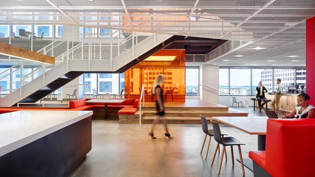
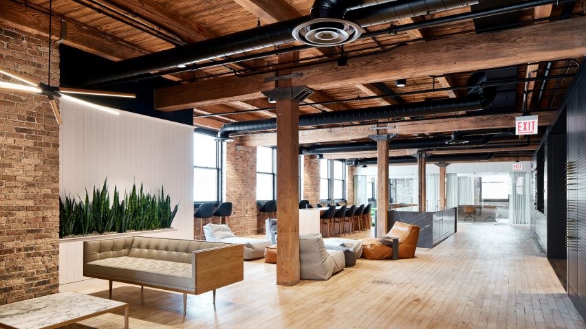
以主题内部和非正式家具为主题,使用免费的材料选择来将内部空间解除机构化。学生服务台呈雕塑形,消除了在这种设施内预期的传统线性计数器。
Themed interiors and informal furniture with complimentary material selections were used to de-institutionalise the interior spaces. The Student Services Desk is sculptural in form, eliminating the traditional linear counter anticipated within this type of facility.
© Peter Clarke
(c)彼得·克拉克


各种工作表都是为自主学习或协作活动而设计的。整个可写表面鼓励小组学习。整个建筑,视觉链接周围的景观和步行是最大化的。
A variety of work tables were designed for self-directed study or collaborative activities. Writable surfaces throughout encourage group learning. Throughout the building, visual links to the surrounding landscape and walks are maximized.
上层计划采用现有的中央走廊及周边办公室的布局,并将其内翻;开放式写字楼、会议室及附属空间已安排在通过图则中心的海湾内,而新的循环空间则沿北面及南面延伸,在外围形成突破空间及非正式座位区。
The upper floor schemes took the existing layout of a central corridor with perimeter offices and turned it inside out; open plan office areas, meeting rooms and ancillary spaces have been arranged in bays through the centre of the plan while the new circulation spaces run along the north and south facades, creating break-out spaces and informal seating areas along the perimeter.
© Peter Clarke
(c)彼得·克拉克


新的外墙是作为一个五颜六色的“部件套件”开发出来的,用于解决太阳能遮阳、建筑特性和透明度问题。采用软钢遮阳环和彩色鳍来活跃和加强建筑物现有的结构节奏,而整个分局的外部色彩方案则力求既反映又抽象周围的景观。
The new facades were developed as a colourful ‘kit of parts’ to address solar shading, building identity and transparency. Mild steel shading loops and coloured fins were used to enliven and reinforce the existing structural rhythms of the buildings while the external colour scheme across the precinct sought to both reflect and abstract the surrounding landscape.
© Peter Clarke
(c)彼得·克拉克


Architects Jackson Clements Burrows
Location College Cres, Keysborough VIC 3173, Australia
Category University
Area 3700.0 sqm
Project Year 2014
Photographs Peter Clarke
Manufacturers Loading...

 PintereAI


