A Warm Clinic RIGI Design
2016-08-28 02:00
在Rigi接手这个项目之前,业主已经有了一套完整的空间设计方案,但是他的计划并没有解决传统医疗空间中存在的问题。在Rigi被委托为这个项目做设计之后,与业主一起,Rigi推翻了原来的设计理念。里吉希望通过空间设计摆脱医疗空间带来的不适感,为整个空间营造一种不同的氛围。Rigi希望通过不同的设计见解来表达医学空间需要表现出信任和希望的想法。生活中应该有温暖、善意、开放、沟通和微笑。里吉希望所有这些都能在这个空间里展示出来。
Before RIGI took over this project, the owner had already got a complete set of space design plan, but his plan did not solve problems existing in traditional medical space. After RIGI is commissioned to do the design for this project, together with the owner, RIGI overthrows the original design concept. RIGI hopes to get rid of the sense of discomfort created by medical space through the space design, and to create a different atmosphere for the whole space. RIGI hopes to express the idea that medical space needs to show trust and hope through different design insights. There should be warmth, goodwill, openness, communication and smile in life. RIGI wishes that all of these could be shown within this space.
© BIAN Huan-Min
c.边欢民


架构师提供的文本描述。牙科诊所并不是一个快乐的地方,或者说,没有一家诊所能让人感到快乐:冷冰冰的登记台、令人担忧的等候椅和诊疗室令人不安的门;整个空间充满了医生和病人之间的不信任感。然而,从精神层面来说,临床应该是一个带来希望的地方,或者至少应该是一个温暖的空间。去看牙医可能不是一件令人愉快的事情,所以Rigi通过设计给这个空间带来了一些魔力,给它带来了温暖和关怀。
Text description provided by the architects. Dental clinic is not a happy place to go, or we should say, no clinic could make people feel happy: the cold registration desk, the worrisome waiting chairs and the disturbing doors of the clinic rooms; the whole space is filled with a sense of distrust between doctors and patients. However, from spiritual aspect, clinic should be a place which brings hope, or at least should be a warm space. It might not be a delightful thing to go to the dentist, so RIGI does some magic to this space through design, bringing it some kind of warmth and caring.
因为有温暖,生活应该更快乐。这是Rigi心脏的一个诊所,这是一个Rigi风格的生活终点站。
Because there’s warmth, life should have been happier. This is a clinic in RIGI’s heart and this is a RIGI-styled life terminal.
© BIAN Huan-Min
c.边欢民


这个牙科诊所的品牌标识和品牌IP形象是橙色的。因此,圆圈贯穿整个设计作为基本元素,木材材料和所选颜色的匹配提供了温暖的质感。该空间由四个区域组成:入口、儿童区、等候区和诊所。除了其基本功能外,每一个区域都有其相应的设计洞察力,这四个区域共同构成了这一牙科品牌的基因,将寒冷的医疗空间转变为一个与人相连、传递温暖和关爱的生命终端。
The brand logo and brand IP image of this dental clinic is orange. So circle penetrates the whole design as basic element, and wood material and the match of selected colors deliver a warm texture sensually. The space consists of four areas: entrance, kids area, waiting area and clinic. Besides its basic function, each of the areas has its corresponding design insight, and together, these four areas make up the genes of this dental brand and turn the cold medical space into a life terminal which connects to people and spreads warmth and caring.
© BIAN Huan-Min
c.边欢民


这个项目位于一个创意园区。从行为的角度来分析,看医生和去购物是不一样的。诊所几乎没有偶尔的客人;病人只有在了解了之后才会来。这个行业的特殊性决定了这个空间不需要用吸引人眼球的标志来吸引顾客,一个友好的门面可以缩小医疗空间和病人之间的距离。因此,Rigi采用了一种设计策略,通过在外墙上使用植物连接室外和室内空间,弱化室外空间和室内空间之间的界限,并简化了墙上标识的规模,以避免传递过多的商业氛围。外观通过圆圈延伸到室内空间,这是IP图像中的一种元素,有趣的材料被用来营造一种温暖的商业氛围。前台的设计也试图表现出一种轻松和平等的态度。从入口开始,人们可以看出这是一个友好的空间和一个温暖的诊所。
This project is located in a creative park. To analyze from the perspective of behavior, seeing a doctor is different from going shopping. There is almost no occasional guest for clinics; patients only choose to come after learning about it. The special nature of this industry determines that this space needs no use of eye-catching signs to attract customers, and a friendly façade could narrow the sense of distance between medical space and the patients. Thus, RIGI adopts a design strategy of weakening the boundary between outdoor and indoor space through using plants on the façade to connect the outdoor and indoor space, and simplifies the scale of the logo on the wall to avoid delivering excessive commercial atmosphere. The façade extends to the interior space through circle, an element from the IP image, and interesting materials are used to create a warm commercial atmosphere. The design of the front desk also tries to present an attitude of relaxed and equal. Starting from the entrance, people could tell this is a friendly space and a warm clinic.
© BIAN Huan-Min
c.边欢民


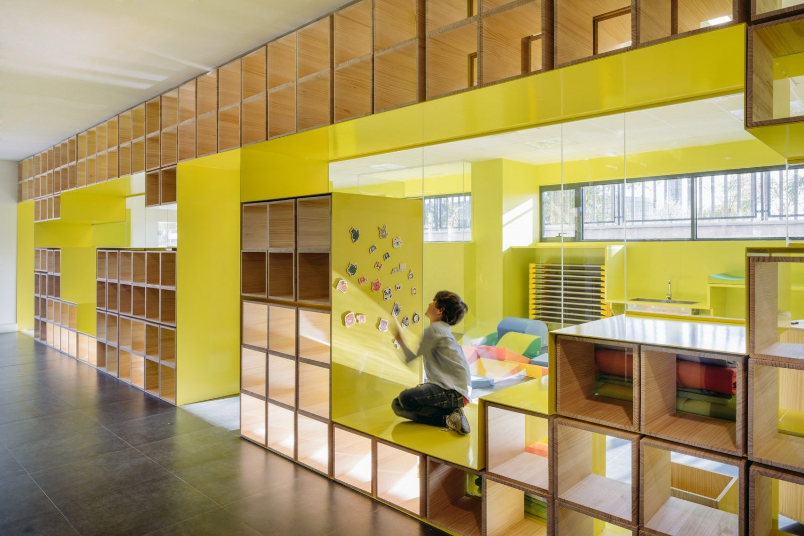
在空间内建立信任感是Rigi设计的重点之一。成人世界复杂而缺乏安全感,过分的关注反而会造成一种不友好的距离感,所以我们建议主人在入口处的重要位置建一个儿童区。照顾孩子就是照顾成年人;一个照顾孩子的诊所在某种程度上会表现出一种关心和责任感。空间并不是孤立存在的,人们在空间中行为的情感和需求是里吉一直试图探索的。设计理念不是自上而下的宣传,而是用户在终端中总能感知和理解的东西。这是这个时代设计的关键。
Building a sense of trust within the space is one of RIGI’s design focuses. The world of adults is complex and lack of security, excessive attentions may create an unfriendly sense of distance on the contrary, so we suggest the owner to build a kids area in the important place of the entrance. Caring for kids is caring for adults; a clinic which cares for kids would, to some degree, present a sense of caring and responsibility. Space does not exist in isolation, the emotions and need of roles of people’s behavior within the space are what RIGI is always trying to explore. Design idea is not top-down propaganda, but something that users could always perceive and understand in the terminal. That is the key to design in this age.
© BIAN Huan-Min
c.边欢民


传统医院的等候椅是以平行方式和顺序排列的。然而,正是这种秩序感增强了病人的不安。毕竟,等待你的是一次去看牙医的可怕经历;期待是没有什么好处的。所以我们让等候区的布局看起来像一张餐桌。在这里,人们可以面对面地坐着,可以彼此交流,也可以静静地等待。这样,这种等待过程是平等和随机的,在此期间,病人可以感受到空间的气质。候诊室左侧的橙色和透明区域是诊所的中央供应室。所有的医疗器械和纱布都将在这里集中消毒,从而通过这种透明和开放的方式来体现诊所的“透明”理念。所有这些设计使人们对诊所的哲学有了进一步的认识,而面向生活场景的设计则进一步表达了诊所的温暖和关怀的本质。它可能不是一个家,但里吉希望通过设计给人们带来一种家的感觉。毕竟,诊所是一个解决问题和创造希望的地方,就像一个家一样。
Waiting chairs in traditional hospitals are arranged in a parallel way and in orders. However, it is this sense of order that enhances the unease of patients. After all, what waiting for you is a terrible experience of seeing a dentist; it is anything but nothing good to be looking forward. So we make the layout of the waiting area looks like a dinner table. Here people can sit face to face; they could communicate with each other or wait quietly. In this way, this waiting process is equal and random during which patients could feel the temperament of the space. The orange and transparent area on the left side of the waiting area is the central supply room of the clinic. All medical devices and gauze will be centralized and sterilized here; thus the philosophy of “going transparent” of the clinic will be reflected through this transparent and open way. All these designs make people have a further perception of the clinic’s philosophy, while life scenario oriented design further expresses the clinic’s warm and caring nature. It might not be a home, but RIGI hopes to bring people a perception of home through design. After all, clinic is a place where problems will be solved and hopes be created, just like a home.
当人们看到诸如牙科植入体和放射科之类的门板的行,在某种程度上,会产生一种不舒服和焦虑感。Rigi取消所有徽标,并在进行设计时在走廊的玻璃上添加具有可读维的文本符号。在这种规模的诊所中不存在空间识别混乱的问题。Rigi还使用编号的符号来连接道路和部门。地板上的不同数字标记不同的功能空间。最大限度地消除看医生的不安和焦虑是Rigi设计的关键。
When people see the rows of doorplates such as dental implant department and radiology department, to some extent, a sense of discomfort and anxiety will grow. RIGI cancels all the logos and adds text signs with readable dimensions on the glass of corridors while doing the design. The issue of spatial recognition chaos does not exist in a clinic of this size. RIGI also uses signs of numbers to connect the corridor and departments. Different numbers on the floor mark different functional spaces. To eliminate in maximum the uneasy and anxiety of seeing a doctor is the key point of RIGI’s design.
© BIAN Huan-Min
c.边欢民


生命设计
Design for life
它是关于温暖的,也是关于关心的。这是给你和你的牙齿的礼物。
It is about warmth and might also about caring. This is a gift for you and your teeth from RIGI.


Architects RIGI Design
Location Tianjin, China
Category Clinic
Area 250.0 sqm
Project Year 2015
Photographs BIAN Huan-Min

 PintereAI


