Casa América Building Oficina Conceito Arquitetura
2016-09-16 15:00
© Rodolpho Reis
鲁道夫·里斯


架构师提供的文本描述。一条住宅大道,建在美国大道279号,安静而绿色,卡萨美国大厦位于阿雷格里港的一个混合用途的社区。
Text description provided by the architects. A residential avenue, built on lot 279 America Avenue, quiet and very green, the building Casa America is located in a mixed-used neighborhood in the city of Porto Alegre.
© Rodolpho Reis
鲁道夫·里斯


该计划主要是由于土地的非常小的尺寸,只有7米和70的正面30米的深度,导致建筑的结构跨越了两个边界,从而创造了两个大的盲山墙。由此造成的侧窗不足也使得每层两套公寓被一口明渠隔开,避免了在单一单元中没有自然照明和通风的大直线延伸。另一个要求条件造成的盲目山墙是延长整个长度的正面,使用大格式的框架和清晰的夹层玻璃栏杆。这个正面的振幅,超出了弥补山墙造成的赤字的范围,它的设计方式也允许从居民的角度更好地设计一个乔木区的框架,从而以这样一种洞察力的方式来寻找奢华,而不是在观赏性的展览中。
The program was largely developed due to the extremely small dimensions of the land, with only seven meters and seventy of frontage by thirty meters of depth, causing the structure of the building addorsed the two boundaries, and thus creating two large blind gables. The resulting lack of side windows also made two apartments delimited per floor, separated by a light well, avoiding large linear extensions without natural lighting and ventilation in a single unit. Another required condition resulting from the blind gables was to extend the full length of the facades, using frames in large format and railings in clear laminated glass. This frontal amplitude, beyond the scope to offset the deficit caused by the gables, It was also designed in a way that allows a better framework of the arboreal area from the resident’s perspective, thusly to find luxury in such a way of insight in nature, and not in ornamental exhibition.
© Rodolpho Reis
鲁道夫·里斯


© Rodolpho Reis
鲁道夫·里斯


卡萨美国是一座缩小规模的建筑,但它是人道的,无论是外部还是内部都充满了耸人听闻的感觉。该大厦有一个缩小的共管公寓面积,有六层,其中有停车位,它还附带一个屋顶公共区域在最后一层和六个住宅单位。它们被分为三种类型,面积在72到115平方米的私人区域和允许内部布局的不同可能性的植物,它只有一个浴室和内部建造一个厕所。这一选择的目的是让居民自由选择自己的公寓空间,无论是内部布局、卧室数量还是每个环境的尺寸,从而反映他们的生活方式。
Casa America is a scaled-down building, but humane, loaded with sensoriality both externally and internally. The building has a reduced condominial area, with six floors where there are parking spaces, it also comes with a rooftop common area on the last floor and six residential units. These are divided by three types of typologies, with areas ranging between 72 and 115 square meters of private area and plants that allow different possibilities of internal layouts, it comes with just a bathroom and a toilet built internally. This choice is aimed to give its residents freedom to choose their apartment space, whether its internal layout, the number of bedrooms, or the dimensions of each environment, thus reflecting their life styles.
© Rodolpho Reis
鲁道夫·里斯


这项计划的目的,是尊重大厦区在我们日常生活中的重要性,这些地区在建筑上经常被忽略,而这类地区是市区混乱与家居舒适之间的一个重要过渡地带。为此目的,我们创造了同样的感觉特性,从整个共管公寓区的正面开始,车库,进入公寓和植被茂盛的屋顶露台的自由流动,使用带有暖色的有机物质和艺术干预来创造充满活力和温暖的亲密关系。这种能量产生的目的不仅是为了让居民在家里有宾至如归的感觉,而且从你穿过车库的那一刻起也是如此。因此这座大楼的名字是:“美国之家”。
The project aims to respect the importance of the condominial areas on our daily routine, such areas often overlooked from the architectural point of view, and which comprises an important transition zone between the urban chaos and the coziness of our home. For this purpose we created the same sensorial identity starting from the facade throughout the condominial areas, garage, free movement access to the apartments and the vegetated rooftop terrace, using organic materiality with warm colors and artistic interventions to create energetic and warm intimacy. This energy created is intended not only to make the resident feel at home from only inside his home, but also from the moment you walk through the garage of the building. Hence the building's name: House America.
© Rodolpho Reis
鲁道夫·里斯


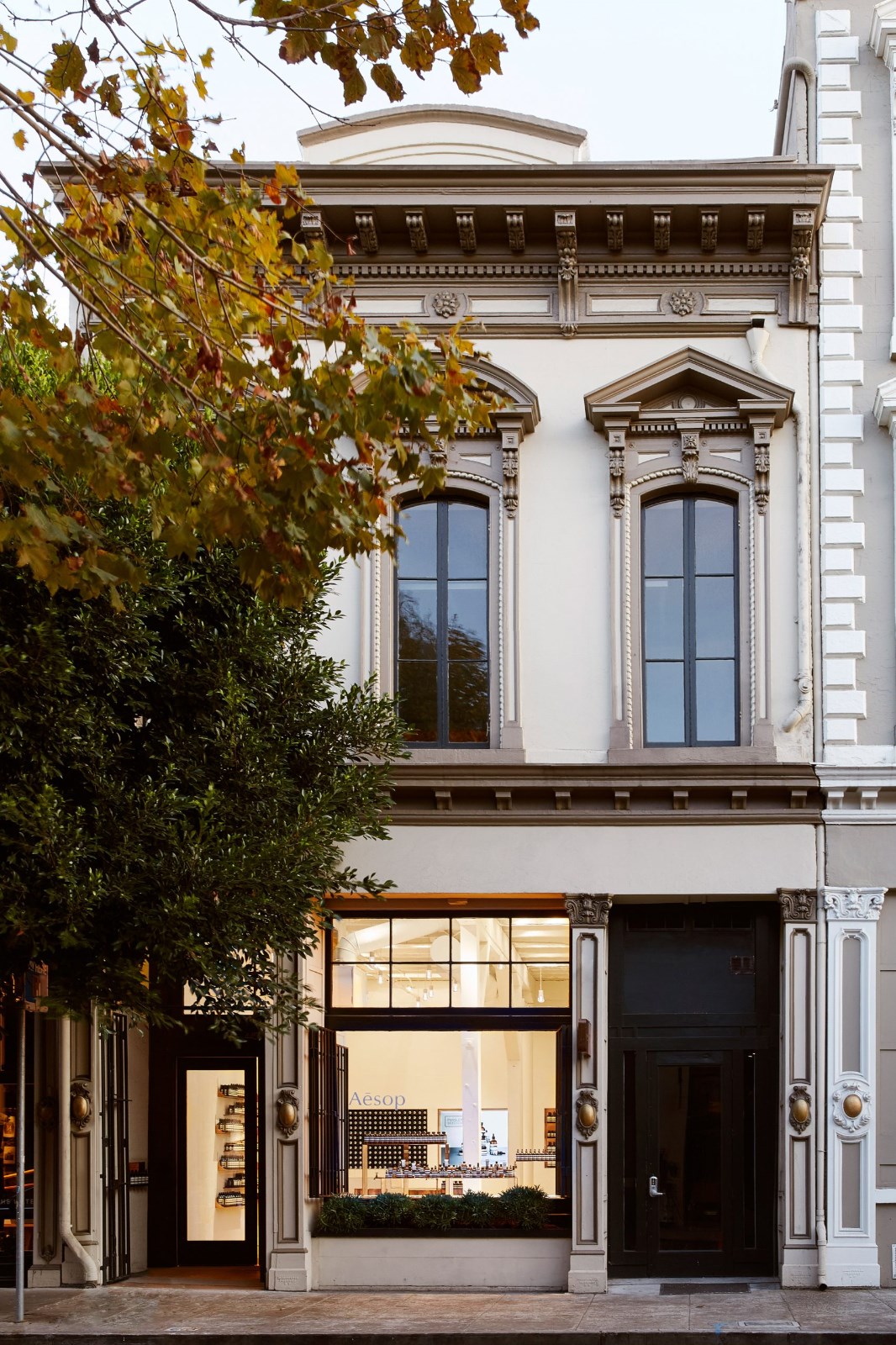
在外表上,用简单的线条和中性的形式,你可以找到物质性的对比,寻找一种从过去到现在以和谐的方式表现出来的审美语言。乡土粘土砖的存在,表达了创造一种氛围的想法,不仅是为了舒适,也是为了怀旧建筑的居民和它的地区,使我们回到建筑技术。作为砖块质感的对立面,体积的设计与黑瓷略有相抵,配以玻璃板的正面,探索和揭示每一种材质的审美差异,提供鲜明的纹理和反光对比。
On the facade, done with simple lines and neutral forms, you can find the contrast of the materiality, seeking for an aesthetic language that displays it in a harmonious way from the past to the present. The presence of rustic clay bricks expresses the idea of creating an atmosphere not only for comfort but also of nostalgia to the residents of the building and also it’s area, bringing us back to the construction techniques. As a counterpoint to the brick rusticity, a volume is designed slightly offset from black porcelain, together with the glass panel’s facade, explore and reveal the aesthetic differences of each material, offering a distinguished contrast of textures and reflections.
© Rodolpho Reis
鲁道夫·里斯


由于缺乏普通设备,例如舞厅或健身房(大楼所在的社区提供了大量空间),顶层设计了一个休闲和反省空间,采用的技术不需要每天浇水,也不需要进行重大维修,因为基础上不断有水和营养。这一空间,除了为居民提供欣赏城市全景的机会之外,它还为邻居的建筑环境提供了比传统屋顶更好的景观,增加了他们日常景观中的绿地面积。
Compensating for the lack of common equipment, for instance a ballroom or gym (spaces which are offered in abundance in the neighborhood where the building is located), a space for leisure and introspection was design on the top floor with a vegetated terrace with technology that does not require daily watering nor major maintenance, due to the continuous presence of water and nutrients in its base. This space, in addition to offering residents the opportunity to enjoy a full view of the city, it provides the surroundings of the neighbor’s buildings a nicer view when compared to conventional roofs, increasing the amount of green areas to their daily landscapes.
© Rodolpho Reis
鲁道夫·里斯


Architects Oficina Conceito Arquitetura
Location Av. América, 279 - Floresta, Porto Alegre - RS, 90440-020, Brasil
Category Apartments
Equipe Rafael Kopper, Anna Falkenberg Muller, Maurício Ambrosi Rissinger, Daniel Dagort Billig, Guilherme Nogueira e Tiago Scherer.
Interiores Rafael Kopper
Area 748.0 sqm
Project Year 2015
Photographs Rodolpho Reis
Manufacturers Loading...

 PintereAI


