An Office for Three Companies Only If
2016-10-22 09:00
© Midori Hasuike
(c)中oriHasuke


架构师提供的文本描述。三家公司的办公室
Text description provided by the architects. An Office for Three Companies
如何用颜色和材料统一越来越多的垃圾在当代办公室景观?三家公司的办公室内部由白色墙壁、白色暴露的天花板和倒出的黑色地板组成的中性背景构成。所有与地板相连的东西都是黑色的。天花板上的一切都是白色的。这三家公司虽然各不相同,在一定程度上是独立的,但通过这一共同的物质框架实现了统一。
How to use color and material to unify an increasing amount of junk in the contemporary office landscape? An office interior for three companies is structured by a neutral background of white walls, white exposed ceilings, and a poured black floor. Everything connected to the floor is black. Everything connected to the ceiling is white. The three companies, while different and to a certain degree independent, are unified through this common material framework.
© Michael Vahrenwald /Esto
迈克尔·瓦伦瓦尔德/埃斯托


© Midori Hasuike
(c)中oriHasuke


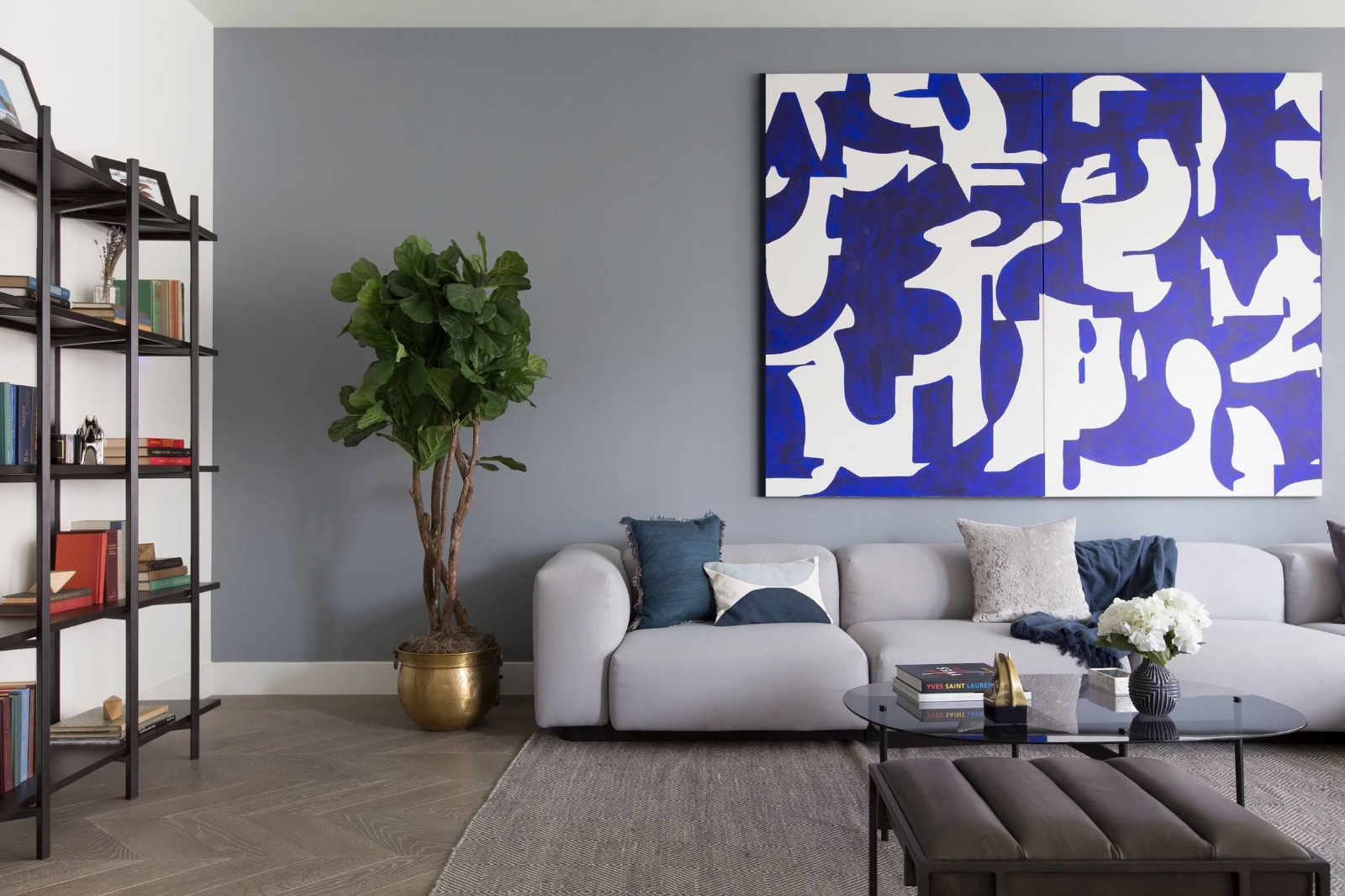
岛屿的颜色和材料(石头,毡,木材,镜子,玻璃)标点,否则单色工作区,创造激活和兴趣。岛屿包括色调和视觉相关的表面和家具,如沙发,椅子,地毯和定制家具组合。
Islands of colors and materials (stone, felt, wood, mirror, glass) punctuate the otherwise monochromatic workspace, creating activation and interest. The islands consist of tonal and visually related combinations of surface and furniture like couches, chairs, rugs, and custom furniture.
Plan of Furniture
家具平面图


© Michael Vahrenwald /Esto
迈克尔·瓦伦瓦尔德/埃斯托


该计划的组织为协作和重点突出的工作提供了各种不同的质量和设置。该项目结合了开放式计划的优势(灵活、非正式、互动)和封闭和半封闭空间(定义、结构和集中)的优势。该项目拒绝了所谓的当代创意办公环境(乒乓球桌、共享豆荚、果汁棒等)的意义,而是通过均衡比例的互动和专注来支持创造力。
The organization of the plan provides a variety of different qualities and settings for both collaborative and focused work. The project combines the advantages of the open plan (flexibility, informality, interaction) with the advantages of enclosed and semi-enclosed spaces (definition, structure, and concentration). Rejecting the signifiers of the so-called contemporary creative office environment (ping-pong tables, sharing pods, juice bars, etc.), the project supports creativity through a balanced proportion of interaction and focus.
© Midori Hasuike
(c)中oriHasuke


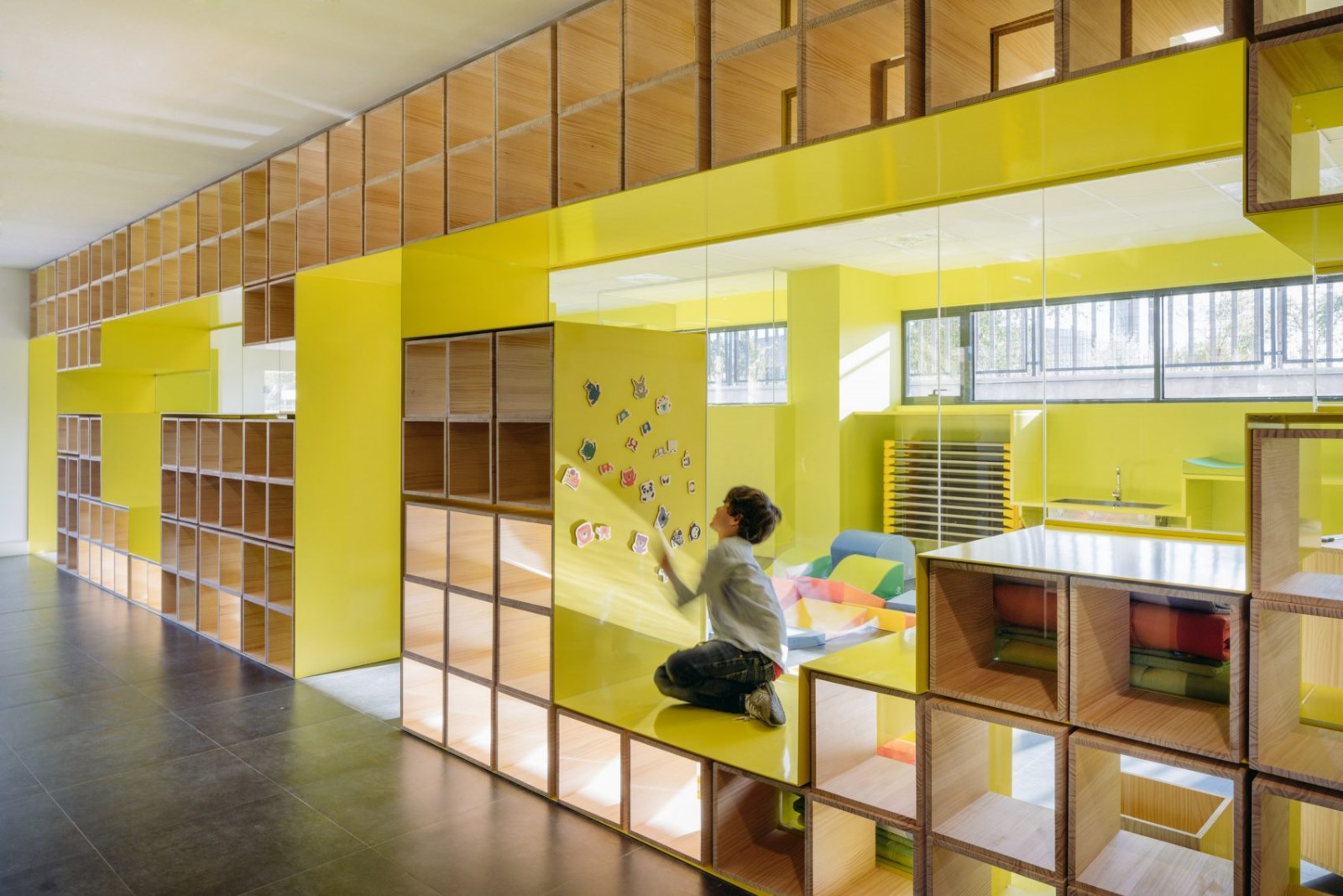
展厅内设有四个滚动模块。模块划分空间,并在内部容纳产品的显示和存储。模块的“X”配置将陈列室划分为四个亲密的会议和演示空间。同时,镜子的完成保持了一种扩张的感觉。模块的其他计划位置允许更大和更连续的配置。
The showroom is populated with four rolling modules. The modules partition the space and accommodate product display and storage on the inside. An “X” configuration of the modules divides the showroom into four intimate meeting and presentation spaces. At the same time, the mirror finish maintains a feeling of expansiveness. Other plan positions of the modules allow larger and more contiguous configurations.
Axonometric


Architects Only If
Location New York, NY, USA
Category Offices Interiors
Area 18000.0 ft2
Project Year 2015
Photographs Midori Hasuike

 PintereAI


.jpg)


