PLVS VLTRA Wiegerinck
2016-11-16 05:00
© Kim Zwarts
(C)Kim Zwarts


架构师提供的文本描述。在瓦格宁根大学校园的新孵化器和多租户建筑的设计中,农业和食品行业的初创企业和知识密集型技术企业将有研究和开放创新的空间。
Text description provided by the architects. In the design for the new incubator and multi-tenant building on the university campus in Wageningen, start-ups and knowledge-intensive technological businesses in the agro and food sectors will have a place for research and open innovation.
© Kim Zwarts
(C)Kim Zwarts


“Plus Ultra”的意思是“将永远有未被发现和探索的领域”(见脚注),并象征着对持续创新的承诺。
‘Plus Ultra’ means ‘there will always be unchartered territory to be discovered and explored’ (see footnote) and symbolizes the commitment to continuous innovation.
© Kim Zwarts
(C)Kim Zwarts


卡丹生物设施与瓦格宁根大学合作开发加超
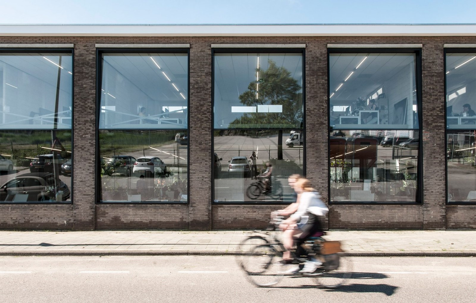
Kadans Biofacilities develops Plus Ultra in cooperation with Wageningen University & Research Centre on the southern end of the university campus. The building offers more than 7,000 m2 of floor space for offices, laboratories, (partly)) multipurpose techno halls and various spaces for encounters and informal contacts.


Wiegerinck建筑设计师Stedenbouw(Wiegerinck建筑和城市规划)的设计旨在通过最可持续和强有力的设计实现协同增效、相遇、合作和创新,从而获得布鲁姆优秀证书。Plus Ultra的设计是尽可能的紧凑和透明,有一个5层的方形平面图。下面两层提供了各种功能的空间:入口、接待、餐饮设施、高“技术厅/实验室”和办公空间。前三层是实验室/办公室层。
The design of Wiegerinck architectuur stedenbouw (Wiegerinck architecture and urban planning) aims at synergy, encounters, cooperation and innovation through a maximally sustainable and robust design that aspires a Bream Excellent certificate. The design of Plus Ultra is as compact and transparent as possible with a virtually square floor plan with 5 floors. The bottom two floors offer space to a varied range of functions: entrance, reception, catering facilities, high “techno halls/labs” and office space. The top three floors are the laboratory/office layers.
楼面平面图已在中央中庭周围实现;在实验室/办公室层,中庭的外部和内面之间的楼层被划分为三个“环”。外圈(正面)构成一个灵活的使用区域,可作为实验室和办公空间使用。中心环是允许进入内部和外部环的循环区域。办公室,会议或遇到的空间,在中庭正面开放,在内部环。
The floor plans have been realised around a central atrium; on the lab/office levels, the floors between the exterior and interior facades of the atrium have been divided into three “rings”. The outer ring (on the facades) constitutes a flexible-use zone that is equipped for use both as laboratory and office space. The central ring is the circulation area that gives access to the interior and exterior rings. Office, meeting or encounter spaces on the atrium facade open up on the inner ring.
© Kim Zwarts
(C)Kim Zwarts


在中庭中,一个优雅的木制楼梯从地面水平上升到中庭正面。在每一层楼,楼梯导致了一个双高的会议空间完成了木材与中央中庭的开放连接。面对中庭,楼梯和高层会合空间螺旋向上进入空间。再加上超。
In the atrium, an elegant wooden staircase spirals upwards from ground level to the atrium facade. On each floor, the stairs lead to a double-height meeting space finished in wood with an open connection to the central atrium. Faced from the atrium, the stairs and the high meeting spaces spiral up into the space. Plus Ultra.


四个建筑核心已被纳入在内部环的角落。所有“固定”设施(通风口、管道、厕所、电梯和技术设施)都设在大楼核心,以便所有其他可用空间都是开放的,适合广泛的布局选择。核心也保证了建筑结构的稳定性。
Four building cores have been incorporated at the corners of the interior ring. All “fixed” facilities (vents, ducts, toilets, elevators and technical features) are housed in the building cores so that all other available space is open and suited for a wide range of layout options. The cores also ensure the constructional stability of the building.
© Kim Zwarts
(C)Kim Zwarts


材料的使用相当谨慎。整个建筑由混凝土、木材、玻璃和金属组成。在可能的情况下,结构是实际的整理。只有中央楼梯和双层会议空间有木板覆盖。木材提供温暖和颜色,以平衡混凝土;它创造愉快的声学在会议地区和中庭,并提供了选项,把安装后的面板。
The use of material is quite discreet. The entire construction consists of concrete, wood, glass and metal. Where possible, the structure is the actual finishing. Only the central stairs and the double-height meeting spaces have wood slats cladding. The wood offers warmth and colour to counterbalance the concrete; it creates pleasant acoustics in the meeting areas and the atrium, and offers the option to place installations behind the panels.
© Kim Zwarts
(C)Kim Zwarts


该设计基于一种晶体清晰的方法。楼层平面图一直以3,6米的模块化宽度来实现。该措施总分为0,9米的桥墩,开口为2,7米宽。垂直地,建筑物由高度为4米的楼层组成。该测量被细分为40cm厚的地板,用于技术设施的60cm空间和3米的自由高度。这种谐波尺寸标注方法在所有内部和外部立面中脱颖而出,并通过5cm深的立面跳跃变成了一个定义特征,以创建阴影线并确保从木材元素中进行适当的排水。
The design is based on a crystal clear methodology. The floor plans have consistently been realised with a modular width of 3,6 metres. This measure is always divided in piers of 0,9 metres with openings of 2,7 metre wide in between. Vertically, the building consists of floors with a height of 4 metres. This measure is subdivided into floors of 40 cm thick with 60 cm space for technical facilities and 3 metres of free height. This harmonic dimensioning methodology stands out in all interior and exteriors facades and has been turned into a defining feature through facade jumps of 5 cm deep to create shadow lines and to ensure proper drainage from the wood elements.
2nd Floor Plan
二楼图则


正面是在经过处理的木头和阳极氧化框架中实现的。优雅的木板屏风限制了直接阳光进入建筑物,自然减少了冷却负荷。与玻璃平行运行的屏幕,也可作为建筑物内外(实验室设置)之间的视觉过滤器。东面和西面都安装了垂直于窗户的木屏风。这些限制在早晨和晚上以低太阳角度加热。南侧立面上的屏风被设计成树冠,为了同样的目的,可以保护人们免受正午阳光的照射。由于没有太阳能负载,北立面已经变得更加平坦。
The facades are realised in treated wood and anodized frames. Elegant wood slat screens limit the access of direct sunlight into the building, naturally reducing the cooling load. The screens that run parallel to the glass, also function as visual filters between (the laboratory set-ups) in and outside the building. The east and west facades are fitted with wood screens perpendicular to the windows. These limit heating up by low sun angles in the morning and evening. The screens on the south facade have been designed as canopies to offer protection from the midday sun for the same purpose. The north facade has been realised more level because of the absence of solar load.
© Kim Zwarts
(C)Kim Zwarts


立面木采用两种不同的木质色调,强调立面的水平性,使其比垂直元素更具有主导性,与校园形象质量规划相契合。楼层、技术区域和自由空间的垂直方法也反映在5厘米的立面跳跃中。因此,建筑物每层扩展10厘米,结构垂直加宽。这样,建筑-无论是外观上还是通过综合中庭-都是指它的名字“Plus Ultra”,以及它将促进的创新。
The facade wood is finished in two wood tones with a subtle difference to emphasize the horizontality of the facade and to make it more dominant than the vertical elements - fitting in with the campus image quality plan. The vertical methodology of floors, technical zones and free space is also reflected in the facades in facade jumps of 5 cm. As a result, the building expands 10 cm on each layer with a vertical widening of the structure. This way, the building - both in outer appearance and through the integrated atrium - refers to its name “Plus Ultra” as well as to the innovation that it will facilitate.
© Kim Zwarts
(C)Kim Zwarts


Architects Wiegerinck
Location Wageningen, The Netherlands
Category University
Architects in Charge Bert Muijres, Roy Pype, Tim Loeters
Area 7600.0 sqm
Project Year 2016
Photographs Kim Zwarts
Manufacturers Loading...

 PintereAI


