klee klee Brand
2017-04-02 20:00
© Dirk Weiblen
德克·韦布伦


架构师提供的文本描述。KleeKlee,一个来自服装前卫的新品牌-gardezzug/,它的名字来源于藏语,意思是“慢下来”。其大姐祖祖格/是一个相机现成的时尚板块,但Klee是一个探索极简主义和低影响的生产,导致高冲击设计。他们的概念与人与自然和谐共存,并期待城市居民想要降低音量,减缓他们的生活,并重新与自然节奏和生活方式。
Text description provided by the architects. klee klee, a new brand from clothing avant-garde ZUCZUG/, takes its name from Tibetan, meaning ‘slow down’. Its big sister ZUCZUG/ is a camera ready fashion plate, but klee klee is an exploration of minimalism and low impact production that results in high impact design. Their concept plays with humans and nature coexisting equally and harmoniously, and looks to city dwellers wanting to turn down the volume, slow down their lives, and reconnect with natural rhythms and lifestyles.
© Dirk Weiblen
德克·韦布伦


当被要求设计他们的第一家商店时,我们最初的想法是那些认同“KleeKlee”的人,以及他们的价值体系是什么。他们的空间会是什么样子?他们怎么生活?当时的目标是设计一家能反映出“KleeKlee”理念的人的栖息地的商店。
When asked to design their first store, our initial thoughts went to the person who identifies with ‘klee klee’, and what their value systems would be. What would their space look like? How would they live? The goal then became to design a store that reflected the habitat of a person who lives by the idea of ‘klee klee’.
© Dirk Weiblen
德克·韦布伦


结论是一个地方的特点是收集内部的东西,一个简单和别致的反映平衡。
The conclusion was a place that is characterized by the collection of things inside, a simple and chic reflection on balance.
© Dirk Weiblen
德克·韦布伦


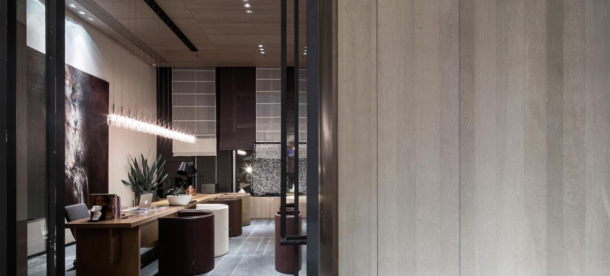
裸露的空间被白色洗出来,呈现出完美的不完美的纹理。LED条形照明强调空间的长度,并将游客吸引到商店的“尽头”,在那里,自然光线透过休息区过滤,可以让客人有时间喝茶和聊天。
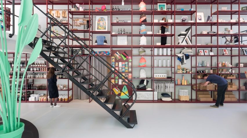
The naked space was white washed to bring out the perfectly non perfect texture. Led strip lighting emphasizes the length of the space, and draws the visitor to the ‘end’ of the store, where natural light filters across a sitting area that invites time for a cup of tea and a chat.
© Dirk Weiblen
德克·韦布伦


虽然祖祖格和克莱从西藏高原和自然环境中汲取灵感,但这两个品牌都以自己的方式具有时代性和老练性。在设计中反映其现代的一面是很重要的。
Although ZUCZUG/ and KLEE KLEE take inspiration from Tibetan plateaus and natural environments, both brands are contemporary and sophisticated in their own way. It was important to reflect its modern side in the design.


家具简单实用,灵感来自中国建筑商在建筑工地上的使用。有一个稀疏的选择,允许内部影响,但从来没有超过的设计。这些碎片是分开的,但通过实用的连接,当放在一起在商店,把所有的东西到一个城市凉爽和自然灵感的一个微妙的平衡。
The furniture is simple and functional, inspired by the pieces Chinese builders use on building sites. There is a spareness to the choices that allows the interior to be influenced but never overtaken by the design. The pieces are separate, but connected through utility, and when placed together in the store, bring everything into a fine balance of urban cool and natural inspiration.
© Dirk Weiblen
德克·韦布伦


钢铁吊架被剥离到了它们的基本部分。
Steel hangers are stripped down to their basics.
更衣室-一轮和一个广场-是移动的,帐篷一样的空间,可以随意放置。
The dressing rooms - one round and one square - are mobile, tent like spaces that can be randomly placed.
© Dirk Weiblen
德克·韦布伦


床罩变成了产品展示。在视觉上,空间有一个安静的丰富,邀请缓慢的第二或第三的期待把它全部吸收。
A bedboard becomes a product display. Visually, the space has a quiet richness that invites slow second or third looks to take it all in.
© Dirk Weiblen
德克·韦布伦


最终,我们用简单的家庭生活习惯组织了这个空间:喝茶、睡觉、工作、储藏。其结果不仅是一个时尚的零售商店,让游客阅读一个新的产品,也是一个地方,体验一个真实的生活表现的KleeKlee。
Ultimately, we organized the space with the simple routines of domesticity in mind: tea drinking, sleeping, working, storage. The result is not only a chic retail shop for visitors to peruse a new product, but also a place to experience a real life manifestation of klee klee.
© Dirk Weiblen
德克·韦布伦


Architects AIM Architecture
Location 101, 322 An Fu Lu, Xuhui Qu, Shanghai Shi, China
Design team Wendy Saunders, Ivan Yu, Byungmin Jeon, Lily Zhu, Rachel Wang, Liat Goldman, Jiaoyan
Area 81.0 m2
Project Year 2016
Photographs Dirk Weiblen

 PintereAI


