House in Silverstrand Millimeter Interior Design
2017-05-05 20:00
架构师提供的文本描述。坐落在山边,这房子捕捉到壮观的海景银线。业主已在那里居住超过15年,并知道该地方的缺点,他们热衷于把这个地方变成一个创新的,但实用的房子,以更好地满足他们的需要。
Text description provided by the architects. Nestled in the mountain side, this house captures the spectacular ocean view of Silverstrand. The owners have been living there for over 15 years and knowing the shortcomings of the place, they were keen to transform the place into an innovative, yet, practical house to better suit their needs.
Courtesy of Millimeter Interior Design
原来的起居室和饭厅都建在群山之间,是分层隔开的。进屋后,上层的餐饮区是第一个看到的区域,干扰了实际的流动。此外,原有的门厅缺乏储存空间,业主别无选择,只能把鞋柜放在楼梯下面。孩子们的房间大小不均匀,主卧室的步入式壁橱空间不足,这些都是导致主人生活质量下降的缺陷。
Built among the mountains, the original living room and dining room were separated by sublevels. The dining area in the upper part was the first area to see after entering the house, disturbing the practical flow. In addition, the original foyer lacked storage space, leaving the owners no choice but to place the shoe closet below the stairs. The uneven size of their children’s rooms and inadequate walk-in closet space in the master bedroom were defects that deteriorated the living quality of the owner.
为了有效地提高业主的生活质量,设计师仔细分析了住宅的原有流程和业主的习惯,并为业主量身定做了一个新的流程,如改变入口处的位置、上部的面积和楼梯。
In order to improve the owner's living quality effectively, the designer carefully analyzed the original flow of the house and the owners’ habits and tailor-made a new flow for the owners, such as changing the location of the entrance, the area of the upper part and the staircases.
Courtesy of Millimeter Interior Design
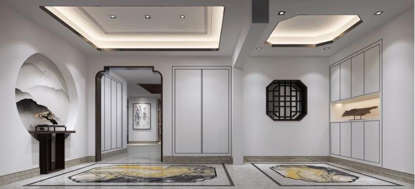
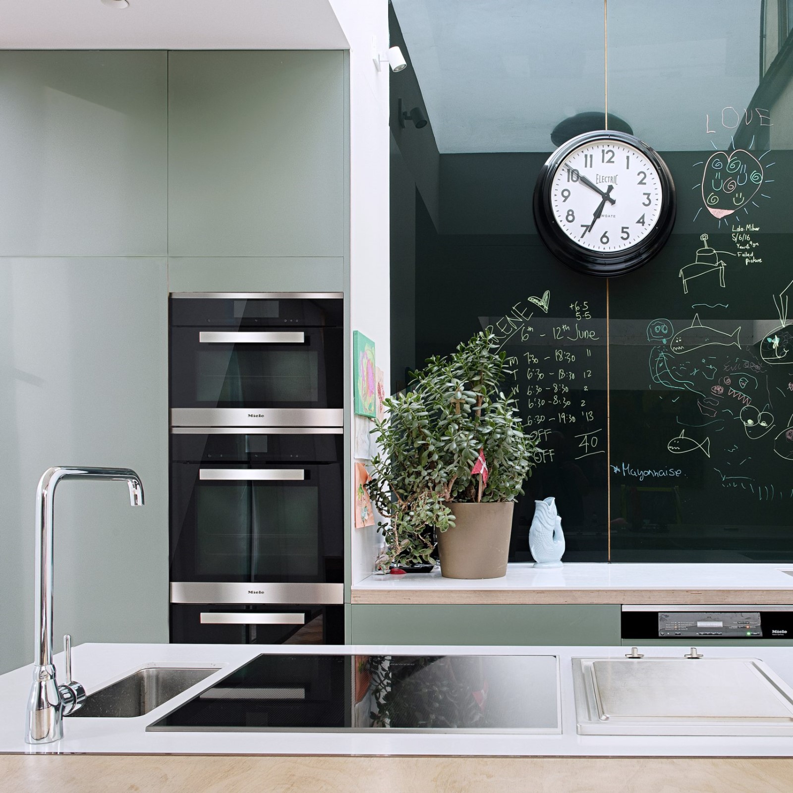
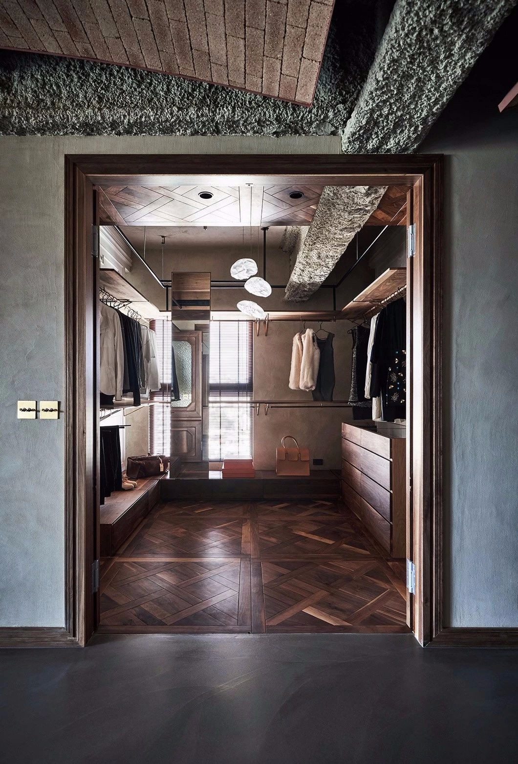
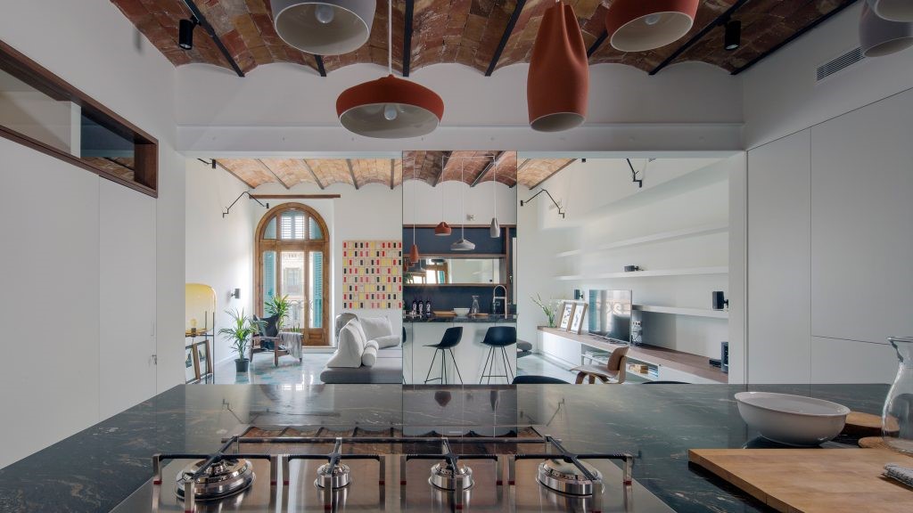
此外,由于业主很少做饭,设计一个简单的烹饪空间就足够了。于是设计师大胆地拆掉了原来的厨房,重新定位了入口处,增加了一个门厅,这样游客就可以在进入房子的时候逐渐体验不同的空间。同时,一楼上部的一个大空间被解放了,设计师把多余的空间和下面的空间合并起来,用于开放式厨房。更有趣的是,设计师发现,通过搬迁楼梯,第二层多余的走廊可以被拆除,这样每个房间的利用率就可以提高20-45%左右。其结果是,它不仅使儿童房间的大小达到平衡,而且使主卧室内的步入式壁橱的大小翻了一番。
Moreover, since the owners seldom cook, designing a simple cooking space is sufficient. So the designer boldly demolished the original kitchen, re-positioned the entrance and added a foyer, so that visitors can gradually experience different spaces while entering the house. Meanwhile, a large space in the upper part on the ground floor was freed up, the designer merged that excess space with the lower part for an open kitchen. Even more interesting is that the designer found that by relocating the staircase, the redundant corridors in the second level can be removed, so that the utility rate of each room can be increased by around 20-45%. As the result, not only did it even out the sizes of the children's rooms, but also doubled the size of the walk-in closet in the master bedroom.
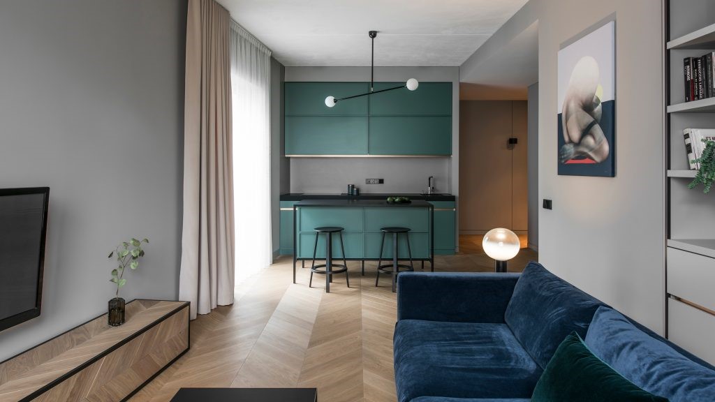
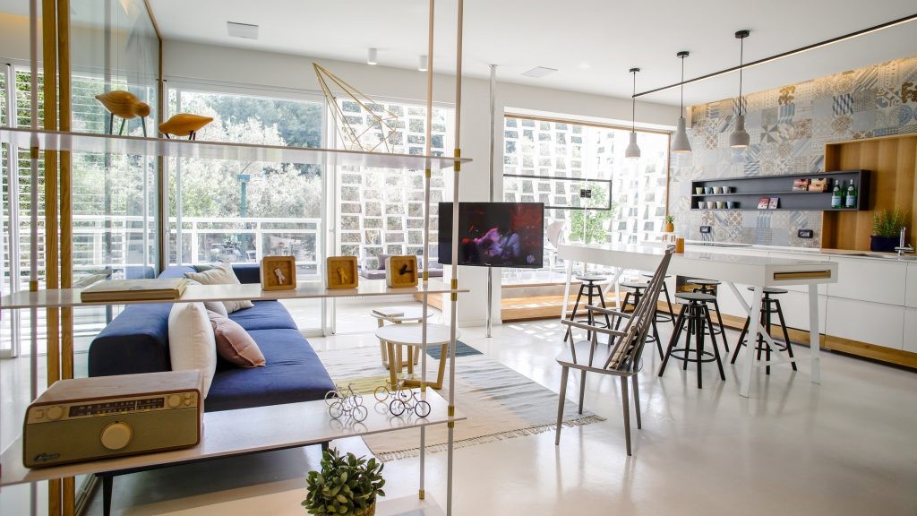
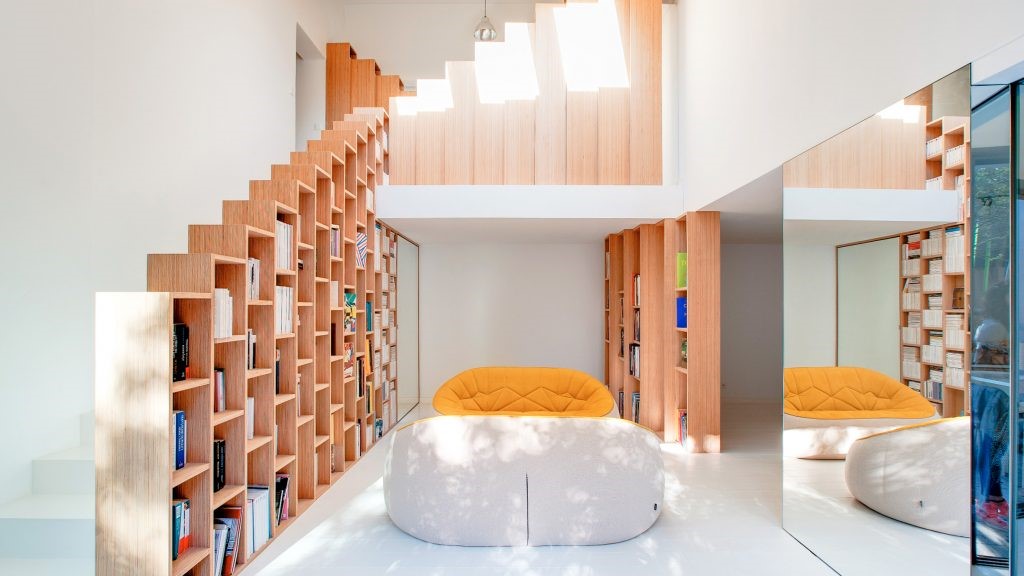
在实施了结构调整后,设计师采用简单而复杂的室内设计,以浅色和浅色材料为主要色调,营造了一种轻松宁静的感觉。此外,浮动楼梯的结构线,开放式厨房台面和长凳的工作内聚一堂,创造了一种建筑美感。
After implementing the structural adjustment, the designer applied simple yet sophisticated interiors design throughout the house by choosing light and pale materials as the main tone, creating a relaxed and serene feeling. Also, the structure line of the floating staircase, open kitchen countertops and benches work cohesively to create a sense of architectural aesthetics.
Courtesy of Millimeter Interior Design
Architects Millimeter Interior Design
Category Houses Interiors
 举报
举报
别默默的看了,快登录帮我评论一下吧!:)
注册
登录
更多评论
相关文章
-

描边风设计中,最容易犯的8种问题分析
2018年走过了四分之一,LOGO设计趋势也清晰了LOGO设计
-

描边风设计中,最容易犯的8种问题分析
2018年走过了四分之一,LOGO设计趋势也清晰了LOGO设计
-

描边风设计中,最容易犯的8种问题分析
2018年走过了四分之一,LOGO设计趋势也清晰了LOGO设计


 PintereAI


