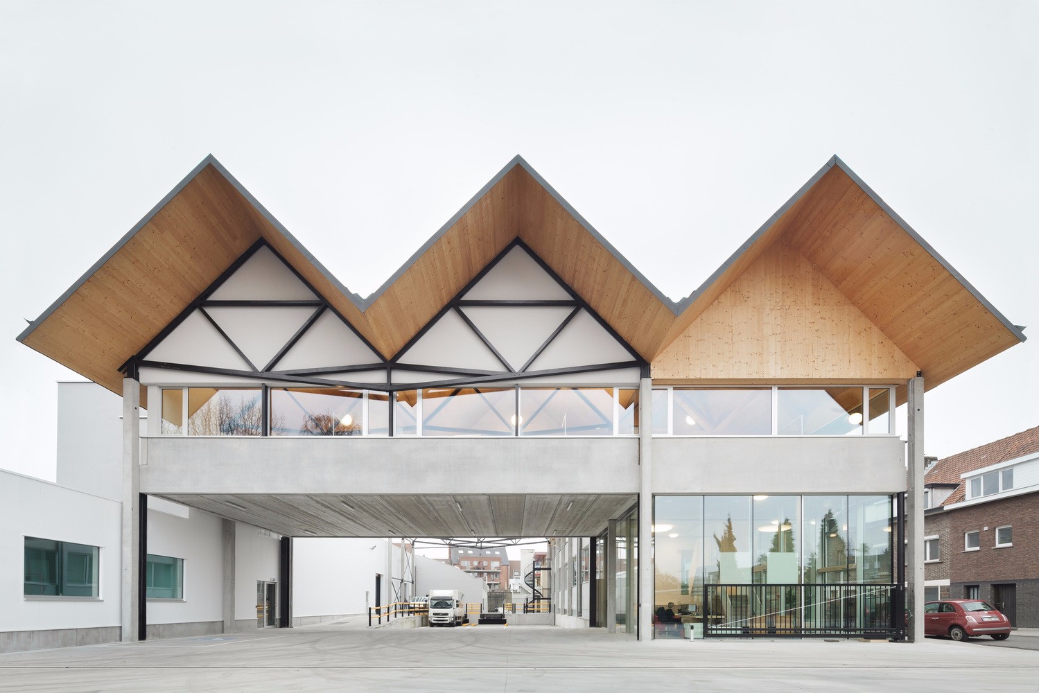
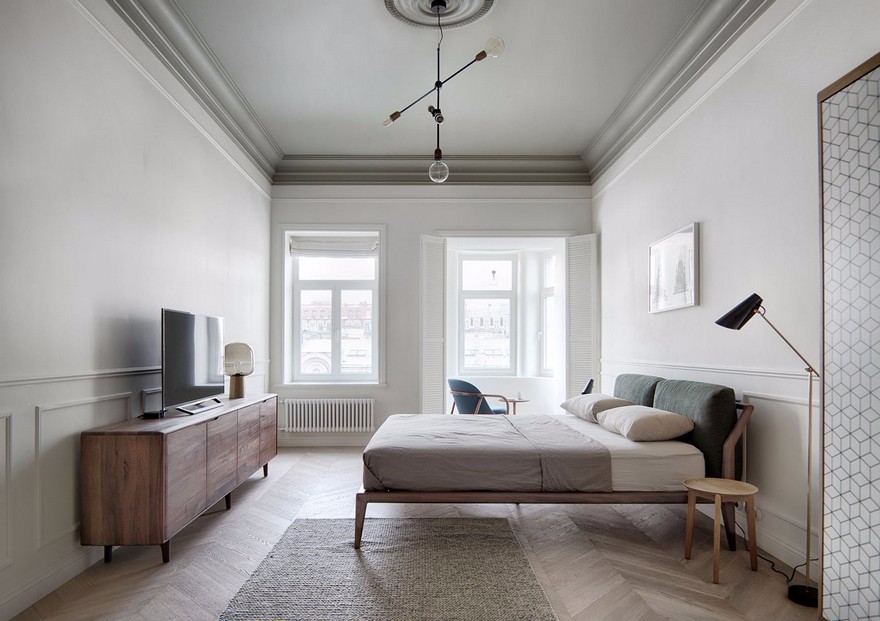
Dplus Intertrade Head Office Pure Architect
2017-09-22 15:00
© Chaovarith Poonphol
(Chaovarith Poonphol)



架构师提供的文本描述。泰国电子配件贸易公司DPlus Intertrade的目标是重振品牌,重振团队的活力,让员工作为一个家庭向前迈进,并通过一个翻新项目来更新员工的生活质量。该项目的概念设计是,让员工感到舒适,感觉像家一样,而让员工感到轻松愉快,让员工感到精力充沛和精力充沛。
Text description provided by the architects. DPlus Intertrade, an electronic accessory trading company in Thailand, aims to re-brand, to re-energize teams to move forward as a family and to renew employees’ quality of life through a renovation project. The concept design of this project is to make it comfortable enough to feel like home while bright and cheerful enough to make employees feel energized and empowered.
© Chaovarith Poonphol
(Chaovarith Poonphol)


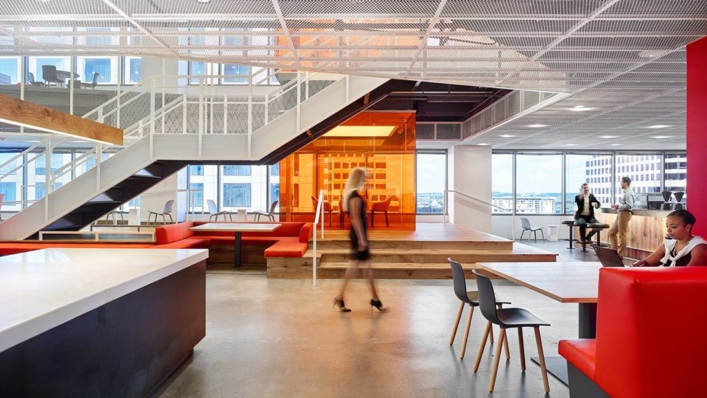
蓝色是公司的颜色,主要与红色、黄色、橙色和绿色混合使用,在空间内建立一种愉悦和娱乐的感觉。不同的颜色也被插入,以区分不同的楼层和功能的建筑物。
The blue color, which is the company color, was mainly used with a mix of red, yellow, orange, and green to establish a sense of cheerfulness and entertainment inside the space. Diverse colors were also inserted to distinguish between different floors and functions of the building.
Meeting Room Sketch
会议室素描


© Chaovarith Poonphol
(Chaovarith Poonphol)


建筑立面的设计也是一种视觉错觉-一种静默的动力。通过在铝制正面插入公司名称D,我们的眼睛可以从不同的角度看到不同的变化。字母D在建筑物的某个角度上可见,在另一个位置消失。我们通过这封信通过幻象的转变建立了运动的概念。从不同的角度看,建筑可以用不同的语言进行交流。
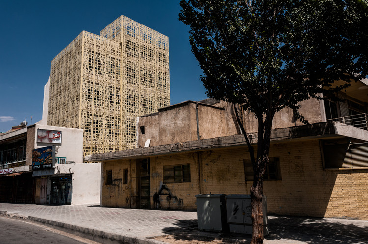
The design of building’s facade also acted as an eye illusion - a silence dynamic. By inserting letter D, a company name, on the side of the aluminum facade, it gives a transformation that our eyes can see differently from a different angle. The letter D is visible on some angle of the building and disappear on a different position. We established the notion of movement through this letter by the transformation of an illusion. From a different perspective, the building can communicate in different languages.
© Chaovarith Poonphol
(Chaovarith Poonphol)


这座建筑正面的另一个有趣的地方是百叶窗。这个铝制百叶窗正面是在对角线方向上组装的,以代表公司的特点,而不是简单的直线和平淡无奇的设计。这种连续的对角线百叶窗给人一种活泼的感觉和流畅的视觉。因为每层楼之间没有阻塞框。
Another interesting aspect on the facade of this building is louver. This aluminum louver facade was assembled in a diagonal direction to represent the characteristic of this company not to be a simple straight and having a mundane design. This continuous diagonal louver gives a lively feeling and smoothness of vision. Since there is no blocking frame between each floor.
© Chaovarith Poonphol
(Chaovarith Poonphol)


Meeting Space Sketch
会议空间素描
.jpg)

此外,设计师还将风水特色融入到设计中.在建筑物前插入水和绿色区域,并在建筑物背面涂上棕色。在风水上代表水元素的水意味着平滑、灵活和宁静.
Moreover, the designer also involved feng-shui characteristic into the design. Water and green area were inserted in front of the building and brown color was painted on the back of the building. Water representing water element on feng-shui means smoothness, flexible, and tranquil.
© Chaovarith Poonphol
(Chaovarith Poonphol)


代表地球元素的棕色代表财富。绿色代表木材元素,意味着生长和审美。这座建筑的总体设计不仅在美学方面有所提高,而且还提高了用户的生活质量。这种静默的动态设计给空间带来了运动和生命,同时使用了鲜艳的色彩色调。
Brown color representing earth element means wealth. And green color representing wood element means growth and aesthetic. The overall design of this building not only enhances in an aesthetic aspect but also enhances the life quality of users. This silence dynamic design gives movement and life to the space along with the use of bright and colorful tone of color.
© Chaovarith Poonphol
(Chaovarith Poonphol)


.jpg)


Architects Pure Architect
Location 123 Thanon Nonsi, Khwaeng Chong Nonsi, Khet Yan Nawa, Krung Thep Maha Nakhon 10120, Thailand
Area 1600.0 m2
Project Year 2017
Photographs Chaovarith Poonphol
Category Offices Interiors
Manufacturers Loading...

 PintereAI


