GINZA LOFT Schemata Architects
2017-10-04 19:00
© Nacasa & Partners
© Nacasa


架构师提供的文本描述。我们为阁楼设计了一家新的银座旗舰店,一家庭用品专卖店。我们的目标是设计室内空间,在那里顾客想要呆很长一段时间,并彻底地漫步。商店占据了从三楼到六楼的空间,每一层都有不同的商品类别。
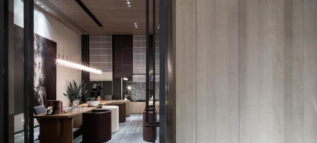
Text description provided by the architects. We designed a new Ginza flagship for LOFT, a household goods specialty store. Our aim was to design interior spaces where customers feel like staying for a long time and strolling around thoroughly. The store occupies spaces from the third to sixth floors in a building, with each floor carrying a different merchandise category.
© Nacasa & Partners
© Nacasa


每一层楼的面积约为990平方米,自动扶梯位于大空间的中心。由于如果按原样进行布局,销售区域的空间深度会太大,我们的设计首先是在自动扶梯周围找到一条大的“环形道路”或主要的客户循环,并尽可能地将销售区域设在流通的两侧,并尽可能地在空间深度相等的情况下确定销售区域。人们聚集的地方,如收银机区和实验室,位于楼层的另一端,意在通过向X方向扩展循环来激活顾客的活动。
Each floor has a floor area of approximately 990 m2, and escalators are located at the center of the large space. Since the spatial depth of sales areas would be too large if the original layout was to be used as it was, our design started by locating a large “ring road” or the main customer circulation around the escalators and located sales areas on both sides of the circulation with the equal spatial depth as much as possible. Places where people gather, such as cash register areas and labs, are located in the areas at the far ends of the floor, intending to activate customers’ movements by extending the circulation in the X direction.
© Nacasa & Partners
© Nacasa


Sixth Floor Plan
六楼图则


© Nacasa & Partners
© Nacasa


这些区域是以独特的方式设计的,以吸引人们的注意,一些实验室是利用荷兰DUS建筑师的3D打印设计和制造的。根据每一层所处理的商品类型,使用不同的材料和形状制作展示架,使顾客能够享受所有楼层之间的差异以及整个旅行顺序。(鼓掌)
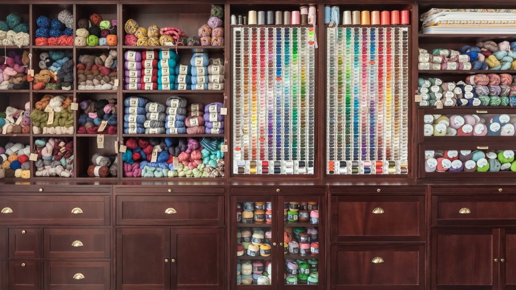
These areas are designed in unique ways to attract people’s attention, and some of the labs are designed and fabricated using 3-D printing by DUS architects from the Netherlands. Different materials and shapes are used to make display shelves according to the types of merchandise handled on each floor so that customers can enjoy the difference between all floors as well as the entire traveling sequence.
© Nacasa & Partners
© Nacasa


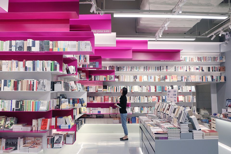
3楼为曲线型陈列架,布置在同心圆布局中;4楼设有盒形陈列架,由白色木箱和劳安木箱组合而成,沿45度轴线布置;5楼由功能齐全但极端简单的钢架组成;6楼提供灵活的地板布局,由盒子和托盘组合而成。商店环境,丰富多样的设计功能,为顾客提供愉快的购物体验,在所有楼层,而一致性的基本组成创造了一个统一的商店身份。
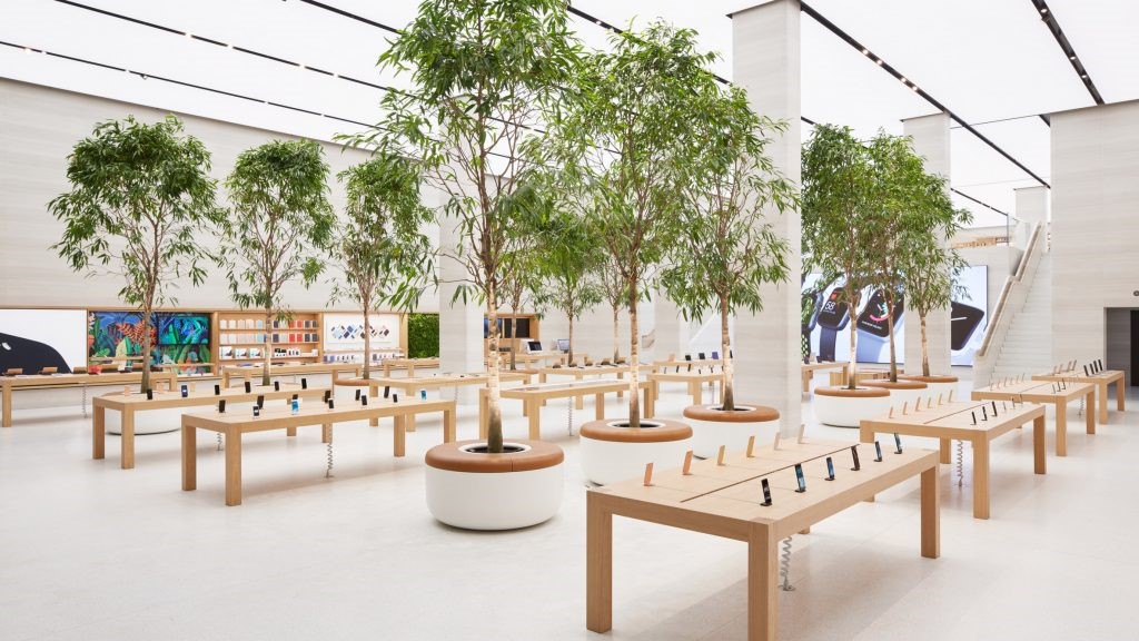
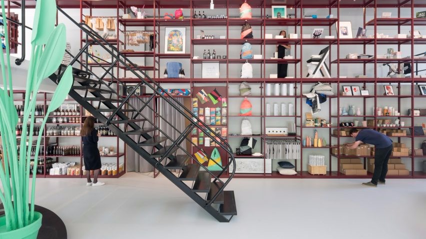
The 3rd floor is composed of curve-shaped display shelves placed in the concentric layout; the 4th floor is equipped with box-shaped display shelves composed of a combination of white-painted wood boxes and lauan wood boxes, laid out along the 45-degree axis; the 5th floor is composed of steel racks that are functional yet simple in the extreme; the 6th floor offers a flexible floor layout composed of a combination of boxes and pallets. The store environment with a rich variety of design features offers customers joyful shopping experiences throughout all the floors, while the consistency of the basic composition creates a unified store identity.
© Nacasa & Partners
© Nacasa


Architects Schemata Architects
Location 4-6 Ginza, Minato, Tokyo, Japan
Architect in Charge Jo Nagasaka
Project Team Masami Nakata, Shouta Miyashita, Kana Yamamoto
Area 3306.0 m2
Project Year 2017
Photographs Nacasa & Partners
Category Interior Design
Manufacturers Loading...

 PintereAI


