School Extension La Fontaine LT2A
2017-10-08 05:00
© Gilles Ribero
c.吉尔斯·里贝罗


架构师提供的文本描述。在20世纪70年代的社会公寓楼占据的敏感地区,现有的学校以其周围的绿色栅栏而与众不同,就好像它在背对着这个地方一样。我们的建议是从现有的质量出发,以更明确的方式将新的内容与其背景联系在一起。
Text description provided by the architects. Inserted in a sensitive area occupied by long 1970s social housing blocks, the existing school distinguishes itself for its peripheral green fence, as if it is turning its back to the site. Our proposal is to start from the qualities of the existing, anchoring the new to its context in a clearer way.
© Gilles Ribero
c.吉尔斯·里贝罗


Elevation/Section
高程/剖面


© Gilles Ribero
c.吉尔斯·里贝罗


现有的建筑基于一个非常简单的计划:教室位于一个暴露得很好的内殿的两侧,作为用户的公共空间。在建筑物的一端,增加了两个新房间,作为现有系统的挤压。在内殿的连续性中,一个新的入口和一个新的门面一起被创造出来,这意味着成为学校自身的新形象。
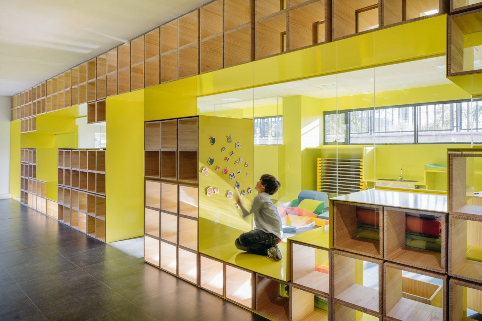
The existing building is based on a very simple plan: the classrooms are positioned on two sides of a well exposed nave which serves as a common space for the users. At one end of the building two new rooms are added as an extrusion of the existing system. In the continuity of the nave, a new entrance is created together with a new façade, which is meant to become the new image of the school itself.
© Gilles Ribero
c.吉尔斯·里贝罗


这堵墙延伸到情节的边缘,以限制外界对教室的看法。
The wall extends to the edge of the plot in order to restrict views from the outside towards the classrooms.
© Gilles Ribero
c.吉尔斯·里贝罗


因此,立面在公共空间和学校内发生的活动之间形成了一个过滤器,让行人可以通过格子板或小开口窥见内部花园,但仍能保护孩子们的活动。
Therefore, the façade creates a filter between the public space and the activities happening inside the school, allowing pedestrians to get a glimpse of the inner garden through the trellis panels or the small openings, but still protecting the children's activities inside.
© Gilles Ribero
c.吉尔斯·里贝罗


Architects LT2A
Location Loos, France
Architect in Charge Paul Emmanuel Lambert – Foucault Tiberghien
Area 300.0 m2
Project Year 2017
Photographs Gilles Ribero
Category Extension
Manufacturers Loading...

 PintereAI


