Chongqing Tiandi Art Museum Shenzhen Huahui Design
2018-02-24 20:00
天帝美术馆位于嘉陵江南岸,紧靠天帝地产。南部的榆中半岛有陡峭的山丘,北部的重庆天帝商业街有陡峭的山丘,西部有正在建设的住宅区。
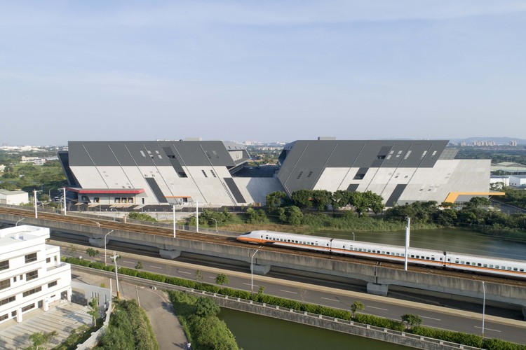
Site Tiandi Art Gallery is located in the south bank of Jialing River, close to the lake by Tiandi property. There are steep hills in Yuzhong peninsula in the south, Chongqing Tiandi Commercial Street in the north, and residential area under construction in the west.
Mountain lake and the building. Image © Zhi Xia
战略的出发点是如何将新建筑融入复杂的环境中,使其成为景观的一部分,如何形成室内空间体验与环境的对话,希望建筑能成为不同城市碎片的容器,作为体验风景的感官媒介。
Strategy The starting point is how to merge the new building to a complex environment and make it become a part of the landscape, and how to form a dialogue between the interior space experience and the surroundings; we hope the building can be a container of different urban fragments and act as a sensory medium to experience the scenery.
以地形为基础的地形布局,地形呈带状湖岸,相对较长、较窄。该建筑物的总体布局符合地形,并根据不同的功能分为三个卷。这三卷书是通过一个机翼空间连接在一起的,其中两个半封闭的庭院与体积相连,一个与水池相连形成一个下沉的庭院,另一个与一个广场相连,为公园里的人们举办小型的聚会活动。
Layout based on topography The shape of the land follows with the belt-type lakeshore, which is relatively long and narrow. The building's overall layout complied with the topography and was divided into three volumes based on different functions. The three volumes are linked together through a wing space, two of which form two half closed yards with the volume, one is connected with a pool to form a sunken yard, the other is linked with a square to hold small gathering activities for people in the park.
Spatial forms Tiandi Art Gallery includes Art Display & Exhibition Hall, Vanke Brand & Project Experience Center and Café House.
Transparent landscape. Image © Zhi Xia
画廊经常展出当地艺术家的当代艺术作品,因此我们设计了一个双高空间来展示它们。楼梯用来连接不同高度的展示平台,可用于展示绘画、雕塑和装置艺术,或为儿童提供艺术教育。在本设计中,我们利用白色墙壁和黑色楼梯的对比来削弱内部空间形态。
The gallery frequently displays contemporary artworks by local artists, therefore, we designed a double-height space to display them. The staircases were utilized to connect different display platforms which are varied in height and can be used to exhibit paintings, sculptures and installation art, or provide art education for children. In this design, we used the contrast of white walls and black stairs to weaken the internal space form.
此外,我们还把重点放在参观路径上,通过这条路径,室内和室外场景紧密相连,风景成为展览的一部分。山顶的平台借用了远山的风景,目的是在博物馆里漫步时唤起一种爬山的感觉,透过高高的窗户反射出来的光线吸引着游客爬上去。
Moreover, we focused on the visiting path, through which the indoor and outdoor scenes were closely linked together and the scenery became a part of the exhibition. The platform on the top borrows scenery from the distant mountains, aiming to evoke a feeling of mountain climbing while walking around the museum, and the light reflected through the high windows attract visitors to climb up.
Entrance. Image © Zhi Xia
The Brand Display & Project Experience Center is a single-storey space used for the introduction of Vanke's Tiandi property, in which we provided a wide scale according to the requirements of planning model display and negotiation. During the design process, we consciously lowered the height of the space by the lakeside, in order to avoid the uncontrollable vision and keep the sight inside the park.
Park inside. Image © Zhi Xia
咖啡屋被抬到二楼,把水景带进去。一方面,一个稍微倾斜的体积与整体形态的几何关系相呼应,另一方面,它试图通过个性化的行动给一个简单的盒子赋予一定的空间姿态和表情。
The Café House was raised to the second floor to bring the waterscape inside. On the one hand, a slightly tilted volume is echoing with the geometric relation of the overall form, on the other hand, it is trying to endow a simple box with certain space gestures and expressions through a personalized action.
因此,这三卷书结合功能需求和环境特征,表现出不同的姿态,即“高”、“宽”和“高”。如果高度是山体的模拟,那么楼梯就是“小径”的典故,而宽的法式窗口则是对水特征的回应。此外,突出建筑物的景观窗口在整个参观线路上创造了一个城市蒙太奇。
Walking scenery Therefore, being combined with functional demands and environmental characteristics, the three volumes show different gestures, namely, being "high", "wide" and "raised". If the height is a simulation of mountain, then the staircases are allusions of "paths", and the wide french window is a response to the water features. Furthermore, the sight-view windows which highlight the building create a city montage on the whole visiting line.
Island trees and the building. Image © Zhi Xia
这三个块被分组在一起,每个块都有一个不同的区段视图。然而,建筑内部并没有强调其中心感,而是以物体和景观的“吸引力”通过身体的运动在游客和城市环境之间创造互动,并将环境特征转化为空间体验。
The three blocks are grouped together, and each has a different section view. The interior of the building does not emphasize its central feeling, however, with the "attraction" of objects and sceneries it creates interaction between visitors and the urban environment through the body's movement, and translates environment features into spacetial experiences.
Transparent landscape. Image © Zhi Xia
展览与自然景观是通过连续的路径连接起来的,这一概念也在景观设计中得到了应用。从停车场、涵洞下的市政道路、湖畔广场到艺术平台,从楼梯、高台、楼窗、咖啡屋到玻璃走廊,所有游客都在建筑内和空间外徘徊。
The exhibition and natural sceneries are connected through continuous paths, this concept has also been used in the landscape design. From the parking area, the culvert under the municipal road, lakeside plaza to the art platform, from the stairs, raised platform, floor windows, Café House to the glass corridor, all visitors are wandering inside the architecture as well as outside the space.
View from the road. Image © Zhi Xia
我们知道,勒柯布西耶高度赞扬雅典卫城的布局,为了再现人类行为所感知的场所精神,他对空间布局、等级秩序和蒙太奇的处理完成了自由建筑的内涵,这是他在“长廊建筑”中倡导的核心精神。
As we know, Le Corbusier praised highly the layout of Acropolis of Athens, in order to reproduce the spirit of place perceived by human behavior, his handling of space arrangement, hierarchical order and montage completed the connotation of free architecture, which is the core spirit he advocated in "Promenade Architecture".
 举报
举报
别默默的看了,快登录帮我评论一下吧!:)
注册
登录
更多评论
相关文章
-

描边风设计中,最容易犯的8种问题分析
2018年走过了四分之一,LOGO设计趋势也清晰了LOGO设计
-

描边风设计中,最容易犯的8种问题分析
2018年走过了四分之一,LOGO设计趋势也清晰了LOGO设计
-

描边风设计中,最容易犯的8种问题分析
2018年走过了四分之一,LOGO设计趋势也清晰了LOGO设计


.jpg)


 PintereAI


