Mais Fitness Fitness Club Estúdio AMATAM
2018-04-16 15:00
合作者Luís Correia Ligthning Melo Rodri总会-Engenharia,LDA AVAC SPM Engenharia Sanitary DSE-Desenvolvimento e Solu es de Engenharia de Edifícios,LDA。平面设计Deadinbeirut三维可视化D22建筑政府模式,LDA。客户Alwayswonder,LDA。多规格少规格
Collaborator Luís Correia Ligthning MELO RODRIGUES–Engenharia, Lda AVAC SPM Engenharia Sanitary DSE – Desenvolvimento e Soluções de Engenharia de Edifícios, Lda. Graphic Design Deadinbeirute 3D Visualizations D22 Construction Gofermode, Lda. Client Alwayswonder, Lda. More Specs Less Specs
架构师提供的文本描述。什么是最健康的?了解一个现有品牌背后的魅力,就是要理解定义它的是人。属于这个“部落”的意愿使人们加入并希望加入这个健身社区。从这个概念出发,在葡萄牙西部地区的一个中等规模的城市托雷斯韦德拉斯(Torres Vedras),这个新健身房的座右铭就是这样的。我们面临的主要挑战是为这个和未来的健身馆创建一个空间形象标识。
Text description provided by the architects. What is it to be MAIS (plus) FITNESS? Understanding the charisma behind one existing brand is to comprehend that what defines it is the people. It is the will to belong to this “tribe” that makes the people to join and want to belong to this fitness community. From this concept comes the motto for this new gym in Torres Vedras, a middle size city in the West region of Portugal. Our main challenge was the creation of a spatial image identity for this and future MAIS FITNESS gyms.
一个部落通过符号和颜色进行交流,我们建议用这种语言来确认mais健身品牌的身份。
A tribe communicates by symbols and colors, and it was this language that we proposed to identify in order to affirm the identity of the MAIS FITNESS brand.
新的健身房将被安置在现有的建筑中,所以正式的健身活动大多是接受现有的特点,并在可能的情况下对其进行调整和重新设计,以便最大限度地利用空间品质,以代表我们打算把这个健身房改造成什么样的东西。
The new gym was to be settle in an existing building, so much of the formal exercise was to accept the characteristics of the existing and when possible adapt and reformulate it, so as to make the most of the spatial qualities in behalf of what we intended to transform this gym into.
在方案一级,任务很简单。MAIS健身的魅力与人们的积极能量有关,与运动员人数最多的集体班级分享这种能量有关。因此,一个XXL工作室是强制性的-越大越好!该空间在布局中的定位,以及其内部的现有通道楼梯的定义,是节目布局的主要因素。在健身房内放置接待处作为循环动力学的一个核点是要求之一。因此,它的中心地位,允许建立与休息区,工作室,办公室和服务区,甚至更衣室的关系。
At the programmatic level, the task was simple. The charisma of MAIS FITNESS is associated with people’s positive energy, and the sharing of this energy in group classes with the maximum number of athletes. Thus, a XXL studio was mandatory - the bigger the better! The definition of the positioning of this space in the layout, as well as the existing access stairs to its interior, were the predominant factors in the program distribution. Placing the reception desk as a nuclear point of the circulation dynamics inside the gym was one of the requirements. Hence, its centrality, allow establishing relations with the lounge area, the studios, the office and service area, and even with the changing rooms.
为了创造品牌的空间特性,我们试图探索与它的宇宙相关的概念:优雅和活力,黑色和黄色,和。通过探索这些元素在空间环境、色彩组成和图形模式中的不同强度,我们打算传递一种独特的、连贯的、同时期的和独特的身份,这与mais适合度所代表的是分不开的。品牌的定位决定了剩下的选择。我们避免了低成本的设计内涵,而是民主的溢价。空间的环境,以及材料的选择,反映了这一点,优雅和良好的品味,在细节上带有一点不敬之意。我们相信更少就是更多,所以我们寻求利用一个合理和公正的材料托盘,以传达统一,但也区别于不同用途的健身房。
For the creation of the brand spatial identity, we sought to explore concepts associated with its universe: elegance and energy, black and yellow, - and +. By exploring these elements in different intensities in spaces environments, chromatic compositions and graphic patterns, we intend to transmit an exclusive, coherent, contemporaneous and unique identity, inseparable from what MAIS FITNESS represents. The positioning of the brand dictated the remaining options. We avoided conveying a Low Cost design connotation, but rather a democratic premium. The environments of the spaces, as well as the choice of materials reflects this, elegance and good taste, with a touch of irreverence in the details. We believe that less is more, so we sought to take advantage of a sensible and just pallet of materials, in order to convey unity but also differentiation between the different uses of the gym.
更衣室是评估健身房质量的最主要的特色之一。我们打算通过创造一个超越当代一切的空间来令人惊讶,因为这一代人习惯于每天寻找新的趋势。通过图形的音符和陶器图案的操控,声调以优雅和不敬的触感而出类拔萃。男女更衣室在美观上是一样的,因为底线是,这里既没有男人也没有女人,只有那些想要更好的人!
CHANGING ROOMS Changing rooms are one of the most preponderant features in assessing the quality of a gym. We intend to astonish by creating a space above everything contemporary, for a generation accustomed to look for new trends every day. The tones excel by elegance and touches of irreverence through graphical notes and the manipulation of the ceramics patterns. The male and female changing rooms are aesthetically the same, because bottom line, here there is neither men nor women, there are just people looking to be in better shape!
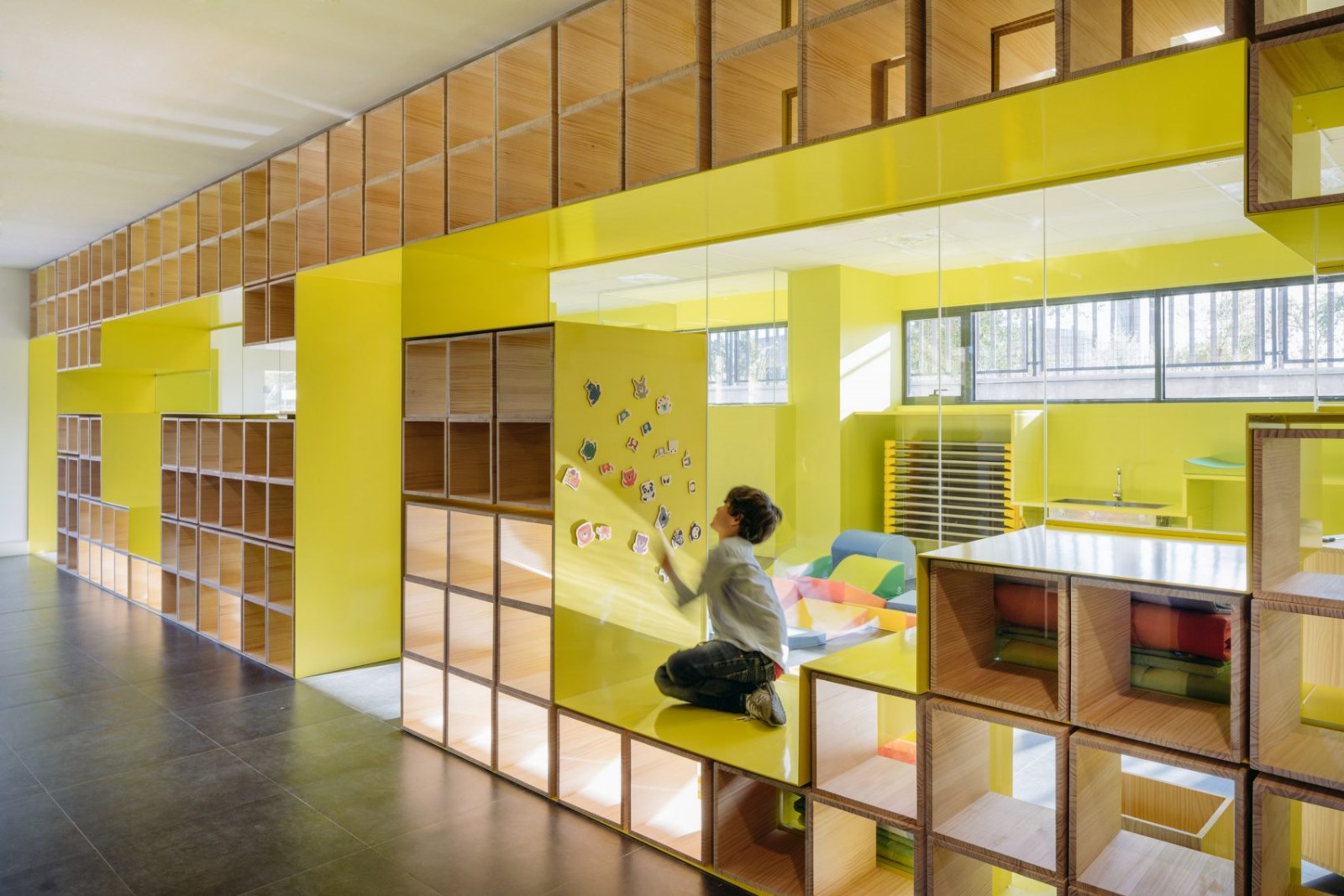
社交区,这是健身房的核心!这就是分享的开始,人们在那里发现共谋和交朋友。这是麦斯健身馆的起点,也是它的终点。这是一个凝聚和中心空间,在这里,欢乐是恒定的。如何展示这一中心地位是构建这一领域的座右铭。从入口到接待处,在路面上使用黄色油漆构成了整个路线,增强了品牌环境,使其具有优势。黄色在所有的空间中显露出来,在墙壁、天花板、家具之间徘徊,被一种具有传染性的能量污染。白色和灰色最终与黄色保持了适当的平衡,通过了一种复杂的氛围。图上,增加了另一层,这是设计来突出-通过图形符号的加号()-运动,方向和能量作为一个优势元素在健身房内,就像一个触觉强度计!
SOCIAL AREAS This is the gym core! This is where the sharing begins, where people discover complicity and make friends. This is where the MAIS FITNESS gym path starts and also where it ends. This is an agglutinating and central space, where conviviality is constant. How to demonstrate this centrality was the motto to structure this area. The application of a yellow paint on the pavement structures the entire route from the entrance to the reception, enhancing the brand environment and giving it preponderance. The yellow reveals itself in all the space, wandering between the walls, the ceiling, the furniture, contaminating with a contagious energy. The white and the gray end up doing the right balance with the yellow, passing an atmosphere of sophistication. Graphically, another layer was added, which was designed to highlight - through the graphic symbolism of the plus word (+) - motion, directions and the energy as a preponderant element inside the gym, as if it were a tactile intensity meter!
在休息区,环境变得更加白皙,让美丽的景色和随意摆放的绿色元素占据优势,激发出一定的情感放松和幸福感,并结合舒适和放松的家具。
In the lounge area, the ambience becomes whiter, giving preponderance to the fabulous view and the green elements that are randomly placed, stimulating a certain emotional relaxation and well-being, combined with the comfortable and relaxed furniture.
走廊到处都充满能量,因此有必要创造中立和减压的空间。这是通过这条走廊实现的,它最终是为新的锻炼阶段做准备,或者是从最后一次锻炼中恢复过来的。在充满活力的时刻之间,它始终是一个通道。白色是主要的颜色。镜子创造的视觉效果将我们引向无穷远。
CORRIDOR With so much energy everywhere, there was the need to create neutral and decompression spaces. That is achieved by this corridor, which ends up being the point of preparation for a new workout session, or to recover from the last workout. It is always a point of passage between energetic moments. White is the dominant color. The visual effect created by the mirrors leads us to the infinity.
旋转工作室这种类型的训练速度,动作,眩晕.正是这些原则决定了这个工作室的设计策略。镜子创造的乘数的优美效果,创造了无限的感觉,就像漩涡一样,增强了那些踩着东西的人的感觉。为了使这一效果更加戏剧化,画了线来强调那些想要达到他们自己设定的目标的人的运动和意志。还有一些与图形元素相关的崇拜空间的光环,旨在探索与这一特定培训课程相关的某种神秘感的创造。
SPINNING STUDIO This type of trainning transpires speed, movement, vertigo .... And it was with these principles that the design strategy for this studio was defined. The scenic effect of multiplication created by the mirrors, which create a feeling of infinity, resembling a vortex, intensifies the sense of those who are pedaling towards something. To make this effect more dramatic, lines were painted to emphasize the movement and the will of those who intend to reach the goal they set himself up. There is also some aura of worship space associated with the graphic elements, which were intended to be explored in the creation of a certain mystique associated to this particular training sessions.
健身工作室这是玛斯健身礼拜场所。所有能量的引擎。这里的强度达到极限。所以我们没有感觉到视觉过度的需要。我们试图通过粉刷天花板和部分墙壁的灰色来使空间更受欢迎,因为它有很大的垂直尺寸,我们打赌通过白色表面的水平性来强调舞台的存在。通过在入口门廊上应用玻璃彩色乙烯基薄膜,在色彩层次上具有独特的特性,旨在创造一种独特的惊喜元素,能够为培训课程增添更多的活力。
FITNESS STUDIO This is MAIS FITNESS worship place. The engine of all the energy. Here the intensity goes up to the limit. So we did not feel the need for visual excesses. We sought to make the space more welcoming through the painting of the ceiling and part of the walls in gray, due to its large vertical dimension, and we bet in emphasizing the stage presence through the horizontality of the white surfaces. Through the application of a glass color vinyl film on the entrance porch, with unique characteristics at the chromatic level, it is intended to create a unique element of surprise, capable of adding more dynamics to the training sessions.
地下空间来了,我的健身更黑暗的一面。一个能量不同的空间.。更具腐蚀性.。一个打破障碍和限制的空间,可以走得更远。与我们内心的自我斗争,追求完美。一个黑暗,可怕,但充满挑战的环境。考虑到战斗环作为设计的起点参考,尼龙网被用于为不同的空间创建边界。黄色的存在使我们永远不会失去这样的观念,我们继续在健身房,只有你需要的是跟随颜色,以回到光明!
UNDERGROUND SPACE Here comes MAIS FITNESS darker side. A space with a different energy.... More corrosive ... a space to break down barriers and limits, to go further. To struggle with our inner selves, in search of perfection. A dark, intimidating, but challenging environment. Having in mind fighting rings as a starting point reference for the design, the nylon mesh was applied to create the boundaries for different spaces. The presence of the yellow color makes us never lose the notion that we continue inside the gym, and that only you need is to follow the color to return to the light!
Location R. Cruz de Barro 16, 2560-241 Torres Vedras, Portugal
Authors João Amaral, Manuela Tamborino
Photographer Invisiblegentleman
 举报
举报
别默默的看了,快登录帮我评论一下吧!:)
注册
登录
更多评论
相关文章
-

描边风设计中,最容易犯的8种问题分析
2018年走过了四分之一,LOGO设计趋势也清晰了LOGO设计
-

描边风设计中,最容易犯的8种问题分析
2018年走过了四分之一,LOGO设计趋势也清晰了LOGO设计
-

描边风设计中,最容易犯的8种问题分析
2018年走过了四分之一,LOGO设计趋势也清晰了LOGO设计


 PintereAI


