Step House Bureau de Change Architects
2018-05-16 03:00
© Ben Blossom
本花


架构师提供的文本描述。而不是更预期的玻璃结构,这一创新的增加重新设想了传统的梯田房屋延伸,庆祝和提升了简陋的砖块。砖的内在潜力,作为一个可堆叠的模块,是最大限度地创造一个更雕塑的表现材料。
Text description provided by the architects. Instead of the more expected glass structure, this innovative addition reimagines the conventional terraced-house extension, celebrating and elevating the humble brick. The brick’s inherent potential as a stackable module is maximized to create a more sculptural expression of the material.
© Ben Blossom
本花


Ground Floor Plan


© Ben Blossom
本花


利用从房屋结构中回收的砖块,延伸部分利用光图的权利,创造出一种交错的挤压形式,使之似乎与现有的结构融为一体。这种由砖块产生的有节奏的踏步在整个内部得到了回响,并被整合到计划和部分中。从上面的露台上看,这一形式创造了一个引人注目的轮廓-这是一个罕见的特点,在更直截了当的补充。
Using bricks reclaimed from the fabric of the house, the extension exploits the rights of a light diagram to create a staggered, extruded form that appears to melt away from the existing structure. This rhythmic stepping generated by the brick is echoed throughout the interior and is integrated into both the plan and section. Viewed from the terrace above, the form creates a striking silhouette – a feature rare in more straightforward additions.
© Ben Blossom
本花


在室内,室内环境被经过深思熟虑的空间排序而戏剧化-将广阔的底层改造成一段经过精心设计的环境的旅程。标准的布局已经被翻转,厨房在房子的前部占据了新的位置-这是一个经常被人忽视的、被遗忘的空间。在这里,房子的原始特征保留下来,强调深色和材质色调。向前移动,空间以从黑暗到光明的顺序展开-强化了加法的明亮,巨大的感觉。
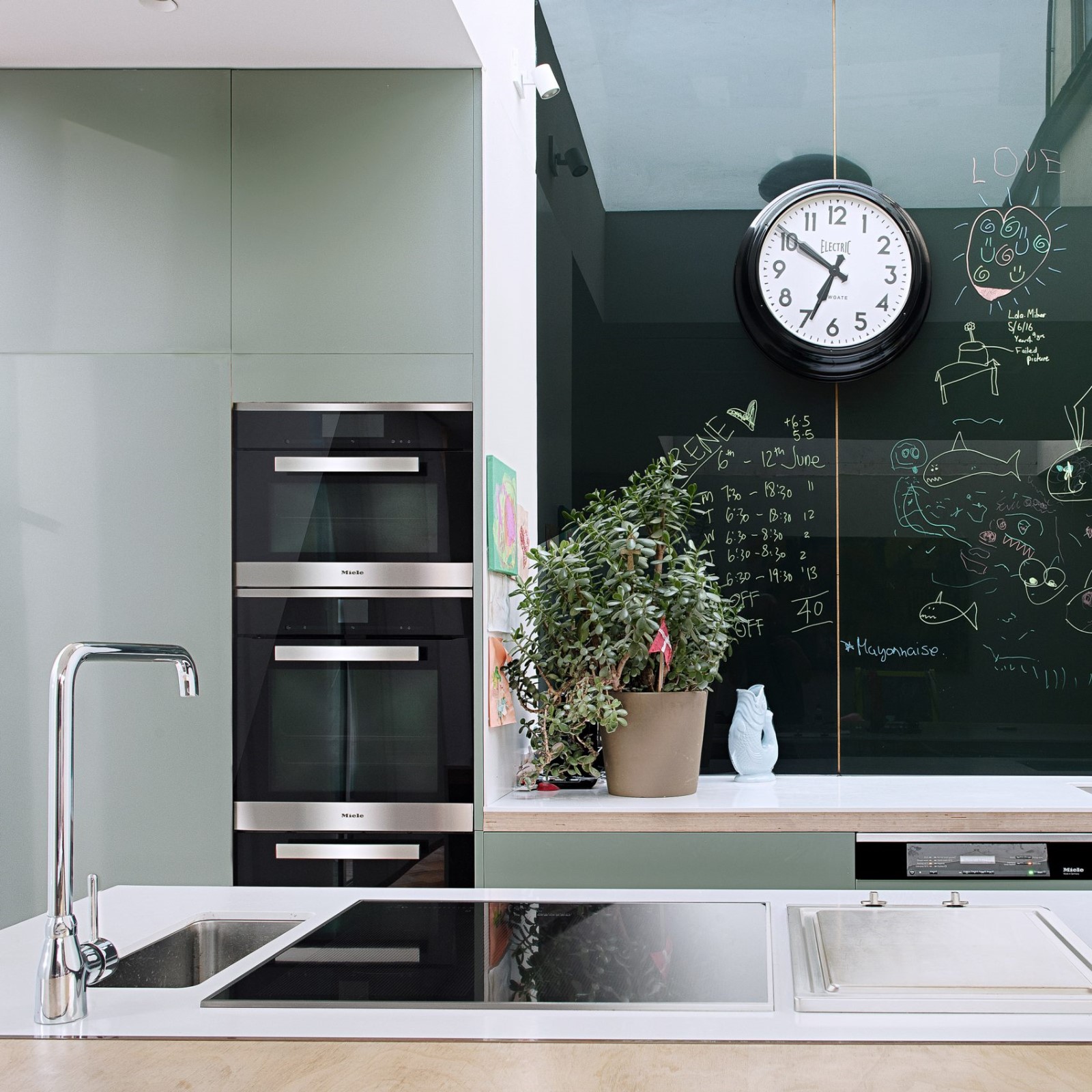
Inside, the domestic setting is dramatized by a considered sequencing of spaces – transforming the expansive ground floor into a journey through carefully designed ambiances. The standard layout has been flipped, with the kitchen taking its new place at the front of the house – an often underused, forgotten space. Here, the original features of the house are retained, emphasized by dark colors and material tones. Moving onward, the spaces unfold in a sequence from dark to light – intensifying the bright, voluminous feel of the addition.
© Ben Blossom
本花


© Ben Blossom
本花


在中心,餐厅的标志是地板处理的改变:狭小的木板,在厨房的光滑混凝土和延伸部分的粗粒混凝土之间,有对向接缝的过渡。一口轻巧的水井确保了整个计划的深度明亮,并为室内提供了片刻的停顿。在这里,在分面玻璃与阶梯式砖块相遇的地方,这个概念的几何学被强调了。
In the center, the dining room is marked by a change in floor treatment: narrow timber planks with aligned seams transition between the smooth concrete of the kitchen and the roughly-grained concrete of the extension. A light-well ensures the full depth of the plan is bright and provides a moment of pause within the interior. Here, where the faceted glass meets stepped brick, the geometry of the concept is accentuated.


与结构工程师密切合作,在延伸部分创造了一个完全没有柱的空间,使用激光切割的双向阶梯梁来支撑一楼。该结构的附加是集成到设计中,从开始手牵手创造的外观,第一层是沉入延伸。留下的砖暴露在里面和外面,庆祝的方式,尊重现有的房子,同时明显偏离了传统的语言的历史建筑。
Working closely with the structural engineers, an entirely column-free space has been created in the extension, using laser-cut, double-direction stepped beams to support the first floor. The structure of the addition is integrated into the design from the start – working hand-in-hand to create the appearance of a first floor that is sunken into the extension. The brick left exposed inside and out, is celebrated in a way that respects the existing house while clearly departing from the traditional language of the historic architecture.
© Ben Blossom
本花


Architects Bureau de Change Architects
Location London, United Kingdom
Area 260.0 m2
Project Year 2018
Photographs Ben Blossom
Category Extension
Manufacturers Loading...

 PintereAI


