Campo de Ourique IV Apartament João Tiago Aguiar Arquitectos
2018-07-06 15:00
© Fernando Guerra | FG+SG
费尔南多·格拉


架构师提供的文本描述。宽敞的面积,公寓覆盖了整层的建筑物,它是集成的。在大楼中央的楼梯井周围,一间高度分隔的公寓形成了一个复杂的内部循环区。
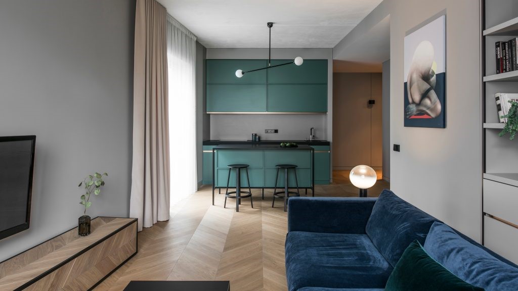
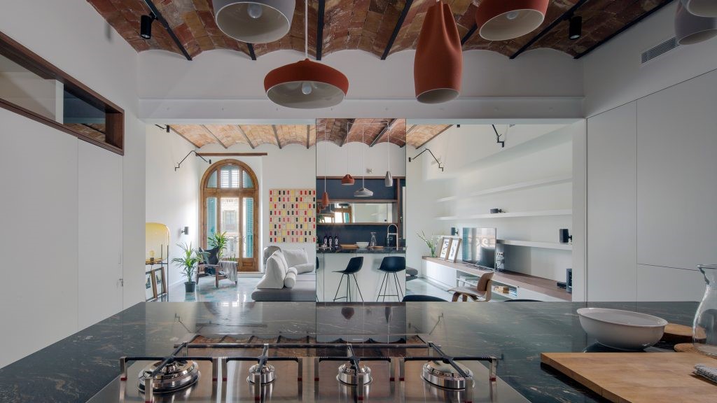
Text description provided by the architects. Of generous dimensions, the apartment covers the whole floor of the building in which it is integrated. Around a stairwell placed in the middle of the building a highly partitioned apartment develops with a complex interior circulation zone.


修复工程涵盖了整个公寓,从厨房的全部翻新到新隔间的创建,例如一个储藏室、一个额外的浴室和一个带步行壁橱的套房。流通区的振兴应该强调,在入口处创建一个大橱柜,然后是一个背光的酒窖,在通往厨房的路上。酒窖有着特殊的力量,因为它就像一个架子,支撑着整个走廊的墙壁,以一种意想不到的方式改变了公寓的第二个区域。
The restoration covered the entire apartment, from the total refurbishment of the kitchen to the creation of new compartments such as a storage room, an additional bathroom and a suite with a walking closet. The revitalization of the circulation area should be stressed with the creation of a big cabinet in the entrance hall followed by a backlit wine cellar, on the way through to the kitchen. The wine cellar has special empowerment since it is like a rack that underlays the entire wall of the corridor, transforming in an unexpected way a secondary area of the apartment.
© Fernando Guerra | FG+SG
费尔南多·格拉


厨房完全被水泥覆盖,与公寓的古典氛围形成鲜明对比,创造了一个例外时刻。两个平行的台面设计了埃斯特雷兹白色大理石涂层,与上和下柜所有对齐。洗衣房放在窗户旁边。
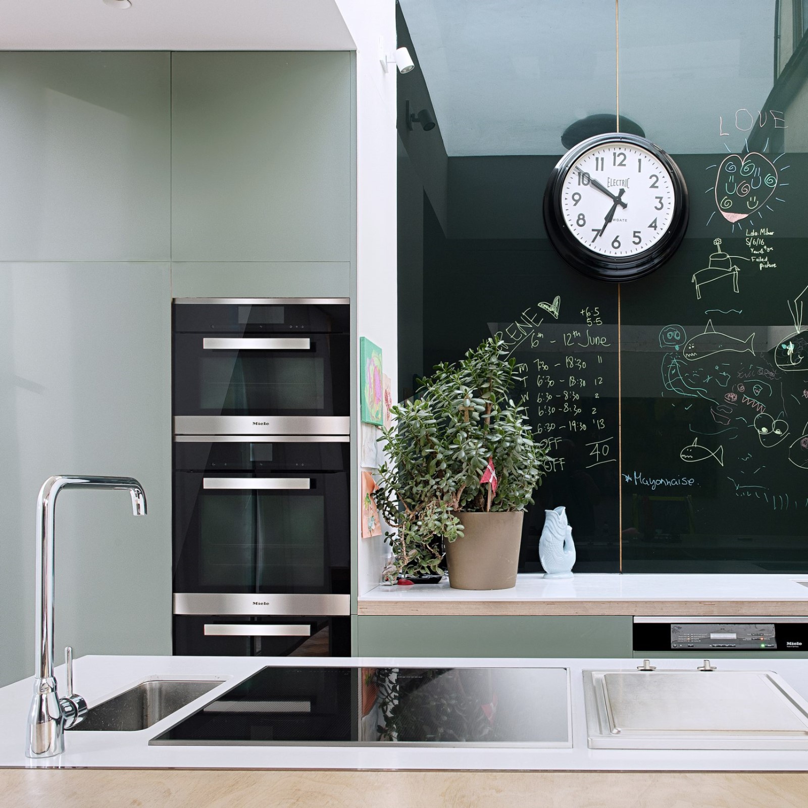
The kitchen, totally covered in cement, contrasts with the classical atmosphere of the apartment and creates a moment of exception. Two parallel countertops were designed coated in Estremoz white marble, with the upper and lower cabinets all aligned. The laundry area was placed next to the window.
© Fernando Guerra | FG+SG
费尔南多·格拉


至于浴室区,它经过了彻底的翻新,原来有2间,现在有3间,其中一间是客人厕所,另一间是用来支撑卧室的,另一间是新套房的。如前面所述,新橱柜的引入在划分和创建新区域方面具有特殊作用。设计了不同形状的天花板上的灯箱,以使循环和浴室等最内部空间的照明多样化。在客人卫生间和套间浴室中,白色和大理石获得突出地位。至于儿童浴室的水泥是以一种更非正式的方式使用的,从而造成了使用者的差别。在行走的壁橱里,浴室的大门在壁橱的一扇门上被弄得模棱两可。
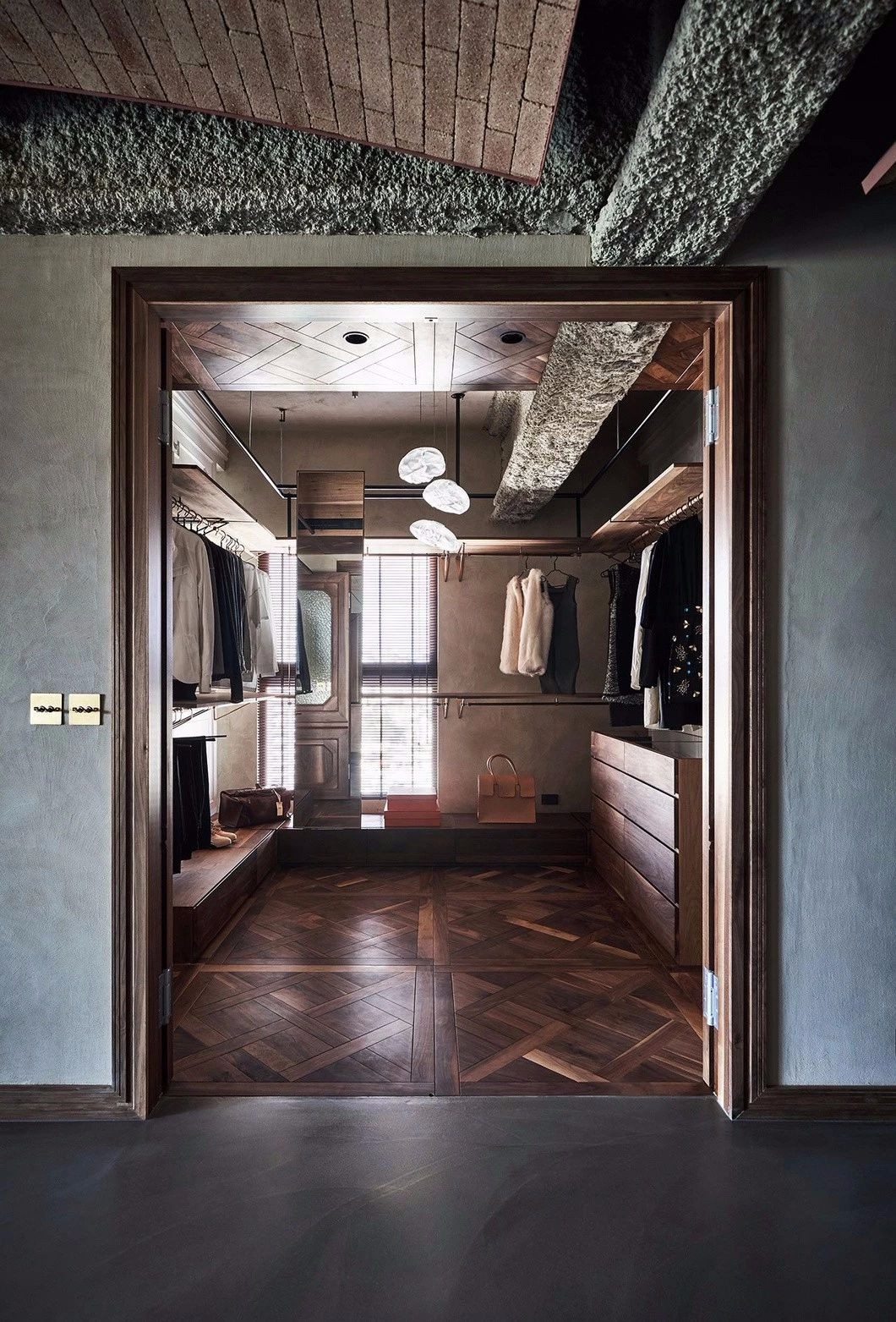
As for the bathroom block, it was totally refurbished and where it used to exist 2 now exist 3, being one of them a guest toilet, other to support the bedrooms and another for the new suite. The introduction of new cabinets has a special role in the partitioning and creation of new areas as described before. The design of light boxes in the ceilings with different shapes was exploited in order to diversify the lighting of the innermost spaces such as circulation and bathrooms. In the guest toilet and suite bathroom the white color and marble stone gain prominence. As for the children’s bathroom cement was used in a more informal way, thus creating a differentiation of users. In the walking closet, the entrance door to the bathroom is dissimulated in one of the doors of the closet.
© Fernando Guerra | FG+SG
费尔南多·格拉


Architects João Tiago Aguiar Arquitectos
Location Lisbon, Portugal
Author Architect João Tiago Aguiar
Team Ruben Mateus, André Silva, João Nery Morais, Rita Lemos, Laura Cettolin, Arianna Camozzi, Maria Sousa Otto, Ricardo Cruz, Renata Vieira
Area 245.0 m2
Project Year 2016
Photographs Fernando Guerra | FG+SG
Category Apartment Interiors
Manufacturers Loading...

 PintereAI


