Designing a new home for a blind client So - So Studio
2018-08-23 02:00
架构师提供的文本描述。设计一个既优雅又直观的智能空间
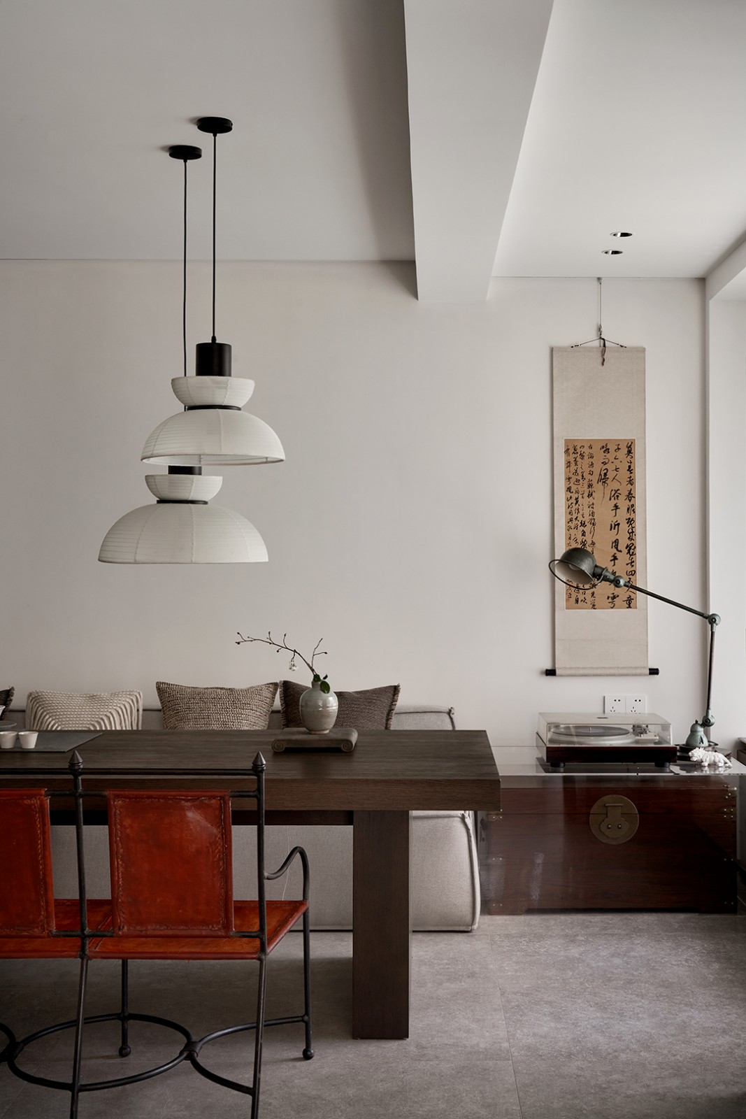
Text description provided by the architects. Designing a smart space, both elegant and intuitive was the intent in So & So Studio’s recently completed home for a blind woman in Thiene, Italy. When their client was ready for what she called “home” for fifty-five years to change, the designers elected to implement a natural process of adjustment and way-finding for the vision impaired woman to navigate her new space.
© Stefano Calgaro
斯特凡诺·卡尔加罗(Stefano Calgaro)


© Stefano Calgaro
斯特凡诺·卡尔加罗(Stefano Calgaro)


对于一个盲目的房主来说,学习新环境的过程不仅对空间的功能至关重要,而且对家里的日常生活也至关重要。所以从第一天开始,这个项目的首要主题就产生于一种简单的字形语言。通过彻底的石瓷材料选择来实现,所以
For a blind homeowner, the process of learning a new environment is vital to not only the function of the space but to the daily life within that home. So from day one, the overarching theme of the project grew out of a simple glyphic language. Realized through thorough material selections of stone and porcelain, So & So Studio aimed to find the perfect balance of textures to guide the end user of the home between program elements using an embedded map system.
© Stefano Calgaro
斯特凡诺·卡尔加罗(Stefano Calgaro)


在设计的第一步是定位周围的空间,一个单一的走廊脊柱,尽量减少任何潜在的迷宫效应,并确保有效率的移动整个房子。在中央通道的三个主要点,入口处都有入口,可以从车库、前门和后露台进入。中央走廊连接两个主要空间,卧室和厨房,贯穿整个房子,沿途连接着客房、浴室和客厅的节点。
The first step in the design was to orient the spaces around a singular corridor spine, minimizing any potential maze effect and ensure efficient movement throughout the house. At the three main points of the central path, the entrances are located, giving access from the garage, the front door and the back patio. The central hallway connects the two main spaces, the bedroom and kitchen, through the entire house, with nodes along the way for the guest room, bathroom and living room.


© Stefano Calgaro
斯特凡诺·卡尔加罗(Stefano Calgaro)


在这间房子里,他们与客户直接合作,以找出她的日常习惯和典型的道路。这确保了家庭的直观组织,帮助缓解了她两栋房屋之间日常活动的过渡;旧的和新的。每个日常使用或活动都成为这样的节点
Within this house, they worked directly with the client to map out her daily habits and typical path. This ensured an intuitive organization of the home and helped to ease the transition of daily activities between her two houses; old and new. Each daily use or activity became a node in So & So Studio’s house map. They then needed to incorporate within the design a language to communicate their design decisions to the client for physical use. This process began first in the way they explained their ideas to the client. The designers continued to use the digital world to work and design, but utilized the physical world in model form as the tool for communicating any changes to the layout.
© Stefano Calgaro
斯特凡诺·卡尔加罗(Stefano Calgaro)


通过消除门限和不必要的材料变化,所以
By eliminating door thresholds and unnecessary material change, So & So Studio created a spatial continuity throughout the house to strengthen the clarity of program nodes within the map and ease the client’s learning curve, moving into her new home. The end result expressed in each node for the client: a glyphic alphabet of simple rules in the floor of the house. In using a textured stone tile within the floor pattern, program nodes are accentuated and a system of way-finding has been activated.
© Stefano Calgaro
斯特凡诺·卡尔加罗(Stefano Calgaro)


Architects So & So Studio
Location Vicenza, Italy
Architect’ Firm So & So Studio
Area 232.0 m2
Project Year 2018
Photographs Stefano Calgaro
Category Houses Interiors
Manufacturers Loading...

 PintereAI


