Office for Communique groupDCA
2018-10-02 21:00
建筑师提供的文字说明。公报营销解决方案办公室Gururam,印度创建了一个现代和平等的工作空间,旨在促进创造力、协作和对话。它的空间规划是这种意图的直接结果:在哪里,选择一种开放规划的办公格式,这是一种透明的象征。该办公室被容纳在一个三层楼的建筑中,该建筑在其眼前的城市环境中创造了一个与众不同的身份。建筑的词汇是无可置疑的Bruratist:立面是一片暴露的混凝土,被测量的Coreen钢的使用打断。
Text description provided by the architects. The Communique Marketing Solutions Office, Gurugram, India, creates a modern and egalitarian workspace in an effort to foster creativity, collaboration, and conversation. Its spatial planning emerges as a direct result of this intent: where, an open-plan office format is chosen that is symbolic of transparency. The office is housed in a three-storeyed building that crafts a distinctive identity for itself within its immediate urban context. The architectural vocabulary is unmistakably brutalist: the facades are an expanse of exposed concrete punctuated by the measured use of corten steel.
Text description provided by the architects. The Communique Marketing Solutions Office, Gurugram, India, creates a modern and egalitarian workspace in an effort to foster creativity, collaboration, and conversation. Its spatial planning emerges as a direct result of this intent: where, an open-plan office format is chosen that is symbolic of transparency. The office is housed in a three-storeyed building that crafts a distinctive identity for itself within its immediate urban context. The architectural vocabulary is unmistakably brutalist: the facades are an expanse of exposed concrete punctuated by the measured use of corten steel.
在一楼,一个短的门廊引导游客到入口门厅。上层的工作空间在一个无缝的两层空间内,可以容纳多种功能。为了优化无眩光日光对这一体积的渗透,它的南北边缘被设计成多孔;开窗方案是通过一种基于度量的日光分析得出的。为了减少进入建筑物的热量,西边-形成它的主要外墙-被一堵厚厚的墙和一层额外的隔热层完全堵住了。
On the ground floor, a short porch leads the visitors to the entrance foyer. The upper floors house the workspaces within a seamless two-floor volume, accommodating a diverse mix of functions. In order to optimize penetration of glare-free daylight into this volume, its northern and southern edges are designed to be porous; the fenestration scheme was arrived at through a metric-based daylight analysis. To reduce the ingress of heat into the building, the western edge – which forms its primary façade – is completely blocked with a massive wall and an added layer of insulation.
On the ground floor, a short porch leads the visitors to the entrance foyer. The upper floors house the workspaces within a seamless two-floor volume, accommodating a diverse mix of functions. In order to optimize penetration of glare-free daylight into this volume, its northern and southern edges are designed to be porous; the fenestration scheme was arrived at through a metric-based daylight analysis. To reduce the ingress of heat into the building, the western edge – which forms its primary façade – is completely blocked with a massive wall and an added layer of insulation.
该卷的亮点是一个阁楼会议室,漂浮在一个圆形剧场风格的,多用途的活动区域之上。第三层被认为是一个巨大的统一空间;健康中心站在地板中央,向两边宽阔的露台开放。这提供了一个不间断的空间,可以主办多种公共活动,如瑜伽和祈祷会议,以及聚会。
The highlight of the volume is a mezzanine conference room that floats above an amphitheater-style, multipurpose event area. The third floor is conceived as a large unified space; the Wellness Centre stands centrally in the floor-plate, opening to wide terraces on both sides. This provides an uninterrupted space that can host a multitude of communal events such as yoga and prayer meetings, and parties.
The highlight of the volume is a mezzanine conference room that floats above an amphitheater-style, multipurpose event area. The third floor is conceived as a large unified space; the Wellness Centre stands centrally in the floor-plate, opening to wide terraces on both sides. This provides an uninterrupted space that can host a multitude of communal events such as yoga and prayer meetings, and parties.
更大的设计策略-生物友好型-致力于加强人类与自然的接触,以创造出促进幸福、健康和幸福的工作空间。大窗户,内衬花盆,设计沿北边缘和南边的地板;他们开放给周围的绿色美丽的景观,而他们的精心放置和大小确保充足的日光进入。此外,垂直绿色墙沿整个两层楼长的体积沿其东西的边缘。这一策略也与优化建筑物热性能的尝试相结合。所有的窗户都是双层玻璃的,而玻璃羊毛则是西方外墙上的绝缘材料。
The larger design strategy – biophilia – endeavors to enhance human engagement with nature in order to craft working spaces that promote happiness, good health, and well-being. Large windows, lined with planters, are designed along the northern and southern edges of the floor-plates; they open to beautiful views of the surrounding greens, while their careful placement and sizing ensures adequate daylight ingress. In addition, vertical green walls run along the entire two-floor length of the volume along its eastern and western edges. This strategy ties in with the attempt to optimize the building’s thermal performance as well. All of the windows are double-glazed, while glass wool is used as an insulating material on the western façade.
The larger design strategy – biophilia – endeavors to enhance human engagement with nature in order to craft working spaces that promote happiness, good health, and well-being. Large windows, lined with planters, are designed along the northern and southern edges of the floor-plates; they open to beautiful views of the surrounding greens, while their careful placement and sizing ensures adequate daylight ingress. In addition, vertical green walls run along the entire two-floor length of the volume along its eastern and western edges. This strategy ties in with the attempt to optimize the building’s thermal performance as well. All of the windows are double-glazed, while glass wool is used as an insulating material on the western façade.
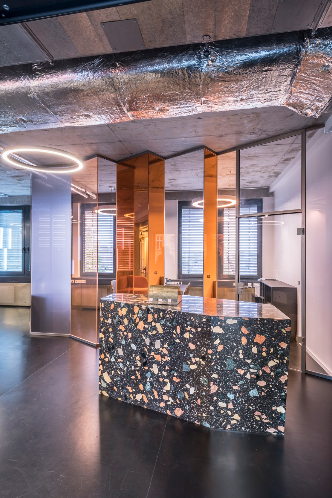
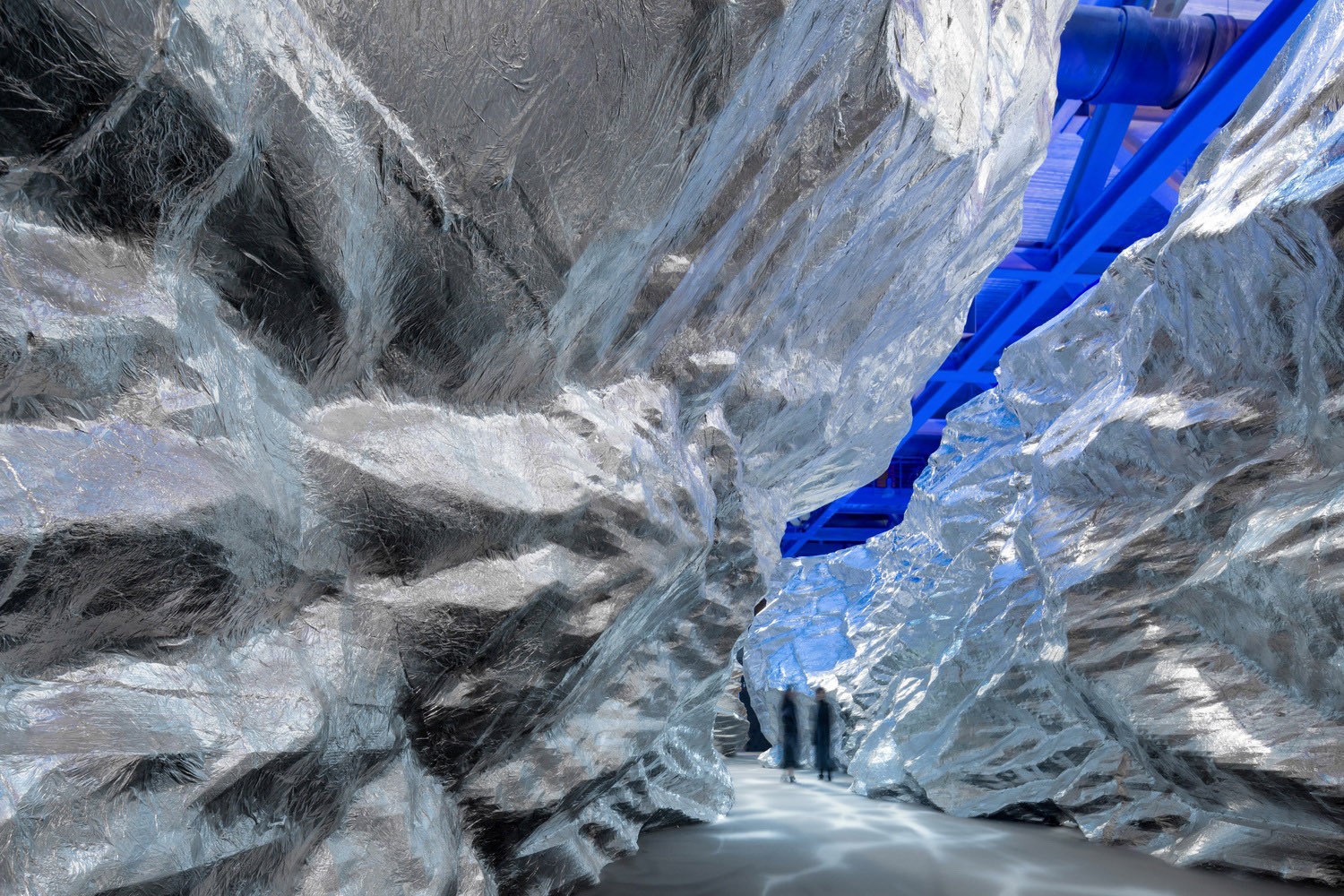
室内空间是对残酷物质的庆祝。墙壁和天花板表面-混凝土、砖块和球状钢-暴露在自然的、未完成的状态中。家具是用桦木胶合板雕刻的,而地板主要是用当地采购的多种颜色的石灰石制作的。空调管道具有雕塑般的品质;不加掩饰,它们似乎漂浮在半空中,增加了空间的原始和工业外观。这些材料的选择有助于大大降低维护成本,同时提高空间的用户体验。
The interior spaces are a celebration of brutal materiality. The wall and ceiling surfaces –concrete, brick, and corten steel – are left exposed in their natural, unfinished states. The furniture is carved out of birch plywood, while the flooring is largely done in locally procured, multi-hued limestone. The air-conditioning ducts take on a sculpturesque quality; left unconcealed, they seem to float in mid-air, adding to the raw and industrial look of the space. These material choices help bring down maintenance costs significantly, while simultaneously enhancing user experience of the spaces.
The interior spaces are a celebration of brutal materiality. The wall and ceiling surfaces –concrete, brick, and corten steel – are left exposed in their natural, unfinished states. The furniture is carved out of birch plywood, while the flooring is largely done in locally procured, multi-hued limestone. The air-conditioning ducts take on a sculpturesque quality; left unconcealed, they seem to float in mid-air, adding to the raw and industrial look of the space. These material choices help bring down maintenance costs significantly, while simultaneously enhancing user experience of the spaces.
印度古鲁格拉姆社区营销解决方案办公室提供了一个工作空间,除了提高用户的专业生产力外,还可以提高他们的工作效率,因为它创建了一种崇尚透明度、思想自由和协作的建筑-本质上是社会主义的建筑。
The Communique Marketing Solutions Office, Gurugram, India, provides a workspace that augments the well-being of its users in addition to their professional productivity, by creating architecture that celebrates transparency, free thought, and collaboration –architecture that is inherently socialist at its heart.
The Communique Marketing Solutions Office, Gurugram, India, provides a workspace that augments the well-being of its users in addition to their professional productivity, by creating architecture that celebrates transparency, free thought, and collaboration –architecture that is inherently socialist at its heart.
 举报
举报
别默默的看了,快登录帮我评论一下吧!:)
注册
登录
更多评论
相关文章
-

描边风设计中,最容易犯的8种问题分析
2018年走过了四分之一,LOGO设计趋势也清晰了LOGO设计
-

描边风设计中,最容易犯的8种问题分析
2018年走过了四分之一,LOGO设计趋势也清晰了LOGO设计
-

描边风设计中,最容易犯的8种问题分析
2018年走过了四分之一,LOGO设计趋势也清晰了LOGO设计


 PintereAI


