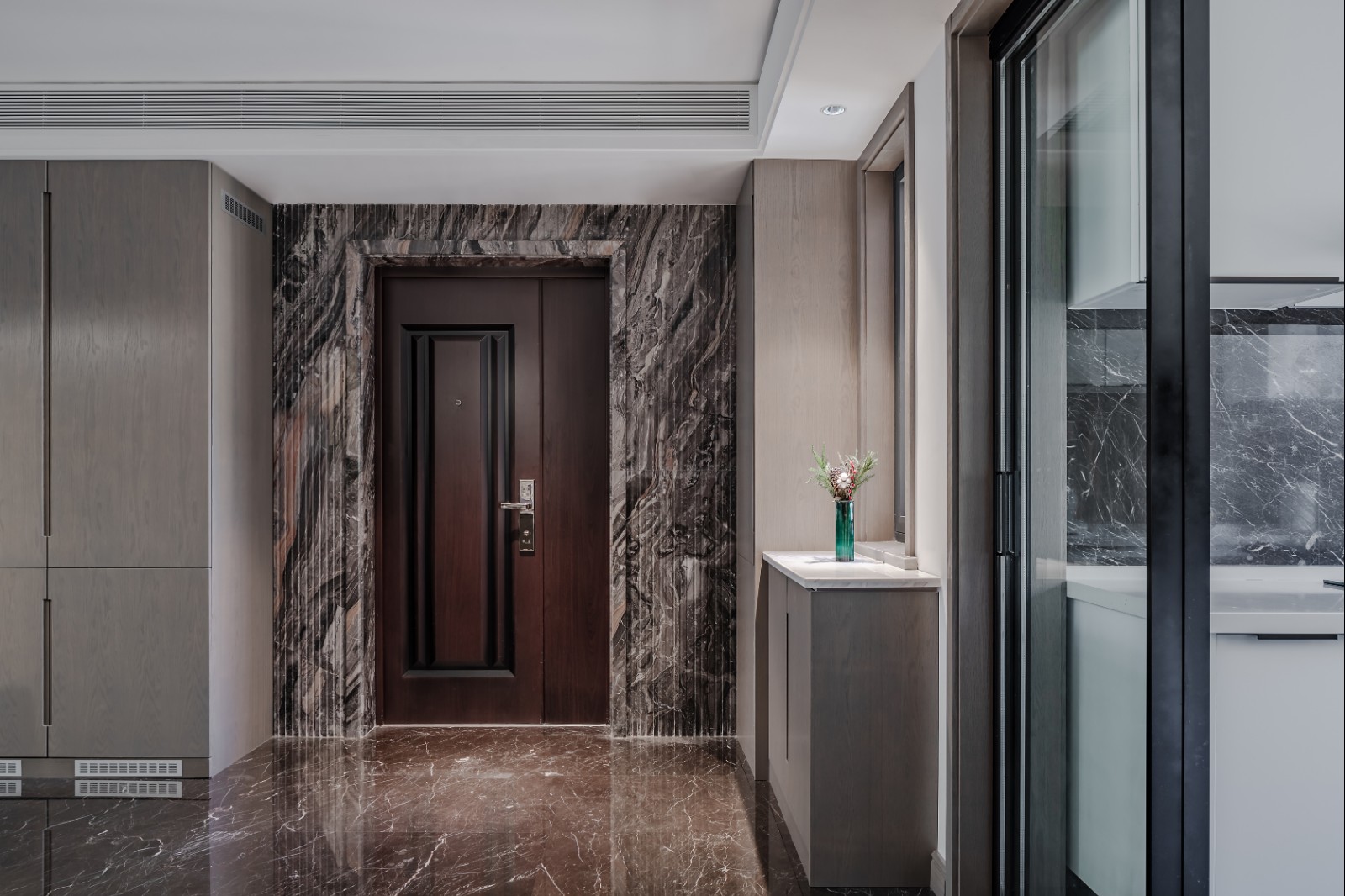
FinUp Office Design hyperSity
2018-11-20 20:00
架构师提供的文本描述。该项目的客户是一家年轻的互联网金融公司。公司的主要思想来源于“让金融有温度”。该公司首席执行官强调,创造一个简单、透明和平等的办公空间是设计开始时的先决条件。因此,设计理念强调平等和自由的地位,消除传统的隔间和封闭感。
Text description provided by the architects. The client of the project is a young Internet finance company. The main idea of the company is derived from "let finance have temperature". The company CEO emphasizes that making a simple, transparent and equal office space is the precondition given at the beginning of the design. Therefore, the concept of the design emphasizes the status of equality and freedom, to remove traditional cubicles and the sense of containment.
Text description provided by the architects. The client of the project is a young Internet finance company. The main idea of the company is derived from "let finance have temperature". The company CEO emphasizes that making a simple, transparent and equal office space is the precondition given at the beginning of the design. Therefore, the concept of the design emphasizes the status of equality and freedom, to remove traditional cubicles and the sense of containment.
作为在后工业时代追求轻松、本地和资源工作场所的一项实验工作,整个办公室遵循由扎哈·哈迪德设计的Galaxy Soho概念,呈现出个性化的曲线模式。它不局限于传统的内向和孤立的分工模式,它是一种愿望,创造一个愉快的心情,如公园和游乐场。
As a experimental work to pursue a relaxed, local, and resource workplace in the post-industrial era, the whole office is personalized curvy pattern following the concept of Galaxy Soho designed by Zaha Hadid. Instead of being confine to a traditional introversion and isolation mode of working division, it is a desire to create a happy mood like a park and a fairground.
As a experimental work to pursue a relaxed, local, and resource workplace in the post-industrial era, the whole office is personalized curvy pattern following the concept of Galaxy Soho designed by Zaha Hadid. Instead of being confine to a traditional introversion and isolation mode of working division, it is a desire to create a happy mood like a park and a fairground.
办公室的布局是一个圆形的形式,在原来的结构中有许多对角线柱。首先,建筑师将不同的功能空间定量化为三维空间,如工作区、会议室、孵化器、展厅、贵宾室等;交通空间允许人们有效地到达任何地方。其次,通过创建静息区来隐藏原隔墙,形成了大量不规则的角点空间。
The layout of the office is a circular form, with a lot of diagonal columns in the original structure. Firstly, the architect quantified different functional space into three-dimensional box, such as the working area, meeting room, incubator, exhibition hall and VIP room, etc. The traffic space allows people arriving any place efficiently. Secondly, lots of irregular corner spaces were shaped by creating resting area to hide the original partition wall.
The layout of the office is a circular form, with a lot of diagonal columns in the original structure. Firstly, the architect quantified different functional space into three-dimensional box, such as the working area, meeting room, incubator, exhibition hall and VIP room, etc. The traffic space allows people arriving any place efficiently. Secondly, lots of irregular corner spaces were shaped by creating resting area to hide the original partition wall.
该设计在本地插入垂直水平,以生产多个活动。例如,在一些较低级别的公共讨论领域,高层形成了一个高平台。公园元素,如滑板,增加了一个更丰富的体验。
The design inserts vertical levels locally for the production of multi-activities. For example, in some public discussion areas in lower levels, a high platform is formed in the upper levels. Park elements such as a slide board are added to bring a richer experience.
The design inserts vertical levels locally for the production of multi-activities. For example, in some public discussion areas in lower levels, a high platform is formed in the upper levels. Park elements such as a slide board are added to bring a richer experience.
综合功能空间容器削弱了场地条件的局限性,突出了原有的建筑特色,合理地解决了空间效率低的问题。由此,有了合作、紧凑、私密的角落,创造了情感互动的领域,实现了多层次场景的重叠状态。
The integrated functional space containers has weaken the limitations of site conditions, and highlight the original architectural features, to reasonably solve the problems of low spatial efficiency. Hereby, there are cooperative, compact and private corners, to create the area of emotional interaction, and achieve the state of multi-level scenes overlapping.
The integrated functional space containers has weaken the limitations of site conditions, and highlight the original architectural features, to reasonably solve the problems of low spatial efficiency. Hereby, there are cooperative, compact and private corners, to create the area of emotional interaction, and achieve the state of multi-level scenes overlapping.
办公室内部设计与Zaha建筑语言的GalaxySOHO的物理量进行协调和对话。在材料选择方面,大部分空间采用木质饰面铺设,并使用金属进行定制。部分半透明和透明的玻璃隔断增加了透明度,最终工作场景是流体和互穿的。
The office interior design makes the coordination and dialogue with the physical quantity of the Galaxy Soho of Zaha’s architectural language. In terms of material selection, most of the space is paved with wooden finish and customized with metal. The partial translucent and transparent glass partition increases transparency, and eventually the work scene is fluid and interpenetrating.
The office interior design makes the coordination and dialogue with the physical quantity of the Galaxy Soho of Zaha’s architectural language. In terms of material selection, most of the space is paved with wooden finish and customized with metal. The partial translucent and transparent glass partition increases transparency, and eventually the work scene is fluid and interpenetrating.
 举报
举报
别默默的看了,快登录帮我评论一下吧!:)
注册
登录
更多评论
相关文章
-

描边风设计中,最容易犯的8种问题分析
2018年走过了四分之一,LOGO设计趋势也清晰了LOGO设计
-

描边风设计中,最容易犯的8种问题分析
2018年走过了四分之一,LOGO设计趋势也清晰了LOGO设计
-

描边风设计中,最容易犯的8种问题分析
2018年走过了四分之一,LOGO设计趋势也清晰了LOGO设计


 PintereAI


