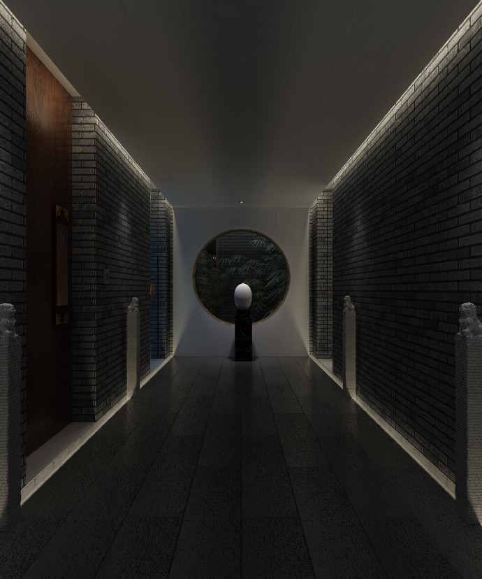
Phoenix Plaza Renovation Design UA GROUP
2018-11-22 21:00
架构师提供的文本描述。南京凤凰广场位于湖南路1号、湖南路与中阳路交界处,东临宣武湖,地铁1号线玄武门站地下。
Text description provided by the architects. Located at No.1 Hunan road, the junction of Hunan road and Zhongyang Road, the Nanjing PHOENIX PLAZA is adjacent to Xuanwu Lake on the east and Xuanwumen Station of Metro Line 1 underground.
Text description provided by the architects. Located at No.1 Hunan road, the junction of Hunan road and Zhongyang Road, the Nanjing PHOENIX PLAZA is adjacent to Xuanwu Lake on the east and Xuanwumen Station of Metro Line 1 underground.
After Renovation_Scene along the Hunan Road. Image © Bowen Hou
主要改造在中阳路、湖南路沿线,以及部分室内中庭,其风格突出如下:
The main transformation is along the Zhongyang Road and Hunan Road as well as the part of indoor atrium, with its style stands out as follows:
The main transformation is along the Zhongyang Road and Hunan Road as well as the part of indoor atrium, with its style stands out as follows:
首先,使用建筑词汇。设计选用约束、简单、干净的形式,而不是复杂的设计。例如,24小时书店所在的红楼是上个世纪的工作。为了表达对旧建筑的尊重并反映更加开放和包容的态度,设计使用一个“一种玻璃盒”来包裹建筑的第一层和第二层。
Firstly, the use of architectural vocabulary. The design chooses restrained, simple and clean form instead of complicated ones. For example, the red building where the 24-hour bookstore located is the work of the last century. In order to express respect for the old building and reflect an even more open and inclusive attitude, the design uses a “glass box” to wrap the first and second level of the building.
Firstly, the use of architectural vocabulary. The design chooses restrained, simple and clean form instead of complicated ones. For example, the red building where the 24-hour bookstore located is the work of the last century. In order to express respect for the old building and reflect an even more open and inclusive attitude, the design uses a “glass box” to wrap the first and second level of the building.
After Renovation_24-hour store. Image © Bowen Hou
玻璃的表面增加了一些侧面的表皮结构,通过玻璃可以看到后面老建筑的痕迹。它不仅使建筑以存在和虚无的视觉效果存在,而且与旧建筑的结合更加优美和诗意。
The surface of the glass adds some lateral skin structure, which can see the traces of the old building behind it through the glass. Not only does it make the architecture exist in a visual effect of existence and nothingness, but also the combination with the old building is more graceful and poetic.
The surface of the glass adds some lateral skin structure, which can see the traces of the old building behind it through the glass. Not only does it make the architecture exist in a visual effect of existence and nothingness, but also the combination with the old building is more graceful and poetic.
After Renovation_Additonal stores along the Zhongyang Road. Image © Bowen Hou
其次,选择材料颜色。主要有三种颜色。第一个是白色。许多铝部件,包括背部支撑的龙骨被视为纯白色。
Secondly, the choice of material color. There are mainly three colors. The first one is white . Many aluminum components, including the keel supported at the back are treated as pure white.
Secondly, the choice of material color. There are mainly three colors. The first one is white . Many aluminum components, including the keel supported at the back are treated as pure white.
After Renovation_Additonal stores along the Zhongyang Road. Image © Bowen Hou
6-Analysis graph of the envelope along Zhongyang Road
After Renovation_Interior of 24-hour store. Image © Bowen Hou
第二个是黑色,最后一个是玻璃的中间颜色,这形成了“黑色、白色和灰色”的三种颜色关系,更符合文化业务的定位。
The second is black and the last one is the middle color of the glass, which forms three color relationships of “black, white and gray” and is more in line with the positioning of cultural business.
The second is black and the last one is the middle color of the glass, which forms three color relationships of “black, white and gray” and is more in line with the positioning of cultural business.
After Renovation_Interior of 24-hour store. Image © Bowen Hou
After Renovation_Interior of 24 hour store. Image © Bowen Hou
最后,业务接口的扩展。在这种设计中,转换点一般是支离破碎和复杂的。但通过有针对性地选择一些重要的节点进行设计,特别是将东中阳路上微弱的架空层改造成一排排商铺,以及这些节点的材质、色彩和划分方式的统一,给人们提供了更加完整、连续的商务界面体验。
Finally, the extension of the business interface. In this design, the points of transformation are fragmented and complicated in general. But through the targeted selection of some important nodes for design, especially the transformation of the faint overhead layer along the Zhongyang Road on the east into a row of shops, and the unification of the material color and the division mode of these nodes, it gives people a more complete and continuous visual experience of the business interface.
Finally, the extension of the business interface. In this design, the points of transformation are fragmented and complicated in general. But through the targeted selection of some important nodes for design, especially the transformation of the faint overhead layer along the Zhongyang Road on the east into a row of shops, and the unification of the material color and the division mode of these nodes, it gives people a more complete and continuous visual experience of the business interface.
After Renovation_View of 24-hour store from Zhongyang Road. Image © Bowen Hou
装修后,从中阳路24小时商店的景观。图片(鲍文侯)
 举报
举报
别默默的看了,快登录帮我评论一下吧!:)
注册
登录
更多评论
相关文章
-

描边风设计中,最容易犯的8种问题分析
2018年走过了四分之一,LOGO设计趋势也清晰了LOGO设计
-

描边风设计中,最容易犯的8种问题分析
2018年走过了四分之一,LOGO设计趋势也清晰了LOGO设计
-

描边风设计中,最容易犯的8种问题分析
2018年走过了四分之一,LOGO设计趋势也清晰了LOGO设计


 PintereAI


