GwangHwaMunHaeMul gongsangplanet
2018-12-08 21:00
概念:古老与现代并存的外观,这座建筑与Gwanghwamunhemul被认为是1940年建造的。我们想要看到Gwanghwamunhemul作为一个适合郑东的品牌,在那里,现代和旧的口味并存,并认为它们在20世纪40年代是现代的和当代的。所以,在我们开始寻找旧的空间外观之前,我们开始熨平木制天花板,金属的内部和外部结构材料,以及现代设计元素。
Concept: Coexistence of old and modern appearance This building with Gwanghwamunhaemul is believed to have been built in 1940. We wanted to see the Gwanghwamunhaemul as a brand suitable for Jeong-dong, where the modern and old tastes coexist, and thought that they were both modern and contemporary in the 1940s. So, before we started to look for the old look of space, we started ironing out the wooden ceiling, the interior and exterior structural material of the metal, as well as the modern design elements.
Concept: Coexistence of old and modern appearance This building with Gwanghwamunhaemul is believed to have been built in 1940. We wanted to see the Gwanghwamunhaemul as a brand suitable for Jeong-dong, where the modern and old tastes coexist, and thought that they were both modern and contemporary in the 1940s. So, before we started to look for the old look of space, we started ironing out the wooden ceiling, the interior and exterior structural material of the metal, as well as the modern design elements.
建筑前面的外观设计立面是在一栋两层楼的建筑中建造的,目的是克服与建筑物大小相比的狭窄缺点,并在二楼挂上鱼群,间接地表达海鲜餐厅的感觉。
Exterior Design Facade in front of the building was constructed in a two-story building to overcome its narrow drawbacks compared to the size of the building, and a fish formation was hung on the second floor to indirectly express the feeling of a seafood restaurant.
Exterior Design Facade in front of the building was constructed in a two-story building to overcome its narrow drawbacks compared to the size of the building, and a fish formation was hung on the second floor to indirectly express the feeling of a seafood restaurant.
为了提高顾客的可达性,他们还创建了一个与停车场相连的大楼后部的入口,随机穿插小窗户以确保白天的照明,晚上则设置暗灯以释放。为了捕捉建筑物背面砖块的外观,它只打算用一个可以清洗和显示的结构来显示防水区域。
In order to increase customer accessibility, they also created an entrance to the back of the building that was attached to the parking lot, randomly pierced small windows to secure lighting during the day, and dim lights at night to let out. To capture the appearance of the brick on the back of the building, it was intended to show the waterproof area only with a structure that could be cleaned and displayed.
In order to increase customer accessibility, they also created an entrance to the back of the building that was attached to the parking lot, randomly pierced small windows to secure lighting during the day, and dim lights at night to let out. To capture the appearance of the brick on the back of the building, it was intended to show the waterproof area only with a structure that could be cleaned and displayed.
室内设计-空间被划分为大型大厅、厨房和房间,柜台被安装在顾客线的中心,考虑到两个入口。这个房间可以作为一个单独的房间供六个人使用,房间和房间之间的墙壁可以作为一组18人使用,而且大厅和房间边界看起来不像一个房间。大厅也是由固定类型的隔断座位构成的,在大厅的一面墙上,柜台旁边的空间被设计成一张单座桌子,为不同的顾客提供更多的选择。
Interior Design The space was divided into large halls, kitchens, and rooms, and counters were installed in the center of the customer's line considering two entrances. And the room can be used as a separate room for six people, and the wall between the room and the room can be used as a group up to 18 people, and the hall and the room boundary did not look like a room. The hall was also constructed of fixed-type partition seats on one wall of the hall, and the space next to the counter was designed to make a single-seat table long to widen the choice for various customers.
Interior Design The space was divided into large halls, kitchens, and rooms, and counters were installed in the center of the customer's line considering two entrances. And the room can be used as a separate room for six people, and the wall between the room and the room can be used as a group up to 18 people, and the hall and the room boundary did not look like a room. The hall was also constructed of fixed-type partition seats on one wall of the hall, and the space next to the counter was designed to make a single-seat table long to widen the choice for various customers.
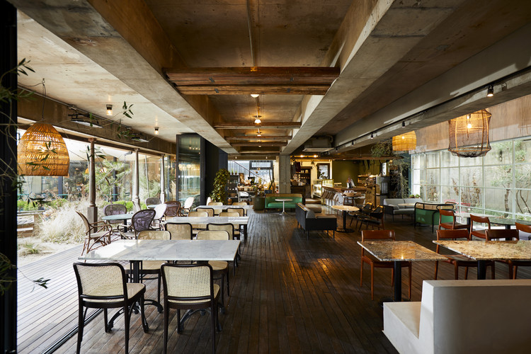
传统木结构形式的山墙已被完善到一定程度的加强结构,并作为元素,允许垂直观察大厅空间和展示过去。此外,在天花板上安装了照明,并在大厅桌子上安装了垂直的下行灯,以便在夜间显示天花板。
Traditional wooden structures in the form of gable have been refined to the extent of strengthening the structure, and used as elements that allow vertical viewing of the hall space and showing the past. In addition, lighting was secured to the ceiling and the vertical downlight was installed on the hall table in order to show the ceiling at night.
Traditional wooden structures in the form of gable have been refined to the extent of strengthening the structure, and used as elements that allow vertical viewing of the hall space and showing the past. In addition, lighting was secured to the ceiling and the vertical downlight was installed on the hall table in order to show the ceiling at night.
没有金属材料从坚固的旧木顶上掉下来,这是现代表达的一部分。隔断是大厅和房间之间的分界线,目的是用金属玻璃对滑动门的形式进行改进,降低房间的天花板,使房间的天花板更加突出,给房间的使用者带来一种舒适的气氛。
The absence of metallic materials falling from the rugged old wooden top serves as a part of modern expression. Partition, which is the boundary between hall and room, was intended to add refinement to the sliding door form using metal + glass, and room ceiling was lowered to accentuate the hall ceiling, giving room users a cozy atmosphere.
The absence of metallic materials falling from the rugged old wooden top serves as a part of modern expression. Partition, which is the boundary between hall and room, was intended to add refinement to the sliding door form using metal + glass, and room ceiling was lowered to accentuate the hall ceiling, giving room users a cozy atmosphere.
 举报
举报
别默默的看了,快登录帮我评论一下吧!:)
注册
登录
更多评论
相关文章
-

描边风设计中,最容易犯的8种问题分析
2018年走过了四分之一,LOGO设计趋势也清晰了LOGO设计
-

描边风设计中,最容易犯的8种问题分析
2018年走过了四分之一,LOGO设计趋势也清晰了LOGO设计
-

描边风设计中,最容易犯的8种问题分析
2018年走过了四分之一,LOGO设计趋势也清晰了LOGO设计


 PintereAI


