PintereAI


Beauty in B.O.W LABOTORY
2018-12-11 20:00
© Choi Yong Joon
(三)崔勇Joon


“B.O.W.中的美”是一家女性健康编辑商店,为那些在工作和生活中保持平衡的女性提供健康的美貌。这个品牌是作为现代百货品牌推出的,它根据与女性健康和美容相关的广泛类别,在一个地方提供多种M.D产品组合,以使消费者能够根据自己的喜好选择产品。
“Beauty in B.O.W” is a women’s wellness editor shop to deliver healthy beauty for women who are keeping balance between work and life. This brand was launched as a Hyundai Department Store brand, and it is offering several product groups of M.D composition according to a wide range of categories related to women’s health and beauty matching certain standards in one place so that consumers can choose products according to their preference.
“Beauty in B.O.W” is a women’s wellness editor shop to deliver healthy beauty for women who are keeping balance between work and life. This brand was launched as a Hyundai Department Store brand, and it is offering several product groups of M.D composition according to a wide range of categories related to women’s health and beauty matching certain standards in one place so that consumers can choose products according to their preference.
© Choi Yong Joon
(三)崔勇Joon

在B.O.W中命名美是从一张白纸开始的。它开始于命名和品牌的概念,只有生活和美容编辑店。在众多的美的概念中,健康的美被认为是平衡的,所以我们认为它是非常重要的。我们把这个重要的观点写在了B.O.W这个词上。B.O.W是“妇女平衡”的缩写。从字面上讲,它指的是女性的平衡感,通过附加描述性的“美”,我们试图直观地强调它是一个美的品牌。
NAMING Beauty in B.O.W began from a white blank paper. It began with naming and branding with only the concept of living and beauty editor shop. Among a wide range of beauty concepts, healthy beauty is considered to keep a balance, so we thought that it is very important. We made the word B.O.W with this important point in mind. B.O.W is a abbreviation for “Balance Of Women.” Literally, it refers to women’s balanced sense and by attaching the descriptive ‘Beauty in’, we tried to emphasize it is a beauty brand intuitively.
NAMING Beauty in B.O.W began from a white blank paper. It began with naming and branding with only the concept of living and beauty editor shop. Among a wide range of beauty concepts, healthy beauty is considered to keep a balance, so we thought that it is very important. We made the word B.O.W with this important point in mind. B.O.W is a abbreviation for “Balance Of Women.” Literally, it refers to women’s balanced sense and by attaching the descriptive ‘Beauty in’, we tried to emphasize it is a beauty brand intuitively.
© Choi Yong Joon
(三)崔勇Joon

当我们想到一个品牌形象时,几件事就会出现在我们的脑海中。当我们想到一个有平衡意识的美丽女人时,谁会出现在我们的脑海中?如果有一个,她会如何管理自己的形象并向其他人展示?她将受到许多人的钦佩,为了保持这种钦佩,她将尝试通过各种方法来保持自己的形象,并展示她设计的外表。因此,我们设计了字体来表达一个有梳子图案的光斑女人的形象,我们设计了一个字体,它提供了一个不过分的平衡的图像。这种设计可用于B.O.W的包装/符号/视觉。
BRANDING When we think of a brand image, several things come into our mind. Who comes into our mind when we think of a beautiful woman with a balanced sense? If there is one, how would she manage her image and reveal it to others? She will be admired by many and to maintain such admiration, she will try to maintain her image through various methods and will reveal her designed appearance. Accordingly, we designed the font to express the image of a spot-light woman with a comb pattern and we designed her with a font that delivers a balanced image that is not excessive. Such designs could be used for B.O.W’s package/symbol/visual.
BRANDING When we think of a brand image, several things come into our mind. Who comes into our mind when we think of a beautiful woman with a balanced sense? If there is one, how would she manage her image and reveal it to others? She will be admired by many and to maintain such admiration, she will try to maintain her image through various methods and will reveal her designed appearance. Accordingly, we designed the font to express the image of a spot-light woman with a comb pattern and we designed her with a font that delivers a balanced image that is not excessive. Such designs could be used for B.O.W’s package/symbol/visual.
© Choi Yong Joon
(三)崔勇Joon

Floor plan

© Choi Yong Joon
(三)崔勇Joon

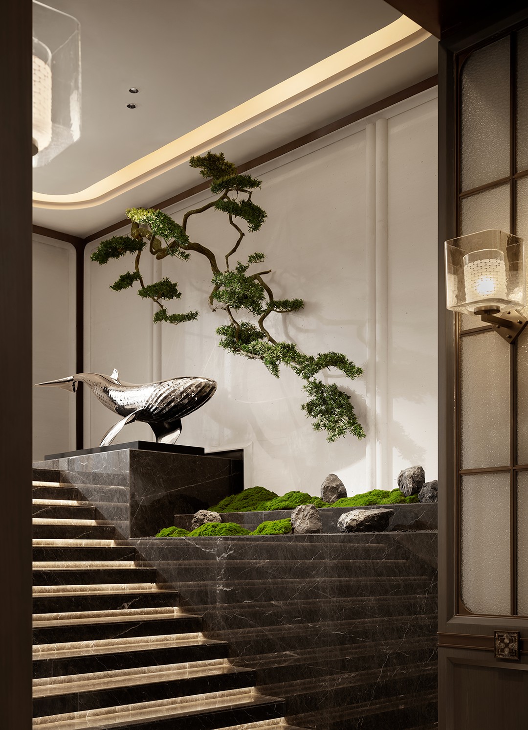
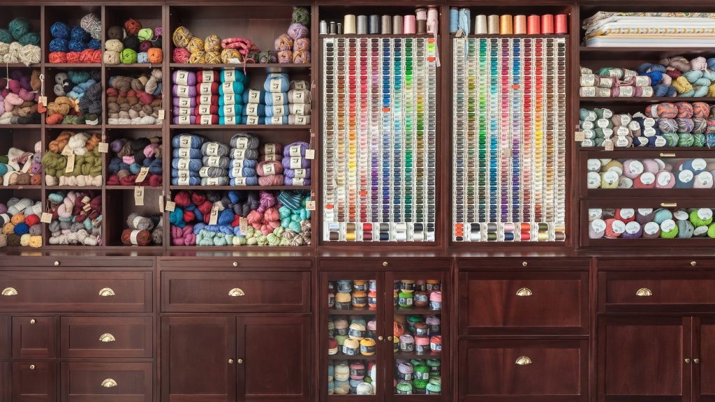
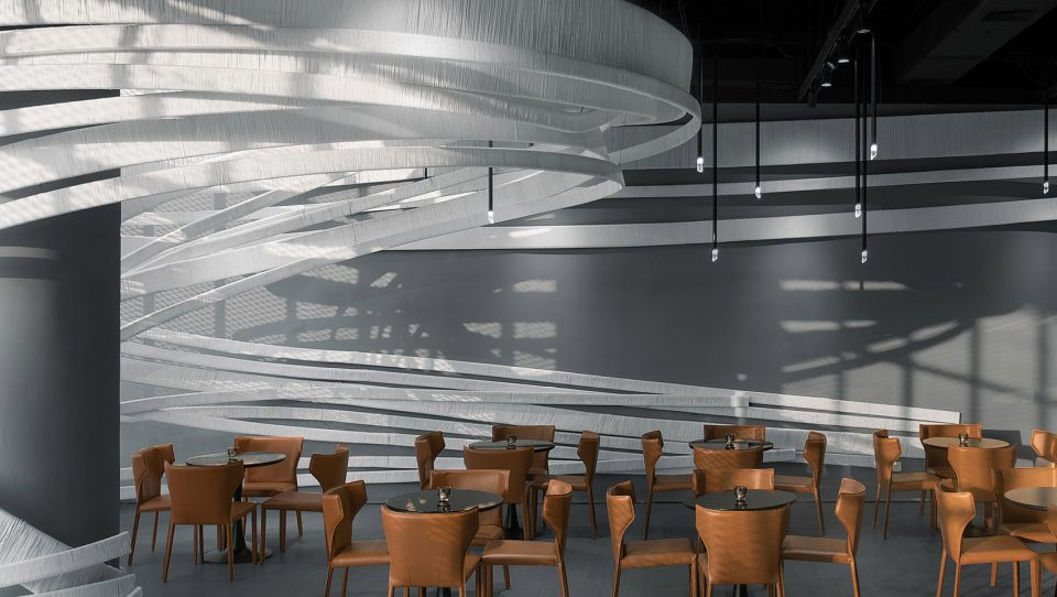
空间同一性-B.O.W.中美的基础是关于平衡的,但由于不同品牌的产品在一个地方逐个展示,实际展示的M.D很难保持一致或平衡。因为这个问题,我们决定把主角放在空间里,给出一个影响,然后用一般的语气来表达其余的部分。此外,为了考虑角色的位置,以及客户和服务器的流量,我们需要了解与M.D相关的信息,如产品的组成和形式、产品组和主要产品组的销售情况。
SPACE IDENTITY The fundamental of Beauty in B.O.W is about balance, but it is difficult for actually-displayed M.D to be in uniformity or balance because products of different brands are displayed in one place by category. Because of this issue, we decided to place the main character in the space to give an impact and to express the rest in a general tone. In addition, to consider the location of the character, and the traffic of customers and servers, we needed to understand information related to M.D such as the composition and form of products, sales of product groups and main product groups.
SPACE IDENTITY The fundamental of Beauty in B.O.W is about balance, but it is difficult for actually-displayed M.D to be in uniformity or balance because products of different brands are displayed in one place by category. Because of this issue, we decided to place the main character in the space to give an impact and to express the rest in a general tone. In addition, to consider the location of the character, and the traffic of customers and servers, we needed to understand information related to M.D such as the composition and form of products, sales of product groups and main product groups.
© Choi Yong Joon
(三)崔勇Joon

为了摆脱百货公司的典型布局,我们试图消除顾客对百货商店统一外观的刻板印象,并与周围的编辑商店相比,提出独特的交通线。
LAYOUT / DESIGN To break away from the typical layout of department stores, we tried to remove customers’ stereotypes about uniform appearance of department stores and to suggest s unique traffic line compared to those of surrounding editor shops.
LAYOUT / DESIGN To break away from the typical layout of department stores, we tried to remove customers’ stereotypes about uniform appearance of department stores and to suggest s unique traffic line compared to those of surrounding editor shops.
© Choi Yong Joon
(三)崔勇Joon

第一与时尚编辑商店不同的是,美的缺点
First. Unlike fashion editor shops, the disadvantage of beauty & living editor shops is having too many forms and categories of product groups. For that reason, customers cannot see what kinds of products are sold in one view intuitively. To resolve the problem, we place a strong impact in the space where customers approach first and we installed furniture where customers can see representative products of this brand to get a glimpse at the brand in this place. The shape of the furniture forms an overall traffic line which is then divided into sections with floor finishing materials in order to construct a basic traffic axis. The floor which is divided by the axis had a contrasting effect by using oak wood floor and trendy terrazzo tiles in order to remove boredom.
First. Unlike fashion editor shops, the disadvantage of beauty & living editor shops is having too many forms and categories of product groups. For that reason, customers cannot see what kinds of products are sold in one view intuitively. To resolve the problem, we place a strong impact in the space where customers approach first and we installed furniture where customers can see representative products of this brand to get a glimpse at the brand in this place. The shape of the furniture forms an overall traffic line which is then divided into sections with floor finishing materials in order to construct a basic traffic axis. The floor which is divided by the axis had a contrasting effect by using oak wood floor and trendy terrazzo tiles in order to remove boredom.
© Choi Yong Joon
(三)崔勇Joon

第二在规划布局时,我们需要从我们的客户那里找出他们最关注的产品组,并期望从哪个产品组获得最高的销售额。这是因为我们必须自然地放置空间的主要特征,并建议适合产品组的设计。
Second. In planning the layout, we needed to find out from our client which product group they focus most on and expect the highest sales from. This is because we must naturally place the main character of the space and suggest a design suitable for the product group.
Second. In planning the layout, we needed to find out from our client which product group they focus most on and expect the highest sales from. This is because we must naturally place the main character of the space and suggest a design suitable for the product group.
© Choi Yong Joon
(三)崔勇Joon

在“B.O.W中的美容”品牌中,美容设备是一种风靡大众的产品。单位成本也很高。只有简单的货架,这样的美容设备是不容易销售的。由于价格相对较高,顾客会想亲自尝试,并在购买之前体验那里的表现。基于这些原因,我们将美容设备的体验测试空间放置在主角的位置上,并计划了一个与周围气氛形成鲜明对比的空间。
Among the brands which have shops in ‘Beauty in B.O.W’, a product which was trendily getting interest was Beauty Device. Unit cost was also high. With only simple shelves, such beauty devices cannot be sold easily. Due to relatively high prices, customers would want to try them personally and experience there performance before making a purchase. Based on these reasons, we placed an experience test space for beauty devices in the location for the main character, and we planned a space that has a contrasting effect with the surrounding mood.
Among the brands which have shops in ‘Beauty in B.O.W’, a product which was trendily getting interest was Beauty Device. Unit cost was also high. With only simple shelves, such beauty devices cannot be sold easily. Due to relatively high prices, customers would want to try them personally and experience there performance before making a purchase. Based on these reasons, we placed an experience test space for beauty devices in the location for the main character, and we planned a space that has a contrasting effect with the surrounding mood.
© Choi Yong Joon
(三)崔勇Joon

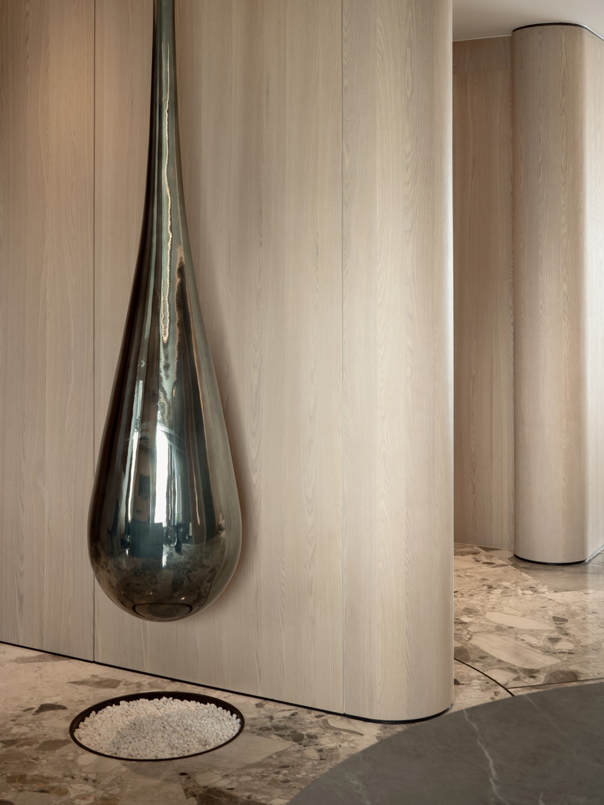
在规划一个显示外部和内部对比的布局的同时,我们也不得不通过使用整理材料和形状来提供一种自然的对比效果。我们用一种明亮和强烈的感觉,特殊的油漆为外部,而我们使用柔软和温暖的材料为内部提供了一种外部和内部皮肤的感觉。因此,表达皮肤内部的墙壁不仅是用温暖的整理材料,而且是为了给使用者提供一种更舒适的感觉,使用的形状可以通过拥抱使用者来给人一种温暖的感觉。通过安装一个工作台和一个镜子,让用户可以采取自拍,用户将能够更有效地尝试产品在空间。
While planning a layout that shows a contrast between outside and inside, we also had to naturally provide a contrasting effect by using finishing materials and shapes. We used a bright and strong feeling of special paint for the outside while we used soft and warm materials for the inside to deliver a feeling of outer and inner skin. As such, the walls expressing the inside of the skin did not stop with a warm finishing material but were also designed to provide a more comfortable feeling for users by using a shape which can give a feeling of warmth by embracing users. By installing a bench and a mirror so that users can take selfies, users will be able to try the products more effectively in the space.
While planning a layout that shows a contrast between outside and inside, we also had to naturally provide a contrasting effect by using finishing materials and shapes. We used a bright and strong feeling of special paint for the outside while we used soft and warm materials for the inside to deliver a feeling of outer and inner skin. As such, the walls expressing the inside of the skin did not stop with a warm finishing material but were also designed to provide a more comfortable feeling for users by using a shape which can give a feeling of warmth by embracing users. By installing a bench and a mirror so that users can take selfies, users will be able to try the products more effectively in the space.
© Choi Yong Joon
(三)崔勇Joon

第三。在美、生活和时尚的范畴中,时尚似乎是最贫穷的产品群体。我们把它放在商店的背面,使它不被进入的交通引起注意,我们使用一个布局,放置一个试衣室和镜子,以满足客户的功能。
Third . Among the categories of beauty, living and fashion, fashion seemed to be the product group that would look the poorest when being displayed. We placed it on the back side of the store to make it unnoticeable by the entering traffic and we used a layout that placed a fitting room and mirrors to satisfy customers in terms of function.
Third . Among the categories of beauty, living and fashion, fashion seemed to be the product group that would look the poorest when being displayed. We placed it on the back side of the store to make it unnoticeable by the entering traffic and we used a layout that placed a fitting room and mirrors to satisfy customers in terms of function.
© Choi Yong Joon
(三)崔勇Joon

第四我们需要一个背景,这将提供一个压抑的情绪,为几个类别的强大的性格。我们为需要展示较多产品的活产品组放置壁饰。我们在中间设置职位,为客户提供产品部门,以便在提供长期开放空间的同时,更容易地将其区分开来。
Fourth. We needed a furnishing of a background that will provide a subdued mood for several categories with strong character. We placed wall furnishing for the living product group which needs to display relatively many products. We placed posts in the middle to provide divisions of products for customers to easily differentiate them while providing a long open space.
Fourth. We needed a furnishing of a background that will provide a subdued mood for several categories with strong character. We placed wall furnishing for the living product group which needs to display relatively many products. We placed posts in the middle to provide divisions of products for customers to easily differentiate them while providing a long open space.
© Choi Yong Joon
(三)崔勇Joon


推荐作品

相关文章
-
2018年走过了四分之一,LOGO设计趋势也清晰了LOGO设计
-
2018年走过了四分之一,LOGO设计趋势也清晰了LOGO设计
-
2018年走过了四分之一,LOGO设计趋势也清晰了LOGO设计