Tuíra Açaí Traama Arquitetura
2018-12-31 17:00
架构师提供的文本描述。Tuíra A aíi需要一个舒适的空间,具有品牌特征,主要目标是以自然的方式使用绿色和紫色,混合着轻薄的木材、绳索和植物。
Text description provided by the architects. The Tuíra Açaí needed a cozy space with the brand identity, the main objective was use the green and the purple color in a natural way, mixed with a light wood, ropes and plants.
Text description provided by the architects. The Tuíra Açaí needed a cozy space with the brand identity, the main objective was use the green and the purple color in a natural way, mixed with a light wood, ropes and plants.
木条的设计是从品牌手册中挑选出来的,并将装饰项目引向了一种更轻松、更年轻的感觉。
The wood slats design were picked from the branding manual and guided the décor project into a lighter and younger feeling.
The wood slats design were picked from the branding manual and guided the décor project into a lighter and younger feeling.
The rectangular space was sectorized in three different ones: kitchen, counter, main saloon.
The rectangular space was sectorized in three different ones: kitchen, counter, main saloon.
在厨房里,我们拆除了浴室,并在合适的尺寸的生产空间,所以我们可以专注于沙龙,以适应更多的客户。
In the kitchen we removed the bathroom and dimensioned the production space in the right size, so we can focus on the saloon, to fit more clients.
In the kitchen we removed the bathroom and dimensioned the production space in the right size, so we can focus on the saloon, to fit more clients.
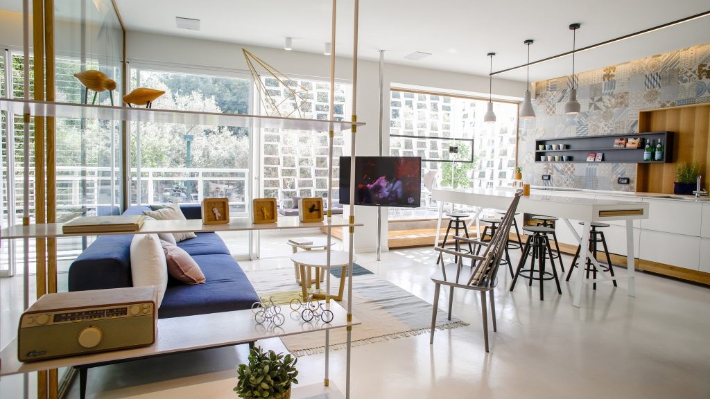
在客厅里,柜台放在厨房和客厅之间。这个空间有出纳员,补充区和交付最终产品给客户。为了做一个直观的流动,我们设计了一个中央通道,将客户引导到订单区,左边是带桌子的线性长椅,另一个是高桌子和凳子。
In the saloon the counter was placed between the kitchen and the saloon. This space had the cashier, complements area and deliver the final products to clients. To make an intuitive flux we designed a central aisle, to lead the client to the order area, in the left a linear bench with tables, in the high a high table with stools.
In the saloon the counter was placed between the kitchen and the saloon. This space had the cashier, complements area and deliver the final products to clients. To make an intuitive flux we designed a central aisle, to lead the client to the order area, in the left a linear bench with tables, in the high a high table with stools.
藤绳强调透视和对齐的每一个地区的沙龙。他们帮助结构花园盆,悬垂的高桌子和对齐吊坠灯以上的桌子。
The rattan ropes accent the perspective and the alignment of each area of the saloon. They help structure the garden pots, the suspense high table and aligning the pendants light above the tables.
The rattan ropes accent the perspective and the alignment of each area of the saloon. They help structure the garden pots, the suspense high table and aligning the pendants light above the tables.
 举报
举报
别默默的看了,快登录帮我评论一下吧!:)
注册
登录
更多评论
相关文章
-

描边风设计中,最容易犯的8种问题分析
2018年走过了四分之一,LOGO设计趋势也清晰了LOGO设计
-

描边风设计中,最容易犯的8种问题分析
2018年走过了四分之一,LOGO设计趋势也清晰了LOGO设计
-

描边风设计中,最容易犯的8种问题分析
2018年走过了四分之一,LOGO设计趋势也清晰了LOGO设计


 PintereAI


