Sappun Flagship Store LABOTORY
2019-01-07 17:00
架构师提供的文本描述。Sappun旗舰店是在辛萨东加罗苏-吉尔路上开业的,许多知名公司的品牌都在这条路上排列着。
Text description provided by the architects. Sappun flagship store was opened on the Garosu-gil Road of Sinsa-dong where many prestigious companies’ brands are lined along the road.
Text description provided by the architects. Sappun flagship store was opened on the Garosu-gil Road of Sinsa-dong where many prestigious companies’ brands are lined along the road.
从企业的角度看,在加罗苏-吉尔上开设旗舰店具有重要的意义和价值。因此,我们的客户有很大的负担,也有很高的期望。然而,现有的Sappun Hong dae第一店享有“总是有人排队等候的商店”的美誉,而且它在线下显示出快速增长,因此客户希望加罗苏-吉尔旗舰店的开张将使其成为一个更受认可的品牌。
From the business’ viewpoint, opening a flagship store on Garosu-gil has a great significance and value. For that reason, our client had a great burden, as much as a high expectation. However, the existing Sappun Hongdae Store No. 1 is enjoying a reputation as a ‘store that always has people waiting in line,’ and it is showing rapid growth offline, so the client wished that the opening of a Garosu-gil flagship store would lead to growth as a more recognized brand.
From the business’ viewpoint, opening a flagship store on Garosu-gil has a great significance and value. For that reason, our client had a great burden, as much as a high expectation. However, the existing Sappun Hongdae Store No. 1 is enjoying a reputation as a ‘store that always has people waiting in line,’ and it is showing rapid growth offline, so the client wished that the opening of a Garosu-gil flagship store would lead to growth as a more recognized brand.
在一次会议上,这位客户说,“我希望有一个空间,以显示‘Sappun’品牌正在进一步增长,并变得强大”。在过去的两年里,Sappun已经成为一个著名的品牌,但我们的设计师不得不想出如何将一个更成熟和更深的品牌的印象灌输到这个空间。
During a meeting, the client said, “I want to have a space that will show the brand ‘Sappun’ is growing further and becoming strong”. For the past 2 years, Sappun has become a famous brand, but our designers had to come up with ideas on how to instill the impression of a more mature and deep brand into the space.
During a meeting, the client said, “I want to have a space that will show the brand ‘Sappun’ is growing further and becoming strong”. For the past 2 years, Sappun has become a famous brand, but our designers had to come up with ideas on how to instill the impression of a more mature and deep brand into the space.
在当代,女鞋具有表达自我的功能,而不是简单的工具功能,因此,鞋的设计正迅速向前发展,脱离了基本的定型。设计师们希望从鞋的形成方面反映出这一趋势。
In contemporary times, women’s shoes have an expressive function, of expressing oneself, rather than the simple function of a tool. Accordingly, the design of shoes is advancing rapidly, breaking away from the basic formativeness. Designers want to reflect that trend in the space from the formative aspect of shoes.
In contemporary times, women’s shoes have an expressive function, of expressing oneself, rather than the simple function of a tool. Accordingly, the design of shoes is advancing rapidly, breaking away from the basic formativeness. Designers want to reflect that trend in the space from the formative aspect of shoes.
除了Sappun现有的空间语言,“曲线的节奏”,我们还想把“不对称平衡”和“多维度性”的空间语言融入我们的设计中。
In addition to Sappun’s existing language of space, “Rhythm of Curves,” we wanted to incorporate the spatial languages of “Asymmetrical Balance” and “Multi-dimensionality” in our design.
In addition to Sappun’s existing language of space, “Rhythm of Curves,” we wanted to incorporate the spatial languages of “Asymmetrical Balance” and “Multi-dimensionality” in our design.
The first spatial language, “Rhythm of Curves”
The first spatial language, “Rhythm of Curves”
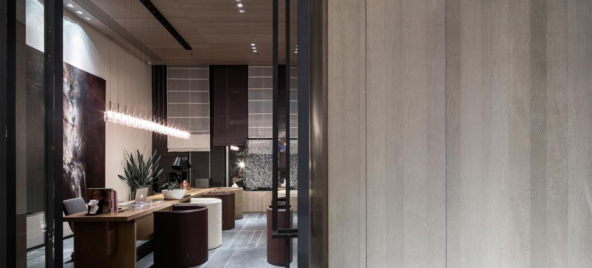
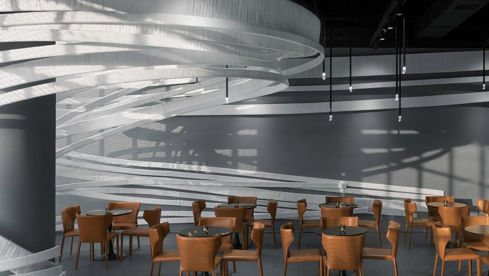
Sappun的新建筑的外部将有曲线,从入口正面开始。入口右侧的曲面将继续延伸到柜台背面的储藏室,空间将看得更深,可以扩展。左边的墙会从隔板的背面开始,然后从天花板上继续,所以它看起来就像从外面继续,两个隔板之间的柱子从天花板上继续,然后朝右边的方向走去。这一设计将显示这三种元素的曲面将重叠在天花板上,并将在天花板上提供各种视觉效果,这可能是简单而乏味的,节奏与空间和谐。此外,这些曲线将继续以同样的形式延伸到柜台上,具有与生俱来的共性,而其他陈设和细节将有共同的特征,有节奏地表达萨普潘的受控感性。
The exterior of Sappun’s new building will have curves, starting from the entrance facade. The curved surface on the right side of the entrance will continue onto the storage room located on the back side of the counter and the space will look deeper and can be expanded. The wall on the left side will start from the back side of the partition and will continue on from the ceiling, so it will look like it has continued on from the outside and the column between the two partitions continues on from the ceiling and heads toward the right side. This design will show that the curved surfaces of the three elements will overlap on the ceiling and will provide various visuals on the ceiling, which could have been simple and boring, and rhythm in harmony with space. In addition, such curves will continue on to the counter in the same form, having innate commonness, and other furnishings and details will have common features, expressing Sappun’s controlled sensibility rhythmically.
The exterior of Sappun’s new building will have curves, starting from the entrance facade. The curved surface on the right side of the entrance will continue onto the storage room located on the back side of the counter and the space will look deeper and can be expanded. The wall on the left side will start from the back side of the partition and will continue on from the ceiling, so it will look like it has continued on from the outside and the column between the two partitions continues on from the ceiling and heads toward the right side. This design will show that the curved surfaces of the three elements will overlap on the ceiling and will provide various visuals on the ceiling, which could have been simple and boring, and rhythm in harmony with space. In addition, such curves will continue on to the counter in the same form, having innate commonness, and other furnishings and details will have common features, expressing Sappun’s controlled sensibility rhythmically.
第二种空间语言,“不对称平衡”,从入口开始,以中心为中心,重心向右移动,入口通向内部的通道开大,使入口左侧更轻,使进入顾客的交通轻松自然地进入空间,使空间看得更深。此外,左边和右边的墙壁,以及架子陈设,将有不同的形状和修整。这种有意的不对称将有消除无聊的效果。
The second spatial language, “Asymmetrical Balance“ Starting from the entrance, centered on the center, the center of weight is shifted to the right side and the passage of the entrance leading to the inside is opened large. This design is intended to make the left side of the entrance lighter so that the traffic of entering customers can be induced to the space lightly and naturally and the space can look deeper. In addition, the walls on the left and right sides, as well as shelf furnishings, will have different shapes and finishings. This intentional asymmetry will have the effect of removing boredom.
The second spatial language, “Asymmetrical Balance“ Starting from the entrance, centered on the center, the center of weight is shifted to the right side and the passage of the entrance leading to the inside is opened large. This design is intended to make the left side of the entrance lighter so that the traffic of entering customers can be induced to the space lightly and naturally and the space can look deeper. In addition, the walls on the left and right sides, as well as shelf furnishings, will have different shapes and finishings. This intentional asymmetry will have the effect of removing boredom.
空间的左右两侧将形成不对称,并根据不同的区域采用不同的装饰设计。在每一个立面上,隔墙和立柱都会被反复放置,而高地将定期重复,为空间提供节奏和活力,而由于左右两侧的矛盾,空间将形成一种独特的平衡。
The left and right sides in the space will form asymmetry, and different designs of furnishing will be applied depending on each area. On each elevation, partitions and columns will be placed repeatedly, and elevations will be repeated in a regular fashion to provide rhythm and vitality to the space and as the right and left sides contradict, the space will form a unique balance.
The left and right sides in the space will form asymmetry, and different designs of furnishing will be applied depending on each area. On each elevation, partitions and columns will be placed repeatedly, and elevations will be repeated in a regular fashion to provide rhythm and vitality to the space and as the right and left sides contradict, the space will form a unique balance.
第三种空间语言“多维”我们设计了多维空间,使之在空间上有两个视角。它们是由地板、墙壁和天花板构成的空间的大视角,也是由家具和固定装置的个性形成的空间的小视角。其中最引人注目的是中央设计家具。在家具设计中,鞋跟的形状反映在家具上,4件中心家具的功能和形状不同。根据这些形式,家具可以用作展台、椅子或播种机,为空间提供乐趣和活力。
The third spatial language “Multi-dimensionality “ We designed multi-dimensionality to have two perspectives in the space. They are a big perspective for space that is formed by the floor, walls and ceiling and a small perspective for space that is formed by the individuality of furniture and fixtures. Among them, the most noticeable part is central design furniture. While designing furniture, the shape of shoes and heels were reflected on the furniture and 4 pieces of center furniture have different functions and shapes, respectively. According to such forms, the furniture can work as a display stand or a chair or a planter to provide fun and vitality to the space.
The third spatial language “Multi-dimensionality “ We designed multi-dimensionality to have two perspectives in the space. They are a big perspective for space that is formed by the floor, walls and ceiling and a small perspective for space that is formed by the individuality of furniture and fixtures. Among them, the most noticeable part is central design furniture. While designing furniture, the shape of shoes and heels were reflected on the furniture and 4 pieces of center furniture have different functions and shapes, respectively. According to such forms, the furniture can work as a display stand or a chair or a planter to provide fun and vitality to the space.
sappun旗舰店将是一个带有独特味道和香味的空间,品牌想要珍爱而不是仅仅是一个简单的美丽的空间。我们希望在购买Sappun的鞋子的同时,该空间将为客户提供新的敏感性体验。
Sappun flagship store will be a space smeared with the unique tastes and aromas the brand wants to cherish instead of just being a simple beautiful space. We hope that the space will offer new sensibility experience for customers while they purchase Sappun’s shoes.
Sappun flagship store will be a space smeared with the unique tastes and aromas the brand wants to cherish instead of just being a simple beautiful space. We hope that the space will offer new sensibility experience for customers while they purchase Sappun’s shoes.
 举报
举报
别默默的看了,快登录帮我评论一下吧!:)
注册
登录
更多评论
相关文章
-

描边风设计中,最容易犯的8种问题分析
2018年走过了四分之一,LOGO设计趋势也清晰了LOGO设计
-

描边风设计中,最容易犯的8种问题分析
2018年走过了四分之一,LOGO设计趋势也清晰了LOGO设计
-

描边风设计中,最容易犯的8种问题分析
2018年走过了四分之一,LOGO设计趋势也清晰了LOGO设计


 PintereAI


