HUUU! Store AA+A
2019-01-11 21:00
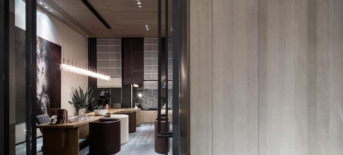
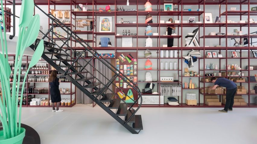
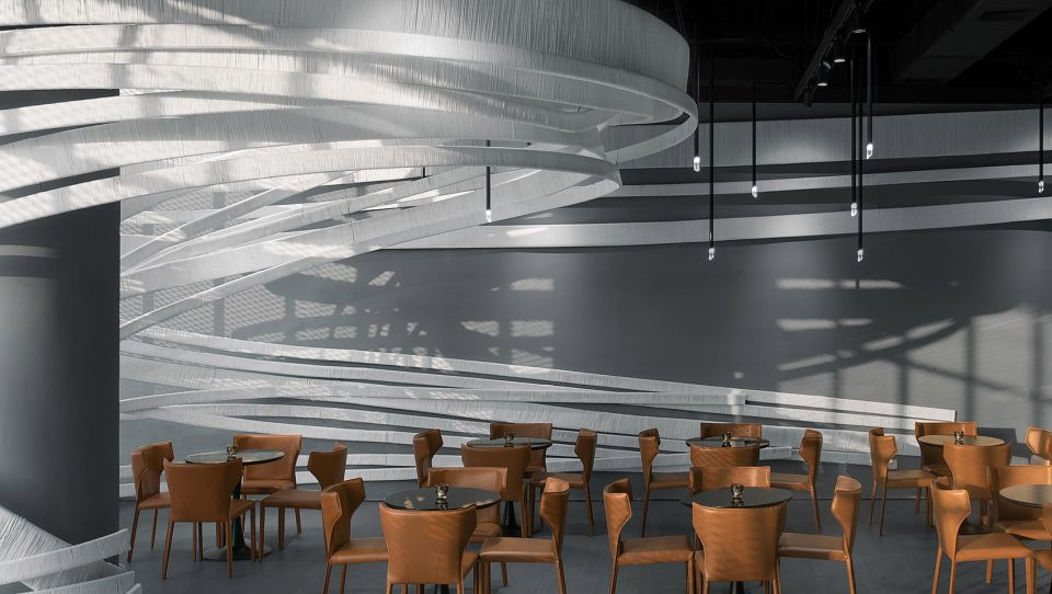
架构师提供的文本描述。该店位于曼谷最著名的“暹罗广场”购物中心。胡武!专注于奢侈品、异国情调和极高品质的色调,从世界各地挑选。零售有三个层次,其中包括[生活方式空间在2F],[复古森林在3F]和[办公空间在4F]。
Text description provided by the architects. The store locates at the heart of the most reputation shopping spot ‘Siam square’ in Bangkok. HUUU! has focused on luxury exotic and extra high quality of shades picking up from around the world. The retail has 3 levels which contain [life style space at 2F], [vintage forest at 3F] and [office space at 4F].
Text description provided by the architects. The store locates at the heart of the most reputation shopping spot ‘Siam square’ in Bangkok. HUUU! has focused on luxury exotic and extra high quality of shades picking up from around the world. The retail has 3 levels which contain [life style space at 2F], [vintage forest at 3F] and [office space at 4F].


Circle Design Diagram
圆设计图


每一层都有基于产品和功能的设计。核心概念是“圆”。眼睛的简单形状,聚焦,无限,旋转和统一。我们在一个图表中分析了这个圆圈,看看这个圆圈的图案如何影响我们的眼睛知觉。
Every floor has its own design based on products and function. The core concept is ‘circle’. The simple shape of eye, focus, infinity, rotation, and unity. We analyzed the circle in a diagram to see how the patterns of the circle could affect our eyes perception.
Every floor has its own design based on products and function. The core concept is ‘circle’. The simple shape of eye, focus, infinity, rotation, and unity. We analyzed the circle in a diagram to see how the patterns of the circle could affect our eyes perception.


在二楼。纯粹的白色PU地板将吸引行人的目光,与之形成对比的是入口、暹罗广场街和丽都剧院之间的复杂环境。回火玻璃架子组织成圆形边界,并在其上连续显示产品的垂直。
On the second floor. The pure white PU floor will catch the eye of pedestrians by the contrast of the complexity between the context of both entrance, Siam Square street and Lido theater. The temper glass shelf organized in circular boundary and display products on its continuously in vertical.
On the second floor. The pure white PU floor will catch the eye of pedestrians by the contrast of the complexity between the context of both entrance, Siam Square street and Lido theater. The temper glass shelf organized in circular boundary and display products on its continuously in vertical.


不锈钢拱门放置在一个折射的方向,以分散的产品分区和扩大整个结构与反射镜在墙上沿空间。客户可以试试墨镜和全身的外观。开放的天花板安装了C线结构,作为天花板的“骨头”,从拱墙到上面创造了多层空间。天然黑石作为突出显示,在空间的中间,与水平镜合并,像一张均匀的桌子来分割流通。
The stainless arch placed in a refracted direction to distributed product zoning and expanding the whole structure with a reflection mirror on the wall along the space. The clients could try the sunglasses with the full body looks. The opened ceiling installed with the C-line structure as ‘bone’ of the ceiling which spaces out from the arch wall to created layers of space above. The natural black stone standing for highlight display in the middle of space merging with horizontal mirror like a homogeneous table to divided the circulation.
The stainless arch placed in a refracted direction to distributed product zoning and expanding the whole structure with a reflection mirror on the wall along the space. The clients could try the sunglasses with the full body looks. The opened ceiling installed with the C-line structure as ‘bone’ of the ceiling which spaces out from the arch wall to created layers of space above. The natural black stone standing for highlight display in the middle of space merging with horizontal mirror like a homogeneous table to divided the circulation.


在三楼。灯光变暖了。把这种感觉带回新怀旧的氛围。复古材料的特点是黄金,单色大理石,深色木材,橄榄绿颜色。橱柜的陈列不断重复与圆形的空白,可以一个地显示,以代表复古太阳镜的个性。该列展示在空间的中心,作为爆炸圆形的垂直方向,并能够围绕自己旋转。圆形碎片大理石地板支撑,并强调每一列的边界显示在对称的角度。
On the third floor. Lighting becomes warmer. Bringing the feeling back to the neo-nostalgic atmosphere. Vintage materials featured as gold, monochrome marble, dark wood, and olive green color. The cabinet display repeated continuously with the circle void which could display one by one to represent the individual character of vintage sunglasses. The column display exhibit in the middle of space as exploded circle shape in a vertical direction and be able to rotate around themselves. The circle fragment marble floor support and emphasize the boundary of each column display in symmetric perspective.
On the third floor. Lighting becomes warmer. Bringing the feeling back to the neo-nostalgic atmosphere. Vintage materials featured as gold, monochrome marble, dark wood, and olive green color. The cabinet display repeated continuously with the circle void which could display one by one to represent the individual character of vintage sunglasses. The column display exhibit in the middle of space as exploded circle shape in a vertical direction and be able to rotate around themselves. The circle fragment marble floor support and emphasize the boundary of each column display in symmetric perspective.
Process Design Diagram
工艺设计图


Architects AA+A
Location Siam Square Soi 3, Khwaeng Pathum Wan, Khet Pathum Wan, Krung Thep Maha Nakhon 10330, Thailand
Area 144.0 m2
Project Year 2018
Photographs VARP
Category Store
Manufacturers Loading...

 PintereAI


