The Ilma LABOTORY
2019-01-13 19:00
架构师提供的文本描述。伊尔玛在芬兰语中的意思是“天气,空气”。所有的空间显然都有和谐的空气,我们的客户希望这种空气的积极能量在空间中挥之不去。在过去20年从事服装行业工作的客户总共经营了8家服装编辑商店,每一家商店的设计和概念根据每个网站的特点而有所不同。Cheongdam Ilma商店是在开发名为“Ilma”的品牌的过程中全面开放的,因此空间的身份必须非常小心地表达出来。
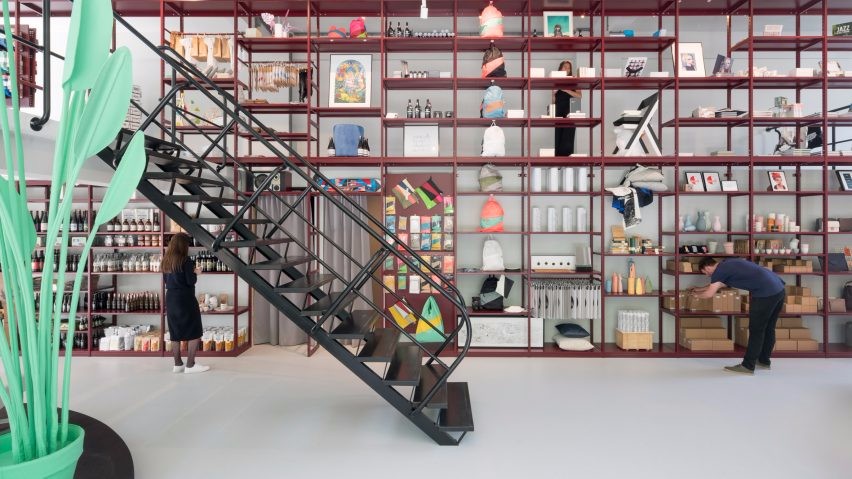
Text description provided by the architects. Ilma means “weather, air” in the Finnish language. All spaces clearly have harmonious air, and our client wanted to have that kind of air’s positive energy lingering in the space. The client, who has been working in the clothing business for the past 20 years, was operating a total of 8 clothing editor stores, and the design and concept of each store is different according to the characteristics of each site. Cheongdam Ilma Store was opened in the process of developing the branding called ‘the ilma’ in full swing, so the identity of the space had to be expressed with great care.
Text description provided by the architects. Ilma means “weather, air” in the Finnish language. All spaces clearly have harmonious air, and our client wanted to have that kind of air’s positive energy lingering in the space. The client, who has been working in the clothing business for the past 20 years, was operating a total of 8 clothing editor stores, and the design and concept of each store is different according to the characteristics of each site. Cheongdam Ilma Store was opened in the process of developing the branding called ‘the ilma’ in full swing, so the identity of the space had to be expressed with great care.
现有的“伊尔玛”的品牌和空间认同是以现代主义为基础的,设计师希望关注现代主义的深层根源。作者通过解读作为现代主义基础的建构主义者李斯特斯基的作品,运用重叠、排列和纹理对比等元素,将艺术作品的几何图形引入到空间中,以期清晰地表达空间的同一性。
The brand and space identity of the existing ‘The Ilma’ was based on modernism and the designer wanted to focus on the deeper origin of modernism. By interpreting a constructivist El Lissitzky’s artwork which served as a foundation for modernism, the designer introduced geometric figures of the artwork into the space by using the elements of overlapping, arrangement and textural contrast with an expectation to express the identity of the space clearly.
The brand and space identity of the existing ‘The Ilma’ was based on modernism and the designer wanted to focus on the deeper origin of modernism. By interpreting a constructivist El Lissitzky’s artwork which served as a foundation for modernism, the designer introduced geometric figures of the artwork into the space by using the elements of overlapping, arrangement and textural contrast with an expectation to express the identity of the space clearly.
在“伊尔玛”的设计中有三个重要的元素。第一个设计元素是形成性和纹理对比。这种对比从入口开始,通过形式和材料的对比生动地表现出来。它试图揭示伊尔玛展厅,这是存在于清坝洞的黑色建筑中心,使用一个独特的属性。外观的形式是抽象的,动态的风格,通过排列圆形和直线消除无聊。涂饰材料也以各种方式增加了空间的体积,白色橡木圆柱体看起来像透明的玻璃和粗糙的石粉处理过的特殊油漆之间的重叠,传递了沉重的群众感觉。
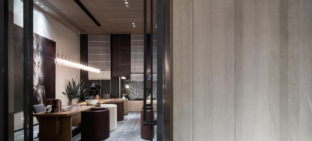
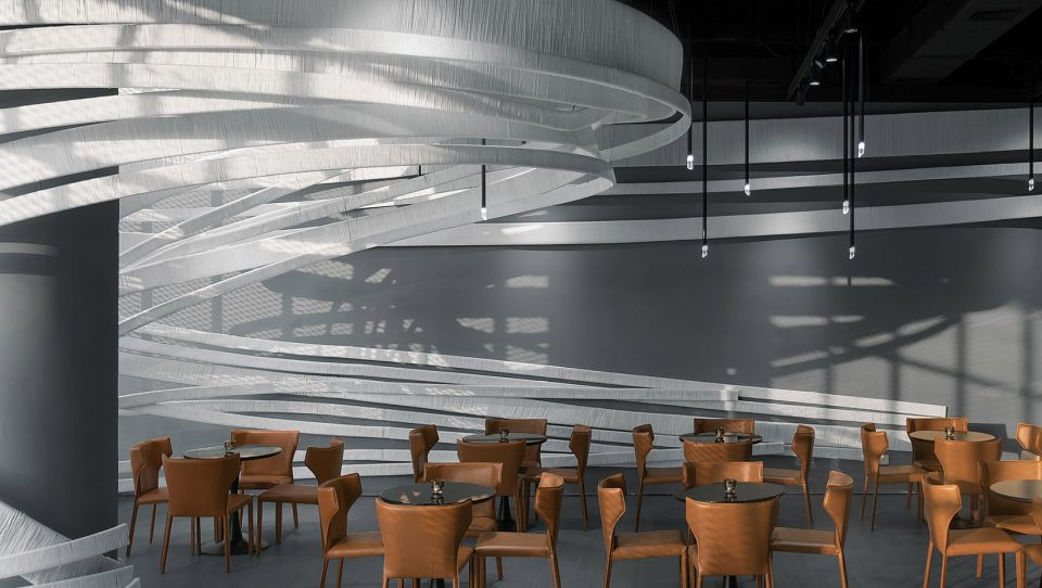
There are three important elements in the design of ‘The Ilma.’. The first design element is formative and textural contrast. Such contrast is vividly revealed through the contrast of forms and materials, starting from the entrance. It attempts to reveal the Ilma Show Room, which is existing in the center of Cheongdam-dong’s black buildings, by using a distinctive property. The form of the façade is expressed in an abstract, and dynamic style by arranging round shapes and straight lines to eliminate boredom. The finishing materials also add volume to the space in various ways as the round columns of white oak wood look overlapping between clear glass and rough stone powder-treated special paint, delivering a heavy mass feeling.
There are three important elements in the design of ‘The Ilma.’. The first design element is formative and textural contrast. Such contrast is vividly revealed through the contrast of forms and materials, starting from the entrance. It attempts to reveal the Ilma Show Room, which is existing in the center of Cheongdam-dong’s black buildings, by using a distinctive property. The form of the façade is expressed in an abstract, and dynamic style by arranging round shapes and straight lines to eliminate boredom. The finishing materials also add volume to the space in various ways as the round columns of white oak wood look overlapping between clear glass and rough stone powder-treated special paint, delivering a heavy mass feeling.
此外,用冷石粉进行表面处理,内部用温暖的白橡木进行整齐的处理,以达到内外对比的目的。这种材料的对比是在墙上和家具上以一种不断重复的重叠方式出现的。四种整理材料-粗糙的石粉,透明的白玻璃,温暖的木材和冷金属-被连接和重叠,以表达不同的天气条件与最终的对比。
In addition, the exterior of the round mass on the outside was treated with a rough finishing made of cold stone powder while the interior was finished neatly with warm white oak in order to from a contrast between the inside and the outside. Such material contrast was presented on the wall and furniture in an overlapping way continuously and repeatedly. Four finishing materials—rough stone powder, clear white glass, warm wood and cold metal—were interconnected and overlapped to express various weather conditions with ultimate contrasts.
In addition, the exterior of the round mass on the outside was treated with a rough finishing made of cold stone powder while the interior was finished neatly with warm white oak in order to from a contrast between the inside and the outside. Such material contrast was presented on the wall and furniture in an overlapping way continuously and repeatedly. Four finishing materials—rough stone powder, clear white glass, warm wood and cold metal—were interconnected and overlapped to express various weather conditions with ultimate contrasts.
第二个设计元素是相互拥抱。一种坎坷的纹理可以感觉到,从天花板到墙壁的‘ㄱ’形状,和一个由混凝土硬化剂制成的整理拥抱空间,从地板到墙壁的‘ㄴ’形状。然后,一个巨大的圆形块状在空间内是提供温暖舒适的感觉,拥抱内部。第三个设计元素是不同序列的几何图形。在每个序列中,圆形、长方形、曲面、平面和线条的元素以墙、柱、衣架、家具、书架、椅子、柜台、试衣室和圆形墙壁的形式相互重叠和纠缠,为空间提供节奏和乐趣。
The second design element is embracing each other. A bumpy texture can be felt, starting from the ceiling to the wall in the 'ㄱ‘-shape, and a finishing made of concrete hardener is embracing the space, starting from the floor to the wall in the 'ㄴ‘-shape. And then, a lump made in a big round mass inside the space is providing a warm comfortable feeling by embracing the interior. The third design element is geometric figures made in different sequences. In each sequence, the elements of round shape, rectangle, curved surface, plane and lines are providing rhythm and fun to the space as they are overlapping and tangling with each other in the form of walls, columns, hangers, furniture, shelves, chairs, counter, fitting room, and round walls.
The second design element is embracing each other. A bumpy texture can be felt, starting from the ceiling to the wall in the 'ㄱ‘-shape, and a finishing made of concrete hardener is embracing the space, starting from the floor to the wall in the 'ㄴ‘-shape. And then, a lump made in a big round mass inside the space is providing a warm comfortable feeling by embracing the interior. The third design element is geometric figures made in different sequences. In each sequence, the elements of round shape, rectangle, curved surface, plane and lines are providing rhythm and fun to the space as they are overlapping and tangling with each other in the form of walls, columns, hangers, furniture, shelves, chairs, counter, fitting room, and round walls.
“阳光是美味的,雨水是清新的,风让我们振作起来,雪是令人兴奋的;没有坏天气这样的东西,只有不同类型的好天气。”-约翰·罗斯金-约翰·罗斯金-我们希望Cheongdam Ilma的空间在任何时候都能被积极的能量所包围,并拥有不同类型的好天气。
“Sunshine is delicious, rain is refreshing, wind braces us up, snow is exhilarating; there is really no such thing as bad weather, only different kinds of good weather.“ - John Ruskin We wish Cheongdam Ilma’s space to be surrounded with positive energy at all times and to have different types of good weather.
“Sunshine is delicious, rain is refreshing, wind braces us up, snow is exhilarating; there is really no such thing as bad weather, only different kinds of good weather.“ - John Ruskin We wish Cheongdam Ilma’s space to be surrounded with positive energy at all times and to have different types of good weather.
Location Cheongdam Square G12-ho, 1,3-beonji, Cheongdam-dong, Gangnam-gu, Seoul, South Korea
Lead Architects Jung Jin Ho, Park Kee min
Photographs Choi Yong Joon
 举报
举报
别默默的看了,快登录帮我评论一下吧!:)
注册
登录
更多评论
相关文章
-

描边风设计中,最容易犯的8种问题分析
2018年走过了四分之一,LOGO设计趋势也清晰了LOGO设计
-

描边风设计中,最容易犯的8种问题分析
2018年走过了四分之一,LOGO设计趋势也清晰了LOGO设计
-

描边风设计中,最容易犯的8种问题分析
2018年走过了四分之一,LOGO设计趋势也清晰了LOGO设计


 PintereAI


