Les Faiseurs catherinecatherine
2019-01-15 16:00
架构师提供的文本描述。Les Faiseur是一家与陶器作坊有关的咖啡馆。需求是创造一个明亮而温暖的空间锚定在附近。明亮的颜色和一堵图形的墙壁,使混凝土地板上的空间充满活力,天花板上有明显的力学作用。设计的主要思想是通过在旁边有一个更光鲜的咖啡厅和一个空旷的工作室空间来创造一个对比。
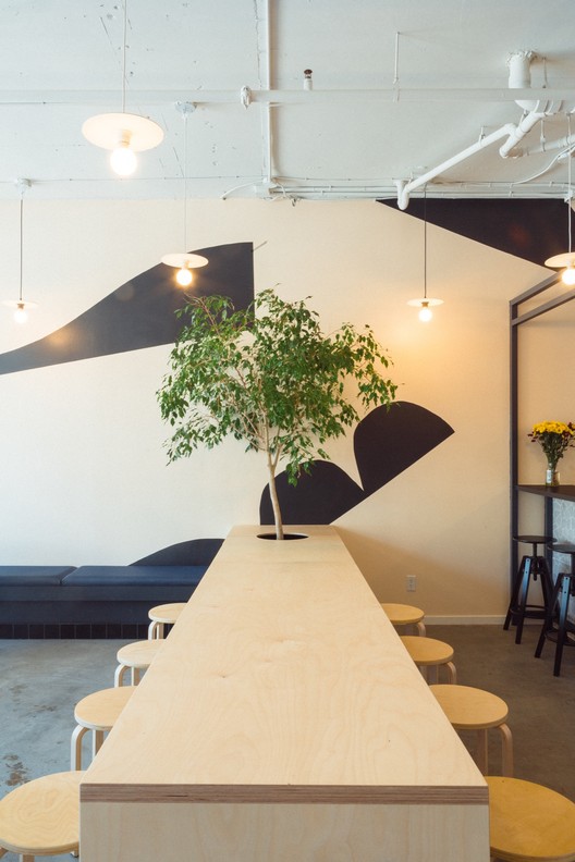
Text description provided by the architects. Les Faiseurs is a café in connection to a pottery workshop. The demand was to create a bright and warm space anchored in the neighborhood. Bright colors and a graphic wall, energizes the space left on the concrete floor and with apparent mechanics on the ceiling. The main idea of the design was to create a contrast by having a more polished café against a bare studio space by it’s side.
Text description provided by the architects. Les Faiseurs is a café in connection to a pottery workshop. The demand was to create a bright and warm space anchored in the neighborhood. Bright colors and a graphic wall, energizes the space left on the concrete floor and with apparent mechanics on the ceiling. The main idea of the design was to create a contrast by having a more polished café against a bare studio space by it’s side.
咖啡厅的空间规划已经制定,以给用户提供最自然的光线。同时可容纳28人。座位区的规划是为了为用户创造不同的可能性。为了为顾客服务,设计师们设计了一个高窗架子,一个长椅和一张摆着一棵树的大桌子。
The space planning of the coffee shop has been developed to give users the most of the natural light. There is room to seat 28 people simultaneously. The seating areas have been planned to create different possibilities for users. In order to serve customers, the designers have designed a shelf on the edge of the windows at bar height, a bench and a large table hosting a tree.
The space planning of the coffee shop has been developed to give users the most of the natural light. There is room to seat 28 people simultaneously. The seating areas have been planned to create different possibilities for users. In order to serve customers, the designers have designed a shelf on the edge of the windows at bar height, a bench and a large table hosting a tree.
食物配制区已被精简至最大限度,已放置在更远的角落后面的空间,以使顾客漫游的处所。一个大型定制书柜允许游客购买各种当地产品和陶瓷制品。
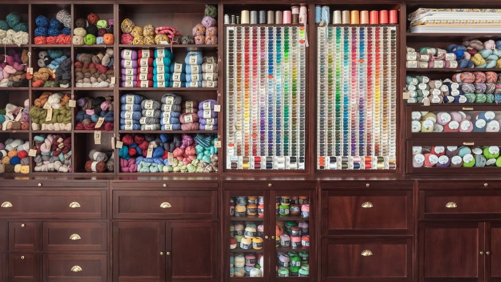
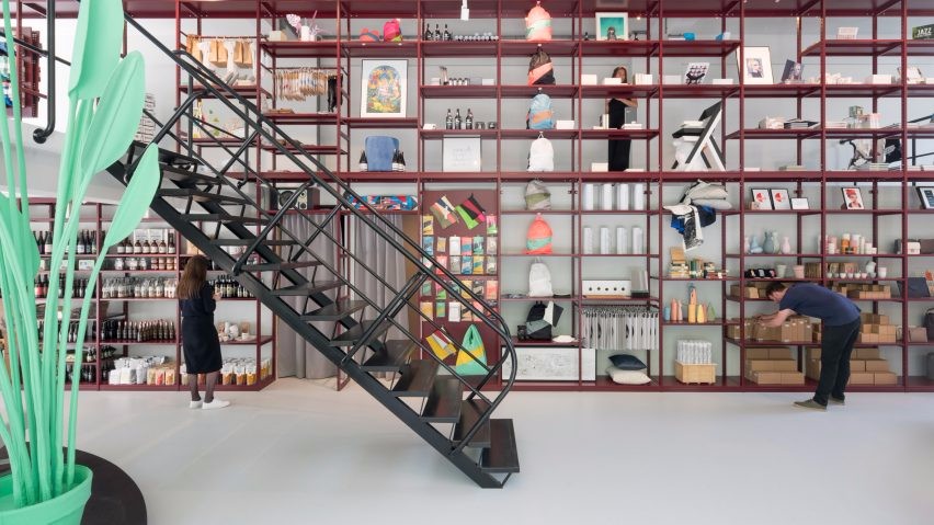
The food preparation area has been streamlined to the maximum, it has been placed at further at the corner back of the space to get customers to roam the premises. A large custom bookcase allows visitors to buy various local products and pieces of ceramics.
The food preparation area has been streamlined to the maximum, it has been placed at further at the corner back of the space to get customers to roam the premises. A large custom bookcase allows visitors to buy various local products and pieces of ceramics.
陶器区的设计是为了容纳8名学生和一些专业陶瓷艺术家的工作空间。这个地方必须是灵活的,提供存储空间,一个烤箱,一个水槽,8个波特的轮子和一张大桌子来揉捏。面对街道的窗户让路人有机会看到工作中的学生或艺术家,甚至在咖啡厅区域关闭时也是如此。为了让陶器具有特色,所使用的颜色是柔软的,并在整个演变过程中为这些陶器提供了一块画布。
The pottery area has been designed to accommodate groups of 8 students and some workspaces for professional ceramic artists. The place had to be flexible, offering storage space, an oven, a sink, 8 potter’s wheel and a large table to knead. The window facing the street offers passersby the opportunity to see the students or artists at work, even when the café area is closed. In order to let the pottery be featured, the colors used are soft and offers a canvas for the pieces throughout their evolution.
The pottery area has been designed to accommodate groups of 8 students and some workspaces for professional ceramic artists. The place had to be flexible, offering storage space, an oven, a sink, 8 potter’s wheel and a large table to knead. The window facing the street offers passersby the opportunity to see the students or artists at work, even when the café area is closed. In order to let the pottery be featured, the colors used are soft and offers a canvas for the pieces throughout their evolution.
使用的材料是混凝土和木材。本实用新型具有良好的环氧表面光泽,具有良好的实用性和光泽度。最大的挑战是在一个狭小的空间里聚集的职业,这就是为什么设计师创造了由家具定义的区域。车间与咖啡的连接是用一面玻璃墙创造的,它提供了各种不同的观点,其中一边比另一面更多。
The materials used are concrete and wood. The large kneading table is lustrous with an epoxy surface so it’s practical and bright. The biggest challenge was the gathering vocation in a small space, which is why the designers created areas defined by the furniture. The connection of the workshop with the coffee is created using a glass wall giving various points of view, as much on one side than the other.
The materials used are concrete and wood. The large kneading table is lustrous with an epoxy surface so it’s practical and bright. The biggest challenge was the gathering vocation in a small space, which is why the designers created areas defined by the furniture. The connection of the workshop with the coffee is created using a glass wall giving various points of view, as much on one side than the other.
 举报
举报
别默默的看了,快登录帮我评论一下吧!:)
注册
登录
更多评论
相关文章
-

描边风设计中,最容易犯的8种问题分析
2018年走过了四分之一,LOGO设计趋势也清晰了LOGO设计
-

描边风设计中,最容易犯的8种问题分析
2018年走过了四分之一,LOGO设计趋势也清晰了LOGO设计
-

描边风设计中,最容易犯的8种问题分析
2018年走过了四分之一,LOGO设计趋势也清晰了LOGO设计


 PintereAI


