Downside Up House WALA
2019-01-19 13:00
建筑商Daylan Developments结构工程师R.I.Brown景观设计师澳大利亚垂直花园集团内部Stylist Rowena Moore(www.rowenamoore.com.au)
Builder Daylan Developments Structural Engineer R.I. Brown Landscape Designer Australian Vertical Garden Group Interior Stylist Rowena Moore (www.rowenamoore.com.au) More Specs Less Specs
Builder Daylan Developments Structural Engineer R.I. Brown Landscape Designer Australian Vertical Garden Group Interior Stylist Rowena Moore (www.rowenamoore.com.au) More Specs Less Specs
架构师提供的文本描述。原来的建筑坐落在一个多元化的住宅区里,是一本破旧的、双正面的维多利亚式房屋书-南侧的一栋双层露台房子结束了。房子位于一个角落的分配,紧贴在主要街道和一个巷道,使它的三角形形状,向后。作为一座列入遗产清单的建筑,抢救严重失修的房屋正面势在必行。
Text description provided by the architects. Nestled in a diverse residential neighbourhood, the original building was a dilapidated double-fronted Victorian house book-ended by a double-storey terrace house on its south side. The house is located on a corner allotment, pinched in by the main street and a laneway which gives it its triangular shape that tapers towards the rear. As a heritage listed building, it was imperative to rescue the front of house which was in a severe state of disrepair.
Text description provided by the architects. Nestled in a diverse residential neighbourhood, the original building was a dilapidated double-fronted Victorian house book-ended by a double-storey terrace house on its south side. The house is located on a corner allotment, pinched in by the main street and a laneway which gives it its triangular shape that tapers towards the rear. As a heritage listed building, it was imperative to rescue the front of house which was in a severe state of disrepair.
房主给我们介绍了一份简报,要求我们在使用邻居的双高边界墙的同时,给我们提供一套3居室的家庭住宅,并在房产的后部引入第二层的音量。
The homeowner presented us a brief that requested a 3-bedroom family home whilst making use of the neighbour's double-height boundary wall to introduce a second story volume to the rear of the property.
The homeowner presented us a brief that requested a 3-bedroom family home whilst making use of the neighbour's double-height boundary wall to introduce a second story volume to the rear of the property.
与原来的房屋复杂而昏暗的布局形成对比的是,新的延伸部分必须是明亮的,采用宽敞的感觉,并与前面的遗产建筑无缝地结合在一起。
In contrast to the convoluted and dimly-lit layout of the original house, the new extension had to be well-lit, adopt a spacious feel, and combine seamlessly with the front heritage building.
In contrast to the convoluted and dimly-lit layout of the original house, the new extension had to be well-lit, adopt a spacious feel, and combine seamlessly with the front heritage building.
原来的后方空间是混乱的,他们的布局和集群随意,所以我们的目标是保留和恢复现有的房子前面,同时改善流动和整体房屋的功能。我们颠覆了一个典型的“地面延伸”的现状,把楼上的起居空间推广起来,把所有的卧室都安排在地面上。这使得卧室能够借到一堵面向巷道的新墙所提供的固有隐私和安全保障。楼上,起居空间现在坐落在邻近的屋顶上方,向不间断的城市景色和灯光开放。
The original rear spaces were messy in their layout and clustered haphazardly, so our goal was to retain and restore the existing front of house whilst improving the flow and functionality of the overall house. We subverted the status quo of a typical “ground level extension” by promoting the living spaces upstairs and organizing all bedrooms at ground level. This enabled the bedrooms to borrow inherent privacy and security afforded by a new boundary wall facing the laneway. Upstairs, the living spaces now sit above the neighbouring roofline and open towards uninterrupted city views and light.
The original rear spaces were messy in their layout and clustered haphazardly, so our goal was to retain and restore the existing front of house whilst improving the flow and functionality of the overall house. We subverted the status quo of a typical “ground level extension” by promoting the living spaces upstairs and organizing all bedrooms at ground level. This enabled the bedrooms to borrow inherent privacy and security afforded by a new boundary wall facing the laneway. Upstairs, the living spaces now sit above the neighbouring roofline and open towards uninterrupted city views and light.
新的当代外观庆祝传统的倾斜屋顶的老维多利亚人在邻居引擎盖,参照这些三角形的形状,在上层的外部板条屏幕。这个屏幕不仅为巷道提供了清晰的外部图形,还通过屏蔽邻居花园的景观来保护隐私。楼上起居空间内面的全高聚碳酸酯墙仍然允许光线进入房间。白天,柔和的日光照亮了高耸的生活空间,当太阳落山时,这些空间就变成了夜空下的灯笼。
The new contemporary facade celebrates classic pitched roofs of old Victorians in the neighbour hood by referencing these triangular shapes in the upper floor's external batten screen. This screen not only presents a clear external graphic to the laneway, but also protects privacy by shielding views into the neighbours' gardens. A full-height polycarbonate wall on the internal face of the upstairs living spaces still allows for light into the rooms. During the day, soft daylight illuminates the elevated living spaces and when the sun sets, these spaces become lanterns under the night sky.
The new contemporary facade celebrates classic pitched roofs of old Victorians in the neighbour hood by referencing these triangular shapes in the upper floor's external batten screen. This screen not only presents a clear external graphic to the laneway, but also protects privacy by shielding views into the neighbours' gardens. A full-height polycarbonate wall on the internal face of the upstairs living spaces still allows for light into the rooms. During the day, soft daylight illuminates the elevated living spaces and when the sun sets, these spaces become lanterns under the night sky.
新的插入,如窗户和玻璃滑块是用铝制的,与旧房子的双层窗框、木结构窗户形成对比。在扩展这一材料的选择,板条隐私屏幕包括铝型材,以实现一个机器级的均匀性,与手工铺设的风化板覆层完美并列的旧。
New insertions such as windows and glazed sliders are framed in aluminium to contrast against the double-sash, timber-framed windows of the old house. In extending this choice of material, the batten privacy screen comprises aluminium extrusions to achieve a machine-grade uniformity that juxtaposes wonderfully against the hand-laid weatherboard cladding of old.
New insertions such as windows and glazed sliders are framed in aluminium to contrast against the double-sash, timber-framed windows of the old house. In extending this choice of material, the batten privacy screen comprises aluminium extrusions to achieve a machine-grade uniformity that juxtaposes wonderfully against the hand-laid weatherboard cladding of old.
一个强烈的调色板‘白人’被用来提升房屋的视觉冲击力。我们设计了这种半透明的墙,使之成为一堵“光之墙”,并将光线均匀地散发到主要的生活区,而不是屈从于传统的有窗户的实心墙。
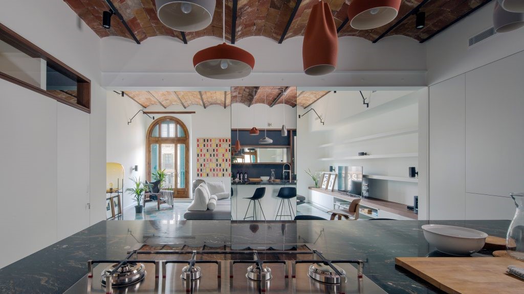
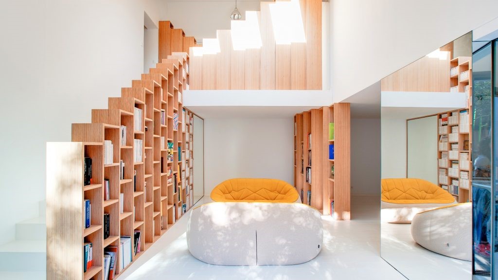
A strong color palette of ‘whites’ was employed to elevate the visual impact the house. Rather than succumbing to a traditional solid wall punctuated with windows, we designed this translucent wall to literally be a "wall of light" and emanate diffused daylight uniformly into the main living zones.
A strong color palette of ‘whites’ was employed to elevate the visual impact the house. Rather than succumbing to a traditional solid wall punctuated with windows, we designed this translucent wall to literally be a "wall of light" and emanate diffused daylight uniformly into the main living zones.
不规则形状的场地也允许我们在街道一级引入一个"共享花园";从沿巷道的恶劣处理出发,这一点在该地区的其他拐角拨款明显。这个花园是通过将新的边界栅栏朝房子倾斜,以在一个人的尺度上雕刻出一个景观特征来实现的。尽管住房面积很小,但这项努力是为了确保住房的一部分能够与社区分享。
The irregularly-shaped site also allowed us to introduce a "shared garden" at street level; a departure from the harsh treatment along the laneway as evident by other corner allotments in the area. The garden was achieved by angling the new boundary fence towards the house to carve out a landscaped feature at a human scale. Despite the house's small footprint, this effort was made to ensure that a part of the house could be shared with the community.
The irregularly-shaped site also allowed us to introduce a "shared garden" at street level; a departure from the harsh treatment along the laneway as evident by other corner allotments in the area. The garden was achieved by angling the new boundary fence towards the house to carve out a landscaped feature at a human scale. Despite the house's small footprint, this effort was made to ensure that a part of the house could be shared with the community.
向下向上的房子最终是在一个小的足迹设计“大家庭功能”的练习。这座房子颠覆了典型的“地面延伸”方法,同时又不影响光线、空间和生活质量。
Downside Up House is ultimately an exercise in designing "big home features" on a small footprint. The house subverts the typical "ground level extension” approach without compromising light, space and quality of living.
Downside Up House is ultimately an exercise in designing "big home features" on a small footprint. The house subverts the typical "ground level extension” approach without compromising light, space and quality of living.
Location Albert Park, Australia
Lead Architects Weian Lim
Photographs Tatjana Plitt
 举报
举报
别默默的看了,快登录帮我评论一下吧!:)
注册
登录
更多评论
相关文章
-

描边风设计中,最容易犯的8种问题分析
2018年走过了四分之一,LOGO设计趋势也清晰了LOGO设计
-

描边风设计中,最容易犯的8种问题分析
2018年走过了四分之一,LOGO设计趋势也清晰了LOGO设计
-

描边风设计中,最容易犯的8种问题分析
2018年走过了四分之一,LOGO设计趋势也清晰了LOGO设计


 PintereAI


.jpg)
