连接 南京缐状建筑设计
2018-04-28 00:00
是我们一直努力实现的主题。
The connection. It’s the theme that we’ve been working on.
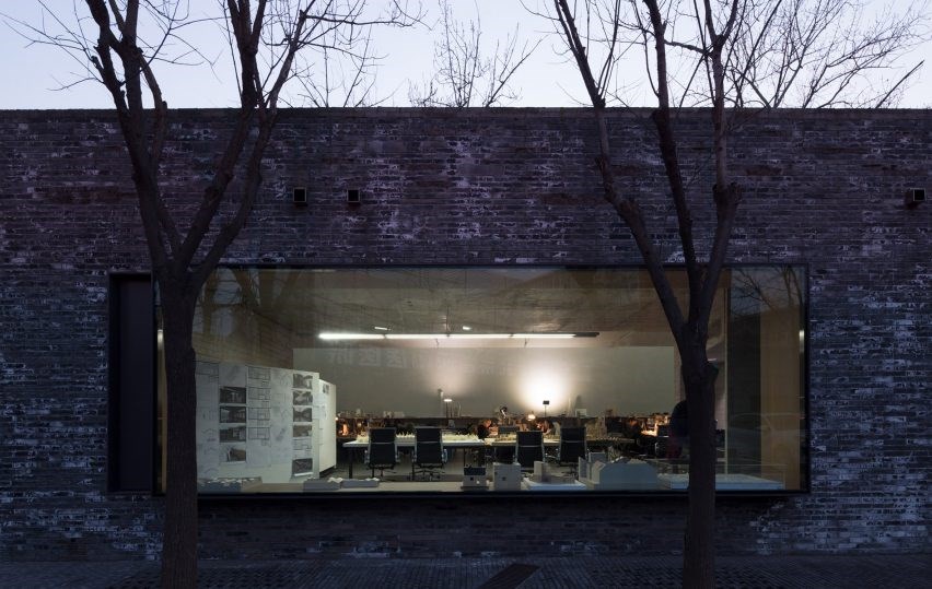
▼办公室概览,overview


这个空间长36米,宽7米,是一个带状空间。在如此狭长的办公空间里,很容易产生交流互动的障碍。所以在分区时,我们将入口处放在空间的中部,空间的左右两端分成员工办公活动区和行政区。中间部分设置了会议区及自由交流区。这样一来员工和管理层的沟通物理距离都相同了,这被我们称为沟通的连接。


The length of this space is 36 meters, the width is 7 meters, it is a zonal space. In such a long and narrow office space, it is easy to create barriers to communication and interaction.Therefore, when dividing the area, we put the entrance into the middle of the space, and the left and right sides of the space are divided into employees’ office activities and administrative regions.The middle section sets up the conference area and free exchange area.It makes the physical distance of communication exchanges between Employees and Management is the same. This is what we call a communication connection.


▼入口区域设置在空间的中部,the entrance was put into the middle of the space
▼门厅接待区,reception area


▼接待台,reception desk


▼贯通的狭长空间,a connected zonal space


▼电话亭,phone booth


▼员工办公空区,employees’ office area


我们用几个“盒子”来分隔或连接空间,以尽可能多地保留空间的开放性。虽然形式上是“盒子”的连接,但实际上是通过时间、空间的连接达到情感的连接。
We use a few “boxes” to divide or connect space to preserve as much open space as possible. Although formally “box” connection, but actually through time, space connection to achieve emotional connection.


在空间色彩的选择上,我们选取了黄色和蓝色。我们觉得这两种颜色是热情和理性的象征。在黑白分明的空间里,我们通过色彩影响员工的情感。白色的墙面和地面会大幅增加空间光线的二次、三次反射。通过最节能最环保的方法增加了空间的照度,使得空间更加明亮。
On the choice of space color, we chose yellow and blue.We feel that these two colors are the symbol of passion and reason.In black and white clear space, we affect employee’s emotion through color.White metope and ground will greatly increase the second and third reflection of space light.We increase the illumination of the space by the most energy-saving and environmentally friendly method, making the space brighter.
▼可移动的“盒子”起到分隔或连接空间的作用,the moveable “box” is used to divide or connect spaces


▼多功能盒子细部,multi-functional box space


▼立面图1,elevation 1


▼立面图2,elevation 2


▼立面图3,elevation 3


项目名称:连接 项目地址:南京市秦淮区1865创意产业园C4栋 项目面积:230 m2 设计公司:南京市缐状建筑设计研究室 设计总监:许智超 设计主案:倪鹏飞 设计团队:陈雷 倪鹏飞 主要材料:PVC卷材、超白玻璃、乳胶漆、金属管 摄 影 师:丛林 Project name: The connection. Project address: C4 building, 1865 Creative Industrial Park, Qinhuai district, Nanjing. Project area: 230 m2 Design company: NANJING LINEAR ARHITECTURE Design director: Xu Zhichao. Design master case: Ni Pengfei. Design team: Chen lei, Ni Pengfei. Main material: PVC coiled material/Ultra clear glass/ latex paint/metallic conduit Photographer: Cong Lin
南京 室内设计 江苏 办公空间 现代

 PintereAI


